Note Editor
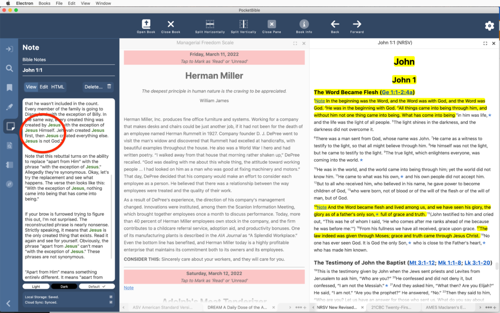
We reported extensively on the note editor in progress update #8. We spent a little more time on that task, in particular as it relates to when we save the changes you make to a note. First, we wanted to make sure that your edits get saved when you exit the app, so we provided a notification to the note editor that the app is about to exit so that it can save your work. (You probably think that just “happens” — and it does — but somewhere there’s a programmer who wrote the code to detect the fact that the app was closing and made sure that your work got saved.)
In addition we took more control over exactly when we sync an edited note to the server. When the note is open for editing, our other apps periodically sync to the server to make sure your changes get saved. This is potentially important on a mobile device where you might drift out of Internet coverage or the battery might die at any moment.
On the desktop, we can be a little more patient. We wait until you are done editing the note (say you switch to the viewer or the other editor), then we save all your changes to the server at that time. Of course locally we save your work every few seconds so that you don’t lose anything if the power goes out. But by waiting to sync with the server until you’re done editing, we make certain problems easier to solve when you have the note open on more than one device at a time.
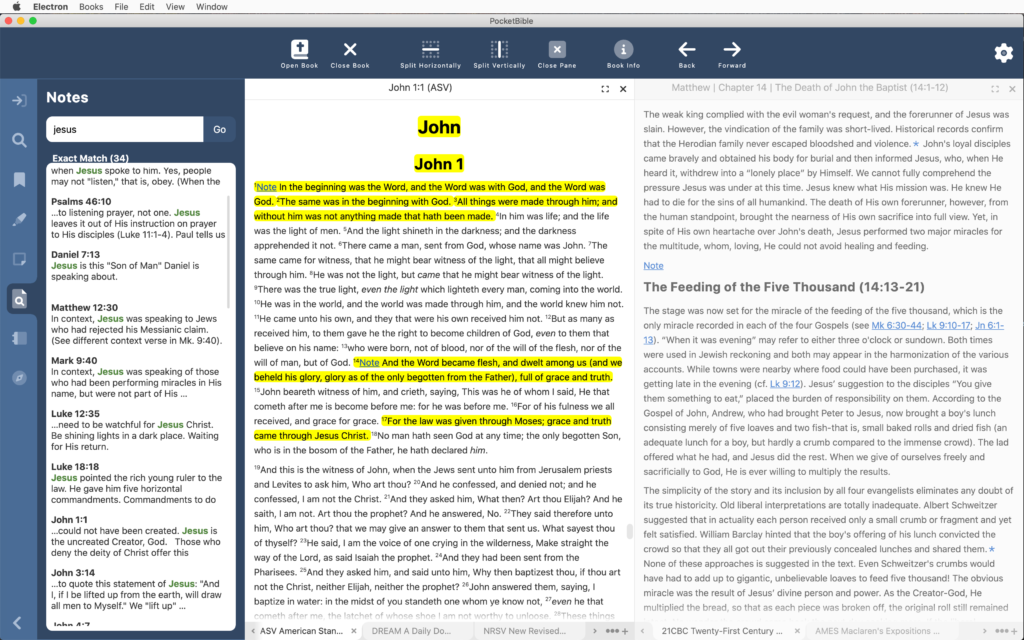
Finally, when linking to a note from search results, we now highlight the searched-for word(s) in the note viewer. This may be a first for PocketBible. I don’t recall doing this in previous releases, though some of you with memories that extend back to the last century more clearly than mine do might remember it differently.
Note Search
Note searching is similar to book searching except there are no indexes and of course the text comes from a completely different place. The overall structure of the code is the same except for when you get down to actually looking for the word or words in the text. Book text comes from an LBK file which has a lot of indices to support searching, but notes come from a database with no indexing. We’re able to use exactly the same code until we get to that last step, where it branches depending on the source of the text being searched. As a result, a lot of the logic of searching was already done.
The display of note search results is similar to displaying book search results. What we didn’t realize going into this was that it is so similar that it can actually share the code. So the Note Search, Book Search, and Journal Search panels are just 3 instances of the same chunk of code (we call it an “object” rather than a “chunk-o-code”). So we spent some time throwing away some work we had done on separate panels for Note and Journal searches and adapted the existing book-searching code to account for notes.
Similarly, the Journal is just a collection of notes, so the work we do for regular note searches and note editing automatically applies to the Journal. So even though the Journal is an Advanced Feature Set feature, we’re doing the implementation now as we work through the general notes feature. (Other AFS features will likely be put of until work on the standard feature set is done.)

On the other platforms, when you do a search for a word in your notes, the search results will show an excerpt of your note, but it’s just the first couple of lines. You don’t see where the thing you’re searching for actually occurs in the note. In the Windows version, we’ve made it so that search words are highlighted in the note viewer and are also highlighted in the search results. And we’ve added a smart “excerpt” function so that if the word you’re searching for occurs later in your note than the first couple of lines, we’ll show you the portion of the note in which your word occurs.
Since the book search, note search, and journal search all turned out to be the same/similar code, when we added excerpts with highlighted search words for notes and Bibles, we were also able to add them for non-Bible books.
Study Panel
As a result of working on the note editor, we learned more about how to better handle layout of other panels. This is particularly related to the re-layout that happens when you resize the Study Panel or the entire PocketBible window. Previously we had been doing a lot of manual calculations to position buttons and text appropriately. It turns out there were some easy ways to allow that to happen more automatically.
Bookmarks
We’re just wrapping up work on managing (add, rename, and deleting) categories. This gets tricky when you’re syncing all that data to other devices, so we’ve had to do a lot of testing of the entire synchronization path from Windows to the server and from the server to other devices.
Book Display

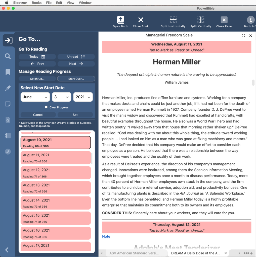
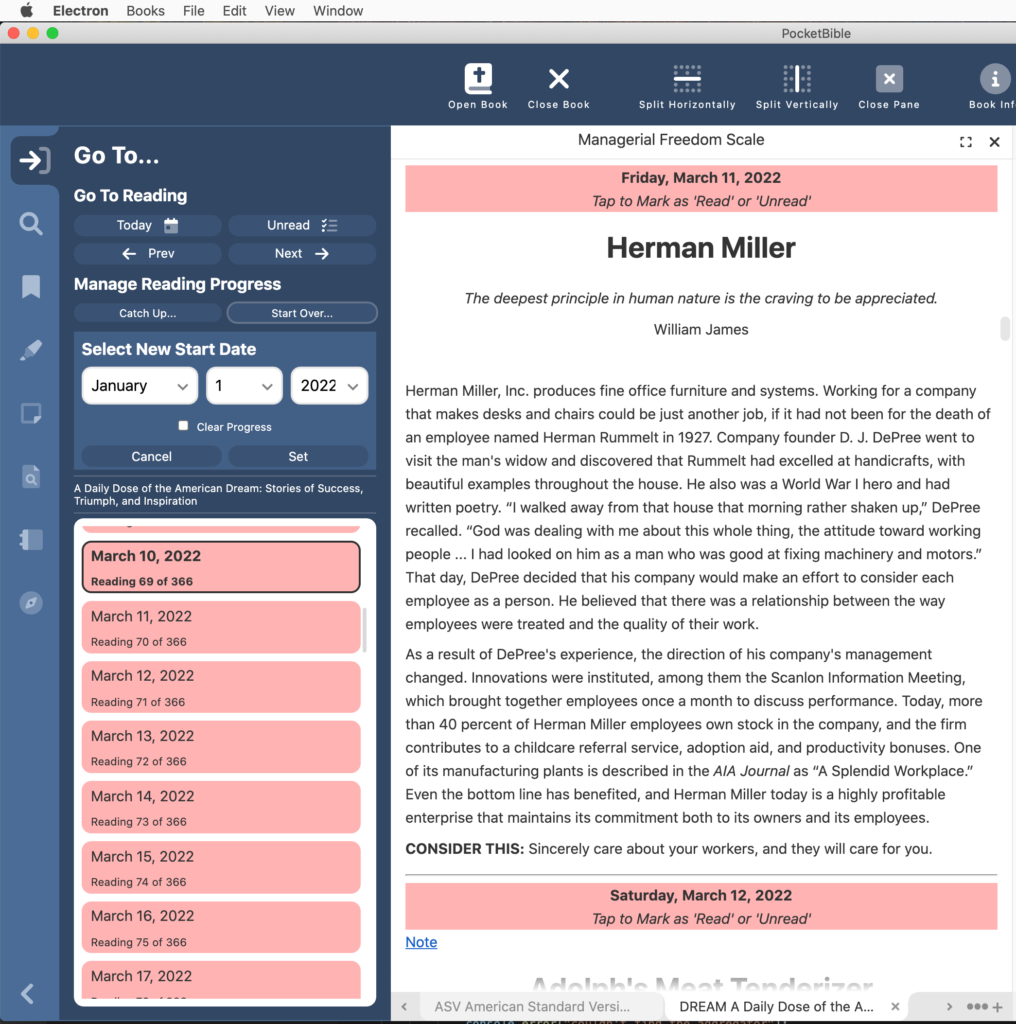
We happened to notice while doing our own devotional reading that the book pane was not getting refreshed when you change the start date of a devotional. So now it gets refreshed to update the dates you see in the text.

Thank you for the update! Sounding great! Can’t wait to try it! Hoping for a beta invite!
I Haven’t been following the update closely. Are you getting close to releasing a beta version?
Appreciate the updates and as an IT director, I like the inside look at how you’re developing the code!
Thanks, Craig, and all the developers, for your work on this. I’m looking forward to it!
I sense, especially from this latest update, that you’re really starting to like Windows, even prefer Windows for how you’re able to get things working… 😉
There’s no use denying it, I can sense it in the very words onscreen 🙂
Given that this will be used with Windows touch-screens (as is mine) would it be possible to have the 3 dots area at the bottom of the screen a bit larger, so it’s easier for fingers to hit the correct area, and NOT the wrong area. They seem quite small compared to other icons that we will be touching.
Also, the calendar icon (2nd up from the left bottom of screen, seems to be the wrong orientation to me. If that is an icon for schedules for reading etc, our calendars always flip over the top, not to the side. But it could be different on your side of the world. I suppose some diary’s go that way? It looks like a car battery icon actually. Maybe some little dots to simulate days of the weeks would work there.
Love how the program is progressing. Can’t wait for beta testing days.
Hi Craig,
Thanks so much – I can’t wait. Been using the program for quite a while (yes, my trusty Palm Tungsten T3 is right next to me – still use it) and I can’t wait for this edition. Thanks for all the hard work1
Hi Craig,
It all looks good. But I was very disappointed to find out that my current Windows Desktop PocketBible version 1, did not allow highlighting and underlining for commentaries and books. After sinking so much money into PB and Laridian books, I sincerely hope you are fixing that problem in this new edition of PB. Thank you.