Christmas break and some changes in the availability of team members have taken a toll on productivity, but work continues on the app.
Navigating: The Go To Tab
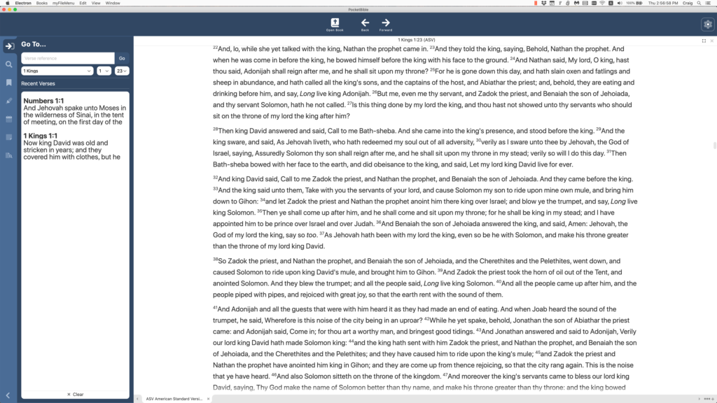
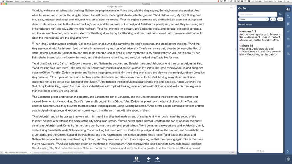
A lot of time has been spent implementing what we call the Go To Tab in the Study Panel. It’s where you go to navigate through a Bible or reference book. There are 3 different configurations of this pane. For Bibles, you have the ability to enter a Bible reference or choose book, chapter, and verse from drop-down lists. In addition, a list of your most recently visited verses is displayed.
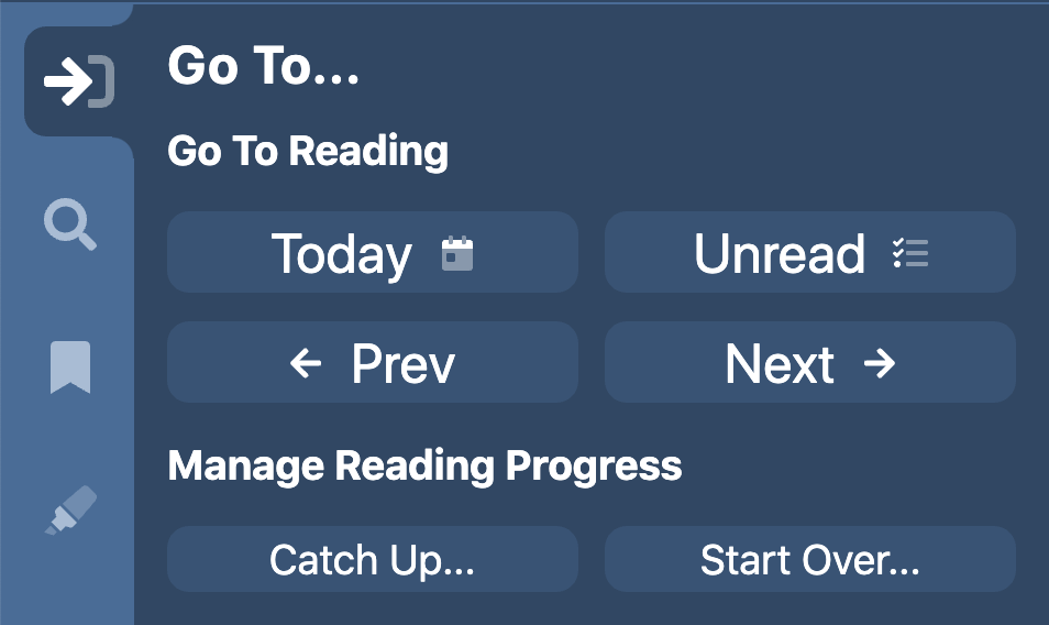
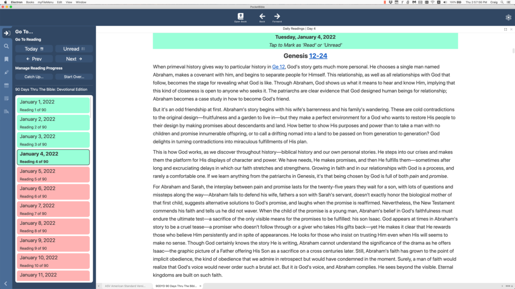
For devotional books, the main interface is the ability to navigate to the first unread reading, previous and next readings, and to the reading for a specific date. A list of readings that are highlighted to indicate whether or not you have read them is displayed. Functionality is provided to “start over” on a devotional by setting the start date and clearing your existing reading progress data. Related to the implementation of the Go To Tab for devotionals is the ability to click on a heading over the reading for a given date to mark that readings as “read” or “not read”.
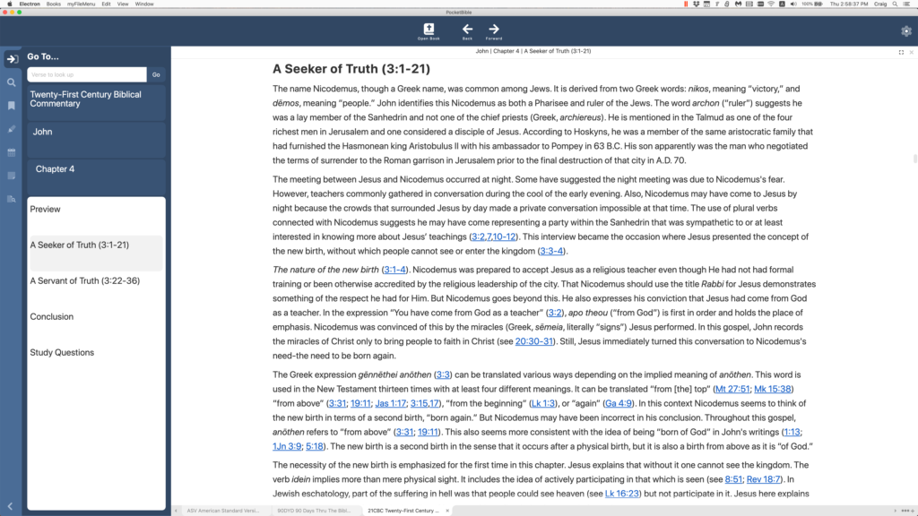
For all other books, a hierarchical table of contents is displayed, and your current position in the book is highlighted.
Study Panel and Toolbar Position and Size
While we were working on the Study Panel, we made it so you could have it positioned on either the left or right side of the screen. (You’ve seen it on the left side in every screenshot to date.) We also save the width of the Study Panel and allow you to double-click on its border to rotate between its minimum width, the width you’ve set it to, and its maximum width. This is in addition to being able to either show or hide the panel.
Related to the position of the Study Panel, we also made it so you can display the toolbar either at the top or at the bottom of the screen. We think this might be handy when using PocketBible on a Windows tablet. While doing that, we made both the toolbar position and contents persistent (saved in your user preferences).
Navigation History
We spent some time on a rough implementation of what we call “navigation history”. This is the data that lies behind the “back” and “forward” buttons on the toolbar. This is significantly more difficult in PocketBible than in something like a browser. In a browser, your back/forward buttons take you through the history of the current browser pane or window. PocketBible can have multiple panes and multiple books open in each pane. The history database needs to keep track of all of that.
We call this a “rough” implementation because there are a lot of places in the code where we need to “capture” history because the position is about to change. Further, there are a lot of places where we don’t need to actually capture history but we need to somehow mark the book or pane as “dirty” and in need of being saved. We believe we have identified most if not all of these places. Further testing is required.
A Few Smaller Things…
The ability to highlight a word and right-click to look up its definition is implemented.
The search field now displays a list of recent searches.
You can specify a range of verses to search when searching a Bible.
The range of font sizes you can select has been expanded.
We spent a lot of time (and continue to spend a lot of time) working on internal, non-user-facing elements of the code. Some of these are to accommodate updates to third-party libraries used by the app. Others are to flesh out implementations that were started with the idea we’d finish when we knew more about what they needed to do. Some are tweaks to the user interface that we’re getting around to as we pay attention to different aspects of the program.
Schedule
I have a hard time coming up with different ways of saying “we’ll be done when we’re done”. We go through periods where we make a lot of progress and others where we have a problem we just can’t figure out and get past. As I’ve said before, we don’t work with a specific release date in mind. We just keep working our way through the list.
A few of you have offered suggestions. We appreciate but can’t always implement those. That being said, the reason the toolbar can be moved to the bottom of the screen is because a PocketBible user asked us if we could do it. We had one false start that led us to believe we couldn’t, but then we backed up and took another run at it and the result is what you see above. So if you have suggestions, feel free to pass them along either here in the comments or to tech support. We are locked into some decisions but will always think and talk about good ideas, regardless of the implications.
Nice progress Craig. Looks good!
Thanks for the update. I’m looking forward to the new app!
The existing Windows store PocketBible app allows a user to simply type commands when a pane is active (e.g. having a Bible pane active and simply typing Gen 1.1 will take you to that verse; or “copy Jn 3.16” will copy that verse to the clipboard). I hope that excellent feature will be retained in this Windows version.
Thanks for the suggestion. This can be a tricky feature to implement but we’re going to try. The problem is that apps don’t like you just typing when they’re not expecting it. They expect the cursor to be sitting in an input field somewhere. But you might not be actively sitting in an input field. Worst-case you’ll have to press a Ctrl or Alt key first, then type your command. That’s how it works on the Mac.
Many thanks for your work. I use the app a lot on a PC, but the most irritating thing is to have to click twice to get the app commands! I would prefer for them to always visible – but I realise we all have our individual preferences.
Don’t feel bad or worry about saying, “We’ll be done when we’re done.” That’s exactly the date we all are looking forward to, and not a day sooner. God bless all of you as you work on this project.
thanx for issuing reports
Thanks for the update and steady progress.
Future users will reap the benefits without seeing the blood, sweat, toil, and tears that went into making this. Thanks for opening the doors of the sausage factory.
Can you make the Sync button a top button so you don’t have to click a few times to find it buried somewhere?
Great job – keep up the creativity.
“Sync” can mean a couple things in PocketBible but I think we have them both covered. There will be a button that allows you to sync all your Bibles and commentaries to the current verse in the active Bible. There will also be a button that will allow you to sync your notes/highlights/bookmarks to the cloud in the event you want to have automatic sync turned off and need a way to manually sync that data with the cloud.
I agree with Tim N. When I travel I might not have a sim card for the country because I do aid work in poor areas with low reception for a few weeks. I would like the ability to sync to cloud “now” when I get to a coffee shop or shopping centre so I can sync laptop, phone and tablet (as a backup) with only 15 minutes contact to do everything.
I enjoy pocketbible on my phone and tablet spend as much time as you need to get it right.
There was never any question that the app would provide this capability. It exists in all versions of PocketBible. The question is whether it would be a button on the toolbar. That button exists on the macOS version and will be present on the new Windows version.
Hi Craig, Excellent work.
I’ve been using PB for around 20 years… Love it.
Thanks so so much for adding the bottom toolbar option. It was worth asking.
A couple of other ideas…
* Will there be a way to rearrange the order of books and resources within a panel, rather than just having them in the order you downloaded them. I’d like to put the most used by me at the top, and that may change over time. So rearranging them would be fantastic.
* Will there be a progress bar along the bottom for certain resources where it’s appropriate. So you can see how far you are through a particular book/resource.
* Would it be possible to add a ‘two finger swipe’ option.
ie. two finger swipe to the left would be the same as the FWD button on the toolbar, or two finger swipe to the right would be the same as using the BACK button on toolbar. Quicker and easier than finding a small Fwd/Back button. This would be the same as available in some browsers.
Alternatively, the two finger swipe could be used to move to the next book/resource, or the next hit in the search result.
* Would it be possible to have an ‘i’ icon in the almost empty toolbar, that took you to the ‘about information’ for the current active resource. I often check this out, and have to delve into menus.
* Would it be possible for us to relabel a resource name differently from what PB shows by default. I have two NIV versions, and in my other PB platforms, they both just show as NIV (New International Versio), so I don’t know if I’m seeing the 1984 or 2011 version. There’s nothing that shows me which one I’m seeing without me going to the About Info. And I can’t rearrange the order of resources, so it would be logical for me. ie. I’d put the 1984 NIV version above the 2011 NIV version. Now on the small phone screen that could be because there’s not enough screen real-estate to show the full label. But re labelling the resource would be great. There could be a page to rename some resources as wanted, with the option to return to ‘default’. I know many resources would require you to show their name only. But this would only be tinkering with the label visible in a tab.
* Double tap on screen for full screen reading.
* Also it would be great to have some programmable buttons on the toolbar where we could choose from a range of options to assign to these buttons. I think a similar feature to this used to be available on one of the PB platforms quite a few years back. I remember filling up the toolbar with my most used functions. It was brilliant.
Thanks again to you and your team for the commitment to getting the best study program and resources out to us. We are indebted to you all.
Regards Ken
Rearrange the order of books in a pane: It will work like the macOS version, where each book in the pane is represented by a tab at the bottom of the pane. The tabs can be dragged into a different order, including dragging them to a different pane.
Reading progress bar (like iOS version): Added to suggestion list.
2-finger swipe: Not completely sure if that’s available across all devices. I’ll look into it.
Book info button:
Double-tap for full-screen: Full-screen will work the way it does for all Windows apps.
Programmable toolbar buttons: There will be more buttons available to be put on the toolbar than will probably fit. If you see it and think of something else that should be there let us know. The current list is fairly short but there are a bunch more in the to-do list yet to be implemented. They’re easy to add late in the project.
Thank you for all your persistence and dedication.
Grace and peace.
Thanks for the update Craig, and thanks for keeping after it. I’m still holding my breath for a screen shot showing 7 bibles, 7 commentaries, and 10 dictionaries all open and viewable at once on my 32″ screen! 🙂
Hey, that’s more like it. 🙂 but it looks like they simply wrap in a single FlowLayoutPanel (.NET speak). It could really use some method of differentiating the categories of books opened (Bible, commentary, dictionary,..) like the panes in my current version 1.102. I know, I know, you’re not finished. Blessings to you and the staff for keeping Windows Desktop version alive!
The color settings you’re referring to are unique to PocketBible for Windows Desktop. They were hard to manage so we didn’t carry them onto any other platforms. You might like to color by book type, but not everyone agrees with our classification scheme. They might want to color each pane separately. This presents challenges as panes are added, as new books are opened into them, as they are split, as those splits are split, etc. They might want to have a different color based on the exact book. Then they expect those colors to carry over to PocketBible on different platforms. And they expect to be able to delete the book but have its color remembered in perpetuity in case they install it or open it again. It’s a bigger problem than it at first appears. 🙂
Reading these updates and seeing the effort that goes into this project makes me appreciate the Windows Desktop version even more, realizing everything that had to go into bringing that to life. It was a well-done program and I use it daily, but I’m really looking forward to some of the features of the new app.
One idea – it would be nice to have a sync on/off option for each pane, so I could have commentaries sync with my Bible pane, but have a second independent Bible pane. Example: I have one Bible pane for my main passage, say John 15, and the other panes, commentaries or whatever, sync to that, but a second Bible pane where I can open other passages without my main passage changing. It could even be cool to have a pane that could open to a cross reference by a click without affecting the main passage.
Regardless, I’m really looking forward to seeing the app on my screen!
Thanks for all your work!
Just stopping by to see if there are any updates.
I have a couple things I can write about. Just need to carve out time to do it. 🙂
👍