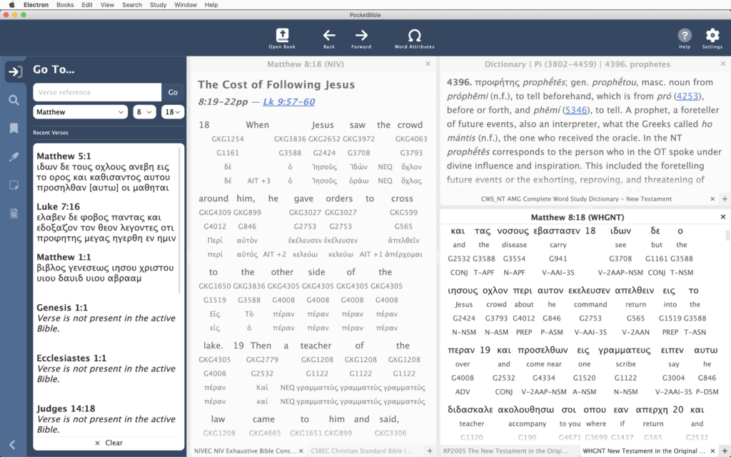
Let’s just dive into what’s been done since I last posted an update….
Modal Dialog Component
With this new-to-us technology stack, we continuously discover that a lot of what we expect to be already done for us has to be created ex nihilo. For example, while there is a “context menu” component available to us in Electron, it isn’t very sophisticated and can only handle the simplest tasks. So we had to create context menu functionality for ourselves.
Similarly, there’s a generic “message box” dialog to use for error messages and to ask simple yes/no questions, but we found ourselves frequently needing to get input from the user, such as entering the name of a new bookmark category or choosing whether or not to clear daily reading progress when changing the start date of a devotional book. The built-in message box can’t do that.
We ended up creating a generic modal dialog that could be used to display error messages, ask simple questions, or gather (and validate) input. This is a little harder than you might think, but taking the time to do it allows us to standardize the way input is gathered in the app and gives us control over the appearance of the dialog so it can match the rest of the app. It also makes it very quick and easy to create a fairly complicated data collection dialog when we need it.
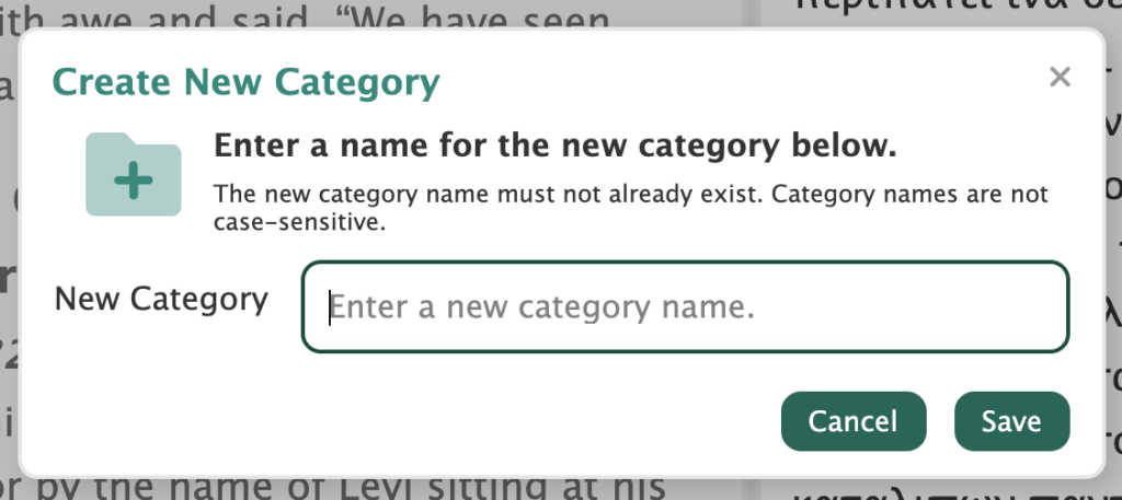
Once we had that component, we went back and made use of it in several dozen places. Some were easy and some required a little more work. But we’re happy with the results. This is the kind of task that takes a long time in the moment but makes future enhancements to the code significantly easier and faster. And it gives the user a much-better experience.
Bookmarks, Highlights, and other Study Panel Features
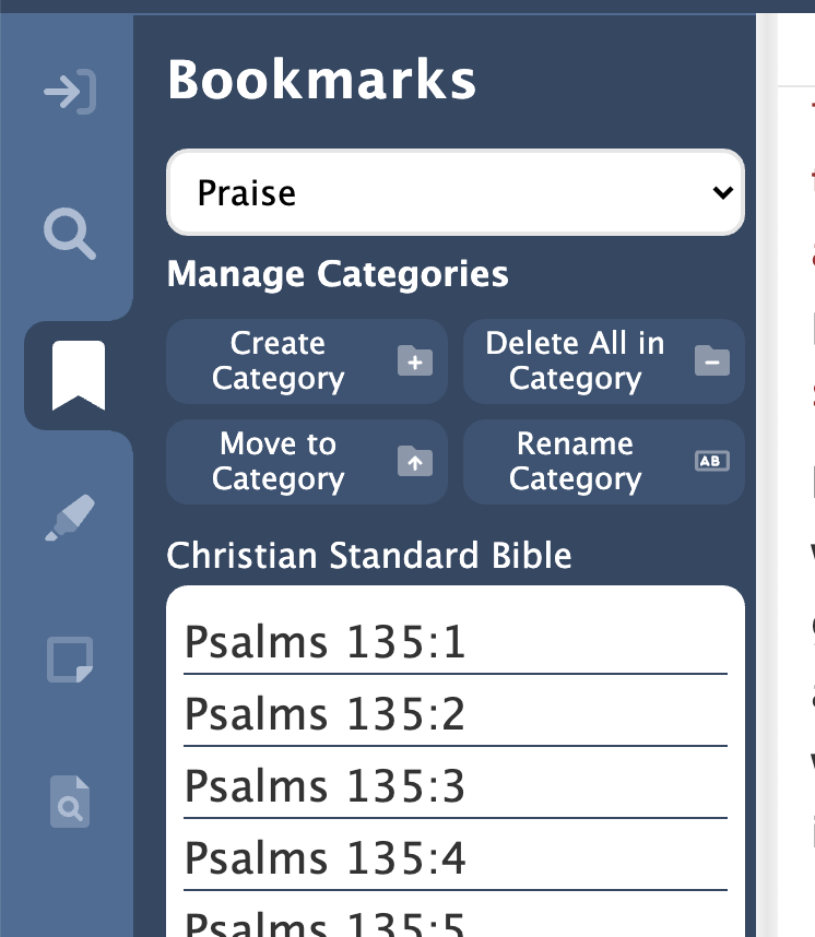
Since the last update we rounded out the features of bookmarks in the app by giving you the ability to create new categories and move the bookmarks from one category into another. We added a (somewhat dangerous) feature that allows you to delete all your bookmarks in one operation. We used our new modal dialog component (described above) to ask you 2 or 3 times if you’re sure you want to permanently delete all your carefully created bookmarks.
We added the ability to change all the highlights in one color to another color. We changed some existing features to use our new modal dialog, and, like we did in the Bookmarks pane, made sure we were using the user’s global font size preference in the Highlights pane.
With our new modal dialog in-hand, we changed the implementation of some existing features to use it. And we made sure the Study Panel panes were using the global font size we’ve talked about in previous updates.
Accelerator Keys
“Accelerator keys” are the keystrokes displayed next to the application menu items that can be used as shortcuts to that menu item. Many of these you do without thinking about it, like Ctrl+C (Cmd+C on a Mac) to copy and Ctrl+V (Cmd+V) to paste. Others you discover when you realize you’ve been selecting an item from a menu over and over and wish there was an easier way.
Since the last update, we’ve implemented the ability to assign virtually any combination of modifier keys (such as Control and Alt) and a letter or number key to any operation in the program. So if you find it easier to remember Ctrl+S for “search” instead of Ctrl+F for “find”, just reassign Ctrl+S to the “Find” operation in the menu. If you find yourself repeatedly turning verse numbers on and off and get tired of selecting “Hide Verse Numbers” from the “View” menu, just assign Ctrl+Shift+H to that item. Now one key will toggle your verse numbers on and off.
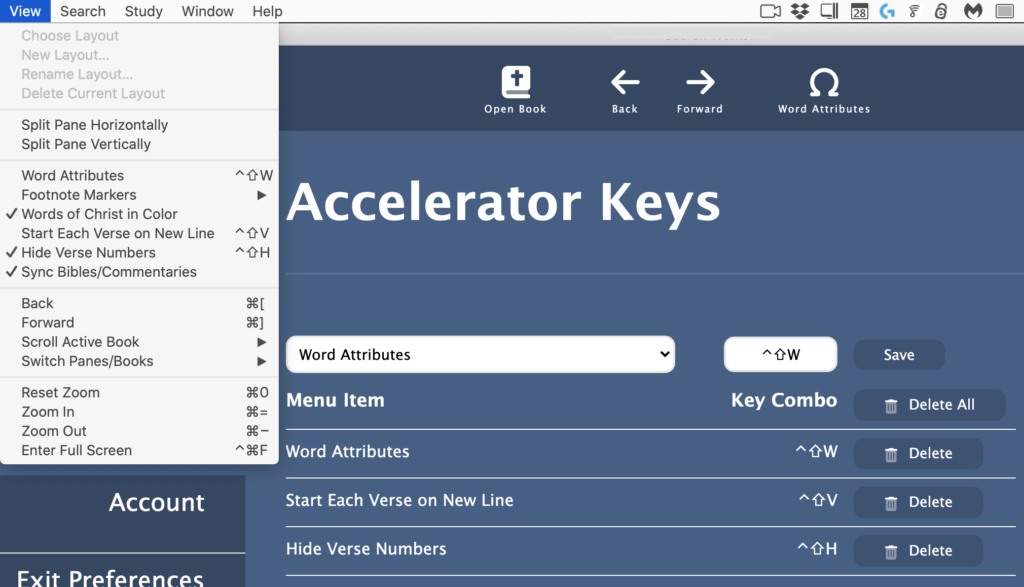
Part of implementing this feature was making sure that everything you might want to do in PocketBible is present in the menus somewhere so that it can be assigned to a key. We discovered, for example, that we hadn’t yet implemented “Next/Previous Pane” and “Next/Previous Book in Pane”, so we added those to the “View” menu and implemented them in the code.
Not every key can be reassigned. Some are just too well-integrated into the way some of the built-in functionality of the code works to be changed. We manage that for you and warn you if you’re trying to do something that isn’t going to work.
Layouts
We’ve been enduring problems with splitting and resizing panes since the beginning of the project. During this period we attacked these problems.
Let me digress briefly to talk about how programming has changed since I started doing this 40 years ago. Back then we wrote our own code. When we had to, we would purchase a “library” that implemented something hard, like managing a database. These libraries were written by knowledgeable, professional programmers, thoroughly tested, and only updated when necessary to add major new features.
Today, the Internet makes it possible both to distribute and to discover little components that supposedly make programming easier. Yes, there are major components like database managers, but there are also tedious little components that do nothing more than remove leading or trailing spaces from strings. It can be easier to import someone else’s code than write it yourself.
You don’t know the pedigree of the people who write these components. Often they write some complex thing (like the virtual list and context menu components we use in PocketBible) then just vanish into obscurity, leaving you to maintain their code and fix the bugs they left in it (like the virtual list and context menu components we use in PocketBible).
The component we chose very early in the project to manage the splitting and resizing of book panes has been both a blessing and a curse. It definitely saved us some time. At least up until earlier this month.
Example: One of the things it does is notify the app that the user has dragged a splitter between two panes and changed their relative sizes. The sizes are expressed in percentages. So the original size might have been 50/50 and now the new sizes are 30/70. That’s great. PocketBible records the new sizes so that it can restore them the next time you run the app. So far so good.
The problem is that it uses the same notification message to tell you that it has internally changed the size of a pane part-way through an operation. So if you have two panes split 50/50 next to each other, and the left pane is split 30/70 vertically (one above the other), and you close the top left pane, it will notify you that you now have a left pane of size 70 and a right pane of size 50. It doesn’t tell you that the left pane is 70% high and that the right pane is 50% wide. Nor does it tell you that in just a few milliseconds it’s going to reorient and resize the panes, and further, that it’s going to do that incorrectly, leaving your left pane occupying 58.33333% and right pane 41.66667% of the screen where they used to be 50/50 before. (Exercise for the reader: Why those weird sizes?)
One of my tasks recently has been to attack this issue and try to resolve it. I believe it’s mostly conforming to my wishes but it took some doing.
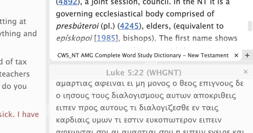
While messing with the screen layout, I made the splitters between the panes a little thicker to make them easier to find with your mouse (or your finger tip if you’re using a touch screen). I gave them little visual “handles” to make it more obvious that they can be dragged to adjust their size.
Book Panes
Speaking of the screen layout, other changes were made to the book panes.
We discovered that closed panes were still “alive” in some respects and were frantically trying to do things in the background as if they were open. This had no visible impact on the app but made it run terribly slow after a while.
We completely re-implemented the book tabs at the bottom of each book pane. They were trying too hard to look all fancy and clever and as a result they didn’t always work correctly. While we were in there we made sure the tabs adjust their size to your chosen font size so you don’t end up with nice, readable Bible text and tiny, unreadable tabs.


The pop-out tooltip that tells you where you are as you drag the scroll bar scroller was getting stuck in the “on” condition. That’s been fixed.
We’ve been ignoring problems with interlinear books like our Greek NT’s and the NIV with Goodrick-Kohlenberger Numbers. Some of the interlinear attributes weren’t being displayed. Now they are.
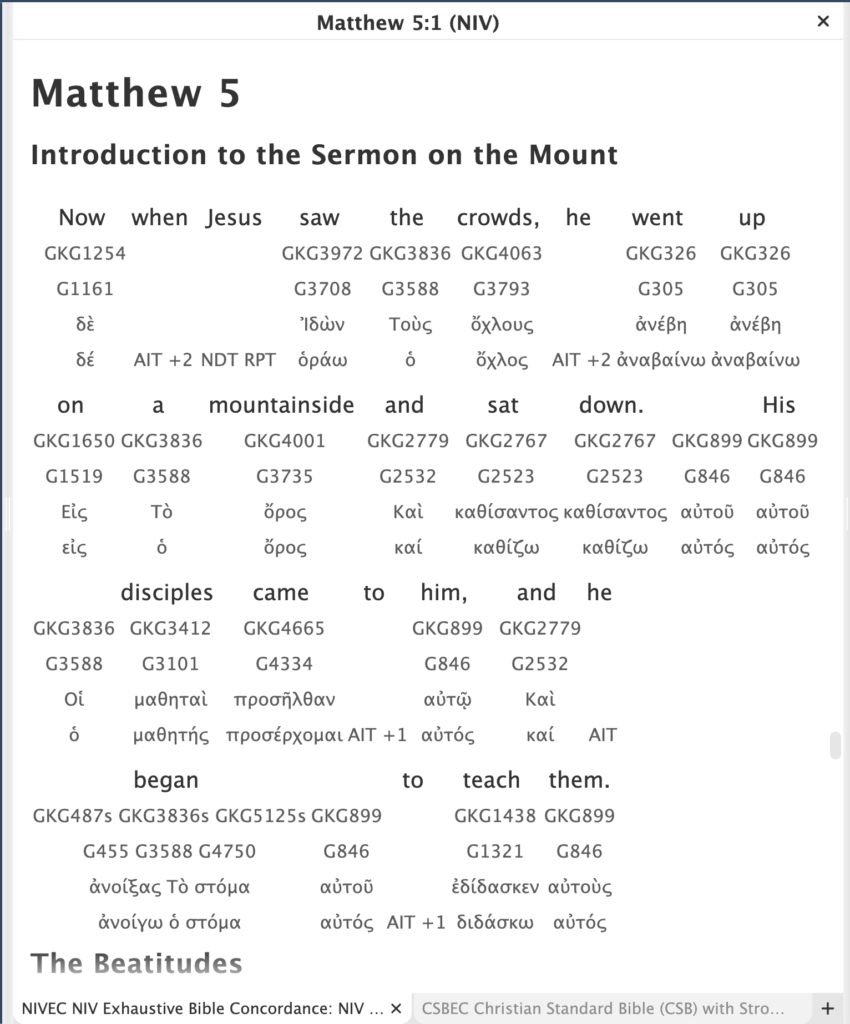
Text Selection
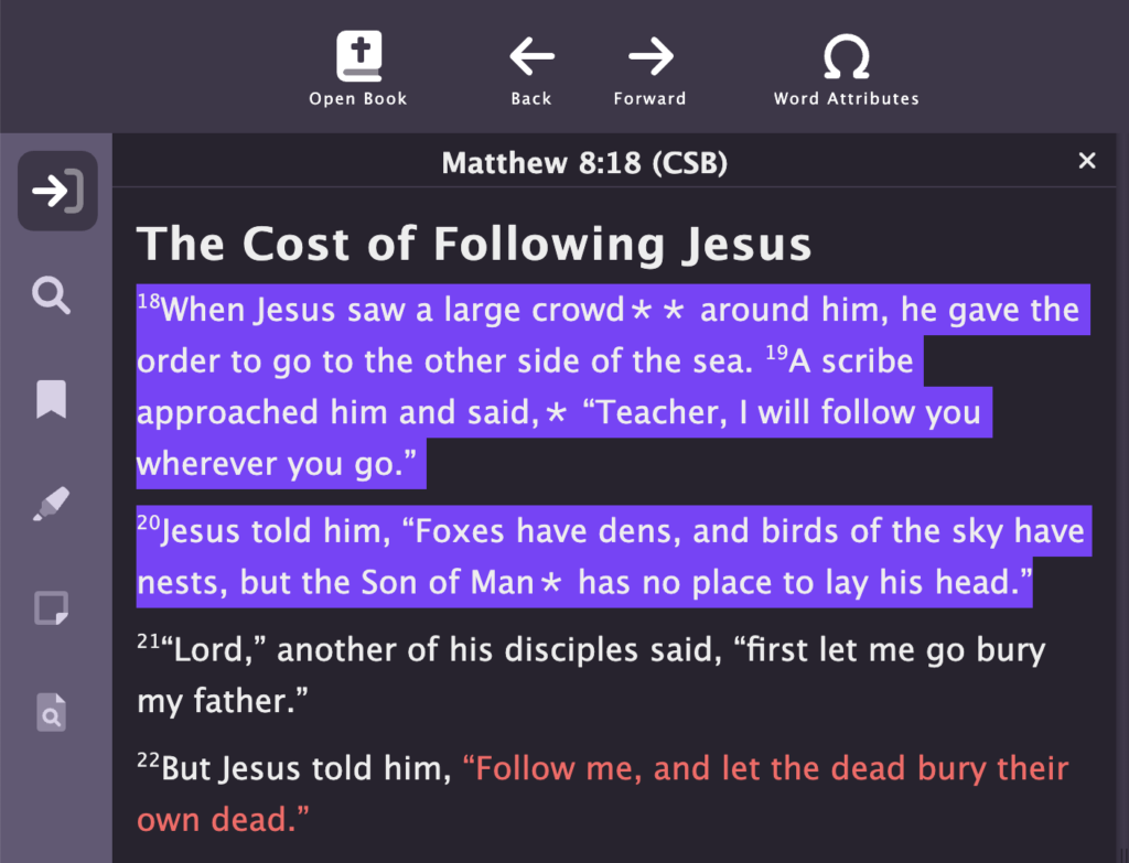
First, the “easy” part: We now automatically calculate a good color to use for text selection (when you drag your mouse to select text). If you think about it, this isn’t straightforward. It needs to be visible against both the background and the text color. Both of those are user-configurable and can be anything. So you can’t just choose a pleasant shade of blue and call it good. The program now finds a color using an appropriate hue from your chosen color scheme that will work for text selection.
The real challenge was handling “select all” in a book pane. It’s simply not realistic to support the ability to hit Ctrl+A (Command+A on a Mac) then Ctrl+C (Command+C) and expect to copy an entire 400 MB commentary to the clipboard (in both plain-text and rich-text HTML). The copyright owners from whom we license texts wouldn’t like it, and it would present some real programming challenges.
On top of this, there’s the fact that PocketBible does not keep the entire book displayed all the time. We just make it look like it is. In fact, it works more like Facebook, where we render additional paragraphs of text as you scroll farther and farther into the book. So when you say “select all”, we actually only select the portion of the text that has already been rendered, which consists of 1 or 2 screen heights above and below what you can see.
A similar problem happens when you start selecting in the middle of the book and drag off to the right of the pane. Selection will extend toward the bottom of the book. (If you drag off to the left, it extends toward the top of the book.) Again, the rest of the book isn’t really there.
The best answer we could come up with was to just make sure we highlight and copy what is rendered. This has the benefit of limiting the amount of text you put on the clipboard, satisfying both our copyright owners and making it so you don’t have to wait while we render an entire Bible into your clipboard.
Miscellaneous New and Updated Features
- Changed the Journal icon (AFS feature).
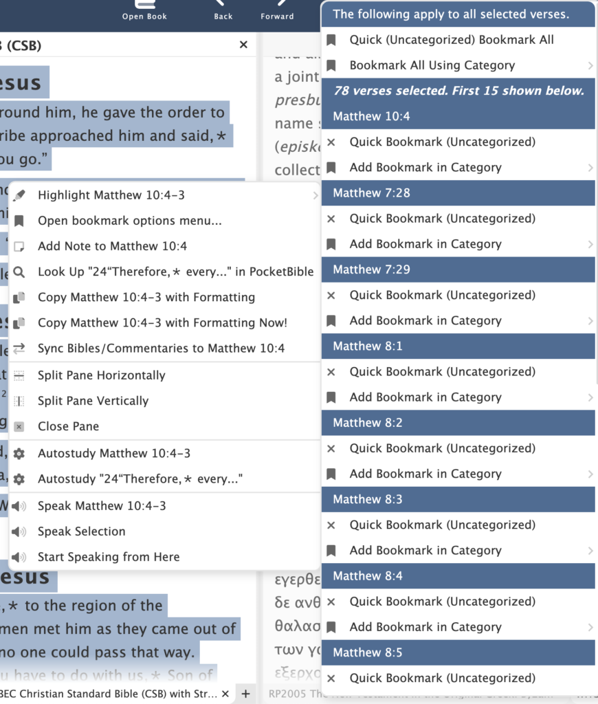
- Adjustments to the way bookmarks are handled in the context menu. It can’t realistically handle the situation where dozens of verses are selected, because it lists options for each selected verse. So if you select 100 verses, you can bookmark them all, but you won’t see each one of the individual verses listed on the context menu.
- Cloud Library wasn’t showing all owned books. Made changes mostly on the server to deal with this.
- Fixed user interface misbehavior of icons on buttons when the buttons got smaller.
- Fixed a database initialization bug that was causing tables to constantly be recreated, which would fail after the first call. This resulted in the database operation also failing.
Schedule
I haven’t talked about this for a while, and a few of you have asked. There’s a very common belief that writing software is like baking a cake. If you break down the tasks and and add the amount of time each takes, you’ll get the total time and can accurately predict when it will be ready to eat.
But it turns out it’s more like writing a college textbook for a subject you know well, but doing it in a language you’ve never learned using publishing tools you may have to create yourself. You can quickly learn bits of the language and maybe write an initial draft that looks pretty good. But as you write, you learn more about the language and have to go back and make corrections to previously written chapters. Then you have to decide on where illustrations are needed, figure out how to create them and how to arrange them in the text. Then there’s choosing paper, fonts, ink colors, cover design, binding style, dust jacket design.
Some parts of our probably ill-considered textbook analogy will be easy; other parts will be hard; and some of the hard parts will have to be re-done 2-3 times until you get them right. You might be able to predict completion dates for portions of it, but it’s pointless to try to predict a completion date for the entire project because you don’t really know what needs to be done until you do it.
People don’t believe me when I say we literally don’t have a planned release date for this product. You’d think after 40 years of writing software for business and pleasure, I’d know how long something is going to take. Instead, what I’ve learned in 40 years is that the “ship date” question is one that has no answer. If you try to answer it along the way, you’ll only disappoint people.
That being said, I felt going into this project that it was going to take 12-18 months. However, the further we got into it, the more we didn’t know.
The good news is that I feel like the to-do list is getting shorter. The bug list grows about as fast as we shrink it by fixing things, but those tend to be small tasks. In the interest of total transparency, I’ve included my list of remaining tasks below.
Interestingly, in the process of capturing screenshots for this article, I had to add items to the to-do list.
As you can see, a lot of these tasks are fairly minor; there’s just a lot of them. Some are harder or more unknown than they look.
Remaining Tasks
Bugs
- When multiple verses are selected, the reference isn’t formatted correctly in the context menu.
- When multiple verses are selected, the last verse appears before the first one in the context menu bookmark list.
- Dragging a book into a new pane results in an infinite render loop.
- Moving study pane to the right side (or moving it back to left side) causes the resizing controls to be lost.
- When moving study pane to the right, the book panes are not getting refreshed.
- Thoroughly test back/forward. May be capturing view state for history too often, like after normal scrolling.
- Verify that we’re loading the latest book ordering database when we see newer Bibles.
- Verify scroll by line and scroll by page is working. Not sure of the latter
- Manage input focus throughout.
- Implement date-sync for devotionals; save last date sync so we can use it when opening devotionals to the last synced date.
- Consider an option to make pane splitters narrow for mouse ops or wide for touch ops.
- If book panes get too small, it’s easy to scroll well past the end and confuse the loader
Go To Pane
- Consider moving book names to top of Go To pane for all book types.
Note editor/viewer
- Make it look better when empty.
- Consider “add note” that adds at current location in active book. There have been serious problems with that on other platforms.
- Deleting Journal notes doesn’t refresh the list correctly. (AFS)
- Can sometimes get duplicate Journal notes somehow. (AFS)
- See if we can honor newlines in plaintext and retain those in the rich editor. Right now they are retained in the viewer but not the editor.
Note search
- Low priority: Switch to enable/disable enhanced search (even for book searches where it defaults “on”)
Preferences: Color Theme
Settle on color themes for free version and for AFS.
Search
- Consider moving search back into main process.
- Verify we’re using global ui styles in the study tab.
User Data
- Verify we’re tracking the last-synced customer and don’t sync when it changes.
- Verify we’re always requesting data from the server when we need to and saving when we should.
Preferences
- Use standard font sizes in preferences.
Accelerator Keys
- Code review
- Organize the list of functions
Advanced Feature Set
Consider whether or not to release the base version before finishing AFS features
- Journal
- Navigator
- Autostudy
- Listen
- Library Search
- Saved Desktops
- Today button
- Hover Tooltip over Links
Prepare for Release
- Resolve issues related to doing a release build
- Search task
- Locations of pre-installed books and images
- Locations of image caches; rendering caches
- Onboarding
- Website
- Add platform landing page and catalog page for the app.
- Add catalog page for AFS subscription.
- Remove other Windows platforms (consider leaving the desktop version for Win7 die-hards).
Appreciate the update. I chuckled about the part when you mentioned external libraries supposedly helping – been there, done that, encountered the “DenverCoder9” issue. I’m hoping a decent “dark mode” can be part of the basic feature set, but I’m still a little in the air there. I use that on my phone, but currently use a tan background to help it not be “WHITE” on my Surface. I do appreciate that you’ve taken the time to make highlighting work better there.
I also understand the “when it’s done” aspect to software. You _could_ throw out an alpha, but then you’d just multiply the bug reports and have to categorize those and keep dealing with them even when already addressed. The semi-regular updates here have been great to see the “behind the scenes” cycles that you’ve been going through, the challenges, and the victories (followed by more challenges, of course).
PocketBible won’t have a dark “mode” as much as it will have dark-background color schemes. I bounce between dark and light color schemes all the time for testing but usually use the default white-background, black-text, blue-toolbars color scheme when I do screen shots. I did the text selection screenshot on a black background because I thought it demonstrated better the way the app choose a color to use.
There’s a custom color scheme editor, but I don’t know yet if it will be AFS-only or be a part of the standard feature set.
You’re right about how releasing alphas and betas can really complicate things. Intermingled with bug reports that have to be tracked are some really good and tempting feature requests. Sometimes it’s best to just get it out there then worry about updates later.
We made a conscious decision to embrace github and npm because that’s what all the kids are doing these days. We quickly found that we were having to do a lot of modifications to make those pieces work well. In one case I abandoned a fairly major component that we had been using as our note editor and wrote it myself in less than a day. Makes you wonder why you’re putting yourself through all the grief of using other peoples’ code. 🙂
One more thing…. re DenverCoder9…. more than once I have encountered a really obscure bug or behavior and googled it, only to find my own stackoverflow post from 5 years ago asking the same question. I once reviewed all my SO posts and found that I answered my own question over half the time. So that’s neat. 🙂
Thanks Craig. I’m sure most people (including me) don’t realize the nuances that go into a project like this, so I thank you for you diligence in making sure things are “right.” I have used other software, especially in the Christian field, where companies release buggy software just to get it out there, and then spend the next year (or more!) trying to address problems. Drives me crazy.
So thanks for paying attention to the details. I’m good with using the desktop version until the release date. But I am eagerly anticipating. And still working on fruit of the Spirit #4.
Dave
To be fair, most software is badly written, not just Bible software. But then, I’m entering my “you kids stay off my lawn” years, so most things other people do just kind of tick me off. 🙂
“my “you kids stay off my lawn” years”… so funny, but “most software is badly written” is so true! I am not a programmer or code writer. But I easily see bad work. Very frustrating when one is used to great work like PocketBible, every version of every platform I’ve used!
When asked, “When will it be done?”, just say enthusiastically, “Well, we’re much closer than we ever have been!”
Except on those days when we were closer yesterday. 🙂
I am a iPad user and am amazed at the functionally of pocket Bible. I have asked to be updated on the windows product. From this update, it looks like a monumental task to replicate the iOS capabilities. As a pastor, I just couldn’t function without the iPad app. God bless and keep up the great work
Thanks for the update Craig – good to hear about the progress – much appreciated. Completely agree and understand about the lack of release date. Nevertheless, greatly looking forward to the release, even if in beta form
Thanks, Craig, for your updates. It is a good feeling that we are part of a “family” instead of just a customer. Since “retiring” from mission academics, I have been a part-time employee for a mission organization helping create online mission courses and websites. I enjoy following your programming challenges and successes, I just wish I had the knowledge and experience you have when I try to work through my more minor ones! I depend on those pre-made routines I can Google up. Even though I need to modify them at times, it is sure better than my attempts at creating the routine! Keep up the good work. Use PocketBilbe daily.
Hi Craig, I love that your default would be a white background and a black font. Even Peter’s (first comment above) mentioned a “tan” background and that would be ok also.
What has become one of my pet peeves on websites today is the move toward a less stark black font color. It seems as if the default preference is a lighter charcoal color. The problem is, my tired eyes can’t read that as well. I’ve been known to highlight a bunch of text, paste it into a word processor and change the font color to black just to read it.
I do appreciate your hard work and I look forward to updates moving forward to the day when we have a new version.
Thanks and my blessings to you and yours
Dale
Well now you have me nervous. The default color we use is actually #333333 which is a very dark gray. It has a very high contrast ratio. If you click on the top image in this blog article to see it full-size, the Greek text in the lower right window uses that shade of black, as does the text in the “Go To” pane on the left. The interlinear text is a lighter tint of that color.
The good news is that all the colors can be customized if you need to make them more readable.
As I am fumbling through sermon creation using PocketBible for Windows Store and sometimes “Desktop”, I was somehow prompted to come back here and re-read the column to get the status update again. (And make the futile search for a clue that I know does not exist – a potential release date.) Something caught my eye – “Can sometimes get duplicate Journal notes somehow. (AFS)” – I have seen this in the Android platform! I always thought I was doing something to cause it. But maybe not. If I see it happen again, I’ll submit a ticket.
No need to submit a ticket. The full text of that note mentions that it happens on other platforms, too. Hopefully whatever makes it happen on Windows will be a clue for those platforms as well. Even more hopefully it will be a sync server issue so we can solve it for all platforms in one place. 🙂
Thanks for reading the status update all the way to the end. I wasn’t sure anyone would read all that.
I’m beginning to see light at the end of the tunnel. A couple major breakthroughs today helped.
Craig, Thanks for sharing these helpful updates! You and your team are totally rebuilding the Windows app from the ground up. A daring endeavor…. with unexpected landmines, as you share. But it will be SO worth it to have a development platform that you know well and can update and expand with much greater control. My prayers are with you all for James 1:5 wisdom from God to bring this important project to total success! Bless you.
Thanks Mark!
This is probably not the best way to make a comment, but ….
I just got a new Windows 11 laptop and downloaded PocketBible for Windows. That didn’t work too well. The panes have wide spacing between lines and both horizontal spacing gaps between words or partial pane-width columns, on all panes. Win 10 PocketBible stills works pretty well on Win 10. If I could, I would paste in a screenshot. Looking forward to any release.
Gerry
You are correct; tech support would be better. Here’s the solution from our Help Desk.
Almost a month has passed two major breakthroughs! Trying to do sermons on Windows 10 using both current Windows products is creating problems when syncing notes. I finally used Microsoft’s Phone Link to put my phones android platform on my Windows screen. I then did my note there, giving me a full keyboard. Just glad this note was short.
Hopefully we have a nice Christmas present this year! 🙂
Craig, your thorough updates are both interesting and reminiscent for me. Years ago as fiscal officer of a small library, I wrote a complete bookkeeping program for a small library using Borland Paradox for DOS. It took six months, and many months after that squashing bugs as they arose while using the program. That software was used for 12 years until I retired in 1991. Moral of the story? Programming is both challenging, sometimes frustrating, but very rewarding, and your meticulous efforts are much appreciated, especially using modern day, complex Windows software. May God continue to bless your efforts!
Thanks, Ron. I figure there are a small number of people out there who might appreciate a more in-depth description of what we’re doing as opposed to something that has been scrubbed clean of all useful facts by a marketing or PR person. So I don’t hold back. Not everyone gets it but it’s nice to hear from someone who has been there and can understand why we’re doing what we’re doing.
Craig, I use Pocket Bible for Android every day but am very much looking forward to an updated version for Windows. Any thoughts yet on when I will be able to start using it? Thanks.
I am looking forward to an updated Windows version, too. I find it amusing that you think I know when this project will be done but I’m just not telling anyone. 🙂
Hi Craig. Thanks for your response. It seems I wasn’t clear in my previous query. I apologize for the confusion. I wasn’t asking when the updated Windows version would be done. I was asking when I could begin using it. I am eager to try it even if it is in a less than complete state. Thanks.
Right now I can’t even build the app for distribution. It only runs in the developer configuration inside the IDE. That’s on the list to figure out ASAP. I need a particular contract developer for this particular problem so I have to wait for him to become available.
Many things to say here! I came to praise the “current members only” sale of name your price! But then I noticed that your last reply to Randy dashes my hope for a wonderful Christmas present. Now it sounds like it won’t even be ready for my birthday :-D. (I was born the third day of the new year.) No matter when it is ready, I have to have the AFS. Most platforms for me expire in the middle of the year 2023. (And I have the legacy AFS for Android, so until that one is upgraded, I guess I will be good there.) However, I had previously purchased the package deal as I do currently use both versions of the Windows platform (both are now very glitchy for me) and I use iOS. Maybe one day I’ll be blessed to use MAC. (I supported its development campaign, even though I’ve never had access to the hardware.) Anyway, I was able to name my price for the AFS bundle and then purchase a second year! I figure we should have the new Windows version before that subscription expires! (Plus, there’s always the chance Jesus comes for the church before then, or I may have added a third year.)
The “distribution build” guy is coming in on Thursday 12/22 and seems very confident he can resolve the issue. We’re mostly working on little fixes that have shown up during development at this point. We’ve been putting off implementing strictly AFS features until we have the basic feature set working, but I’m at the point where I have one person working on an AFS feature (named layouts), and I just put the final touches on color schemes, which is also mostly an AFS feature (AFS has more color schemes and allows for custom color schemes). So we’re closer to the end today than we were yesterday, if that helps. 🙂
Well, THAT is encouraging!
Until then, look at what I discovered! With no access to journal notes on Windows yet, I found a workaround. I have been using the Windows Phone link for quite some time. I do not touch my phone while at the desktop. It allows me to receive and respond to text messages with just a click of the mouse. However, this program is quite robust and will display your phone screen right on your desktop. I knew this, but just yesterday, I found the magic! If the phone gets turned to landscape mode, it will go full screen on the desktop. Full android functionality, plus, copy and paste anything into Windows! This is a great temporary fix until we get the new PB for Windows released!
Wondering if there might be a Windows version Beta release soon, especially if it could run parallel to the old version in case of problems. No progress in a year?
Just because you’re reading and commenting on a blog article from a year ago doesn’t mean nothing has happened since then. Get caught up on your reading, and if your question still isn’t answered, ask again. 🙂
I would like to see updates a little more frequently than annually 😉
Then you’ve come to the right place. This is where we post updates more frequently than annually.
What is the likelihood that we may someday see a Linux based version; or one that will run in Linux?
Highly unlikely. We’re a small shop with limited resources and the market share for Linux is tiny. We can’t afford to put any effort into it.
I appreciate the reply. I find myself resistant to some changes I’ve experienced with recent versions of Windows; at home and work. Been dabling with Linux Mint for 5 years; increased my Linux Mint dependancy over the past couple of months. I don’t know if I can fully disconnect from Windows? Thinking of running windows in a “phone booth”; no internet connection for it? Maybe?
I agree that Windows is generally problematic and it’s a shame that it’s the leading desktop operating system. We transitioned to macOS as our primary development platform about 10 years ago. The new version of PocketBible for Windows is developed and tested on macOS. It’s only with the release of the beta that we’ve built it for Windows. I would drop Windows like a hot rock if I could, but everyone uses it. I don’t get it; you don’t get it; but it’s the way it is. If Linux ever gains about 10 times the market share it has now, we’d be all over it. But we’ve been saying that for 25 years (maybe longer — I was using Xenix on an 8086 PC in the very early 80’s — not Linux but a Unix clone).
I’ve been happier with macOS than I ever was with Windows. I run Windows in Parallels and we own one Windows PC for testing (Beelink Mini PC — highly recommend). I have a telescope at a remote observatory with 400 other amateur astrophotographers. Most of them run Windows mini PCs to control their equipment and 80% of the traffic on our Discord is them trying to help each other manage updates and get the connectivity to all their devices working. I run a specialized device (ASIAIR Plus) powered by a locked down version of Linux that just works. I also have a Mac mini on my system to manage things that the ASIAIR can’t (like the UPS, all-sky camera, and environmental monitoring). As Weird Al said, “While your computer’s crashin’, mine’s mult-taskin’.” 🙂
But yeah, no, it’s not likely we’ll do a Linux version soon.