It’s been a while since I posted an update. With the madness of Christmas weekend behind us, I thought I’d take a moment while the house was still quiet to go back through the last three months (yes, it’s been that long) and let you know where things stand.
 First, let me say that this was a slow quarter for progress. It has gotten to where I (Craig) am usually the only programmer working on this project and the end of the year has required me to turn my attention to other things. Probably the biggest of these was wrapping up my 7-Minute Bible so that we could finally get that out the door. It was the result of several years of work that required reading all the way through the Bible multiple times, including a very interesting final pass (performed mostly in the 3 months prior to release) to add subject headings throughout the text. If you want an exercise in really learning the Bible, I suggest you create an outline of the entire text for the purpose of adding your own subject headings. I speak from experience.
During this same time I negotiated contracts for 2 new Bibles, 2 significant updates (NRSV and NET), and 2 minor updates. In addition I spent quite a bit of time trying to work with a new publisher (new to Laridian, not new to publishing) who refused to tell us whether or not digital files existed for any of the titles we wanted, refused to provide any sample files so we could understand how difficult they might be to tag, and refused to describe (even in the most basic terms) what value they have added to several public domain titles to justify licensing their version of the text vs. just finding a public domain source. We have been unable to work with this publisher, who insists that the other software publishers just sign the contract without asking any questions about what they’re going to get.
On top of this, 2 of the Bible contracts were perhaps the most poorly written I have ever seen. One wanted a fixed dollar amount per unit sold, to be negotiated later (we’re negotiating now — how about we include a discussion of what this is going to cost). They wanted to write the contract as being between Laridian, Inc. and a “nickname” they have for the imprint under which the Bible is published (that is, not a legal entity). In that situation, they would have no legal obligation to uphold their end of the deal.
The other poorly written contract required that we submit every new update to PocketBible to them for review before releasing it for you to use. And if we ever stopped selling their Bible, we’d have to stop distributing PocketBible. In addition, there were very specific guidelines for how they wanted their Bible formatted. Unfortunately, it was worded in a way so that it applied to every Bible we published. It wouldn’t have allowed you to control the widths of the margins, the font, or the font size. And wouldn’t have allowed us to distribute some Bibles at all. Their response to these concerns was, “Everyone else just signs this.”
 Finally, this quarter is when we update our PocketBible Library Edition collections. This year we added a new Emerald Edition with a significantly expanded selection of books. This required both a review of available products that weren’t already in the Bronze, Silver, Gold, or Platinum libraries and a review of royalties and other contract restrictions. It also required revisions to the script that creates the comparison chart on our website. You would think this would be easy, and it isn’t bad. The hard part is that it automatically calculates your personal upgrade price, and that has to be carefully updated to include the new resources in the Emerald and other 2023 collections.
OK let’s get into this…
New Features
The active study tab was made to persist between sessions so that you can exit the app and relaunch it later and the screen should look like you never left.
We added a “new note” button for notes. This seems obvious, but on other platforms, you add a note by right-clicking (or long-clicking) on some text then selecting the option to add a note from the context menu that appears as the result of your right/long click. Adding a Journal note is only a little easier — a button appears on the note editor view. For the new Windows version, we expanded the behavior of that button so that it works for Bible and book notes as well as Journal notes. By default, the new note is added to the “current” verse for a Bible (the top verse on the screen), but you can also just type a Bible reference to add the note to any arbitrary verse.
Throughout development, searching has been a background process so that long searches can happen while you’re doing other things in the app. This has presented some problems related to being able to get this work in a production build of the app (that is, a build of the app that can run on your machine and not just one of ours). It works reasonably well in our internal development builds but since Electron apps are not really designed to be able to spawn new threads, it has been challenging to get a production build to work. To get around this, we moved searching into the main thread. This makes the program less responsive during searches, but searches don’t take very long. We’ll have to continue to work on this but at least we’re in a position where the program could be released as-is and it would be acceptable.
Last time I mentioned the ability to attach custom accelerator keys to most program functions. The user interface for this feature was enhanced significantly to make it easier to find the function you’re looking for.


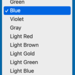
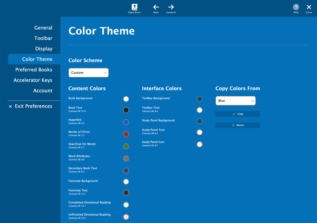
The new app will have a selection of color schemes much like the iOS version of PocketBible. We took a couple days and finalized the full set of color schemes and divided them between standard and advanced feature sets. We made the custom color scheme feature only accessible if you own an Advanced Feature Set subscription.
One of the reasons we haven’t implemented a custom color scheme option on other platforms is that there are too many variables that have to be considered and too many colors that need to be defined. For example, the shade of red you choose for “words of Christ” could be invisible against a dark background. To help both you and us to create color schemes, we added a feature that displays the WCAG contrast level for each text or icon color along with an indication of its acceptability. There are three levels of acceptance: OK, bad, and bad for small text. This doesn’t address issues related to color blindness or other vision impairment, but we figure you can handle that on your own — if you’re able to distinguish the text from the background, then it must be OK. If you are unable to distinguish text from background in one of our built-in schemes and you don’t own the AFS (and therefore can’t customize the theme), you can probably find a different color scheme that will work.
Toward the end of this reporting period, significant progress was made on supporting multiple saved layouts if you own the Advanced Feature Set. Tabs are displayed for each layout, similar to the macOS version. Tabs (layouts) can be created, renamed, deleted, and re-ordered.
Finally, with respect to creating a production build, we made quite a bit of progress. We believe we can build the app in its final format, but we’ve yet to see it packaged into an exe that can be distributed to users. But we’re much closer to doing that than we have been to date.
Little (And Not So Little) Things
- Many small tweaks were made throughout with respect to font sizes, colors, and wording of the user interface text.
- Operations on selected verses (such as “copy” and “add bookmark”) were not retrieving the selected verses correctly.
- The program was crashing while trying to update the title bar when no book was open.
- Switching from having the study pane on the left to having it on the right resulted in corruption of the user interface. Ditto switching from right to left.
- There were versification issues in bookmark lists, highlight lists, and note lists. These items could be appear to be attached to the wrong verse.
- There were problems being able to consistently open “newer” Bibles (the ones that don’t work with the current Windows versions of PocketBible). This was related to the fact that they carry information with them that makes them work on macOS, Android, and iOS. This information was not always being interpreted correctly.
- Features weren’t getting added correctly when you upgrade from the standard to advanced feature set or when your Advanced Feature Set expires.
- The screen wasn’t being updated after searches were complete. Search hits that you could see on the screen were not being highlighted, and highlighted results from the previous search remained visible.
- Interlinear rows and Strong’s numbers weren’t using the right color.
To-Do List
Since I posted this last time, here it is again…
Bugs
- Thoroughly test back/forward. May be capturing view state for history too often, like after normal scrolling.
- If book panes get too small, it’s easy to scroll well past the end and confuse the loader.
- Go To pane doesn’t appear to scroll to the correct location for devotionals. Current reading is correct but may not be scrolled into view.
- Handle versification issues when following links. Links that begin or end on verses that don’t appear in the active Bible should still get resolved.
- Font size changes may not be being recognized when switching to the bookmark list.
- Manage input focus throughout.
- Not search appears to start a search on mount(); never finishes.
Note editor/viewer
- (Low Priority) See if we can honor newlines in plaintext and retain those in the rich editor. Right now they are retained in the viewer but not the editor.
Note search
- (Low Priority) Switch to enable/disable enhanced search (even for book searches where it defaults “on”)
Search
- (Low Priority) Figure out how to move search back into its own thread; solve problem of syncing SourceManager and other functionality between threads.
User Data
- Verify we’re tracking the last-synced customer and don’t sync when it changes.
- Verify we’re always requesting data from the server when we need to and saving when we should.
- Use the logged-in customer rather than the test customer.
Advanced Feature Set
We will release the standard “free” version before finishing AFS features.
- Journal (partially implemented)
- Handle AFS state changes.
- Handle delete operation better.
- Solve duplicate Journal notes problem.
- Navigator
- Autostudy
- Listen (may not be possible due to weird Chromium “security” issues)
- Library Search
- Saved Desktops (partially implemented)
- Today button
- Preview when hovering over links
Prepare for Release
- Finish resolving issues related to doing a release build
- Search task
- Locations of pre-installed books and images
- Locations of image caches; rendering caches
- Onboarding
- Website
- Add platform landing page and catalog page for the app.
- Add catalog page for AFS subscription.
- Remove other Windows platforms (consider leaving the desktop version for Win7 die-hards).
Thank you for your hard work and for considering leaving the windows 7 desktop version.
While I am looking forward to the new release, I am hoping to use the desktop version in addition to the new version.
Currently, I use the Desktop, iPad, and iPhone versions daily (and sometimes simultaneously) but in different ways and for different tasks.
Also, I am looking forward on testing the navigation on the search results. The desktop version requires a lot of scrolling when searching the whole library.
If this post was really released the day after Christmas, I need to figure out why I just now see it! (And this new editor.) Any way, the big feature I need, I now see we won’t get initially. While that makes me sad, I am betting the stability and reliability will make me happy! I have strange issues in both current versions. I sure do not dare submit those issues. That diverts time to getting the new product ready for full release.
I appreciate the updates. Crazy stuff with the contracts, but I guess I’m not really surprised by that too much.
I look forward to a new version of PB for Windows that we can use. I’ve been using the PB for Windows Store version for some time and am pretty pleased with the beta for that overall, though sad about its lack of adoption. I hope the new Windows version will be better received.
Bring color-blind, I only use perhaps 5 colors (including black). I’ve recently updated the colors (eliminating purple for fuchsia) on all notes because the dark (night) background essentially made some colors blend into the background. I’m setting background colors in some tables (including setting the backgroun to white) so that the link color will remain visible.
Setting the background color works with tables if one edits html: I don’t think PocketBible has a control for setting background colors. Being color-blind, using background colors expands my limited set of colors (for example, red and black cannot be differentiated and yellow is difficult). I tend to use tomato, green, fuchsia, orange, and infrequently grey. I used to use purple but the white background when switched in “dark mode” makes that difficult. Blue is sometimes used but that is the same color as links.
There are two concerns that I can see:
if a new link is not valid in the current translation but is in another, I think you should be able to make the link with a warning. But if the link is completely incorrect, I like being told that it is not valid (has caught many typos). Perhaps the same warning box with an option to “use anyway” (an advanced feature?).
Any news from the Windows front?