Make Your Daily Bible Reading More Pleasant with “Autostudy Today”

I have used the devotional features of PocketBible off and on over the last 20 years in my personal Bible reading. This year I’m using our free Old Testament in a Year and New Testament in a Year reading plans simultaneously to create a custom plan that will give me readings from both the Old and New Testaments each day.

One of the challenges of this approach is that I have to open the Old Testament plan, select the link to the passage, read the passage in the Bible (which may or may not default to the version I want to read from, depending on what else I’ve been doing in PocketBible since I last did my reading), then open the New Testament plan, select the link for the day’s reading, then read the New Testament passage from my preferred Bible. That’s a lot of jumping around just to read 3-4 chapters.

I’m going to take a slightly different approach to it to make the viewing of the text more pleasant and to make it easier to simply read the OT and NT passages without any jumping back and forth between the two devotionals and my Bible. I’ll have two-click access to each day’s text in my desired Bible regardless of what Bibles are open or active in PocketBible at the time. To accomplish this, I’m taking advantage of the “Autostudy Today” feature of the Advanced Feature Set.

Autostudy Today lets you collect the Bible passages and devotional passages you want to read for the day in an HTML or PDF file that can be viewed either within PocketBible or externally. It also lets you customize the styles that are used in the Autostudy output according to your preferences. Most people don’t bother with this, but I’m not most people. 🙂

If you don’t already own the Advanced Feature Set, it can be purchased as a subscription for $9.99/year. This particular feature is only available in the iOS, Android, and Mac OS versions of PocketBible. I’ll be using the Mac OS version to read from and to demonstrate these features, but the iOS and Android versions are similar.

To make it easier to do this every day, I right-click on the toolbar, choose Customize Toolbar, then drag the Today Study button onto the toolbar. That will give me one-touch access to my reading each day.

Drag Today Study to the toolbar.

On the Autostudy Today screen I can select which books to include in the Autostudy report each day. Since the particular devotional book I’m using is just a reading plan and doesn’t itself contain any text I need to read, I’m going to un-check the Devotionals checkbox and make sure Bibles is checked.

Deselect Devotionals; select Bibles.

Then I click on Devotionals (not the checkbox, but on the word “Devotionals” so that it is selected. This causes a list of all my installed devotionals to be displayed on the right. I choose the None button under that list to deselect all the devotionals, then find my Old Testament in 1 Year and New Testament in 1 Year reading plans and select their check boxes to include them in the Autostudy output.

Since I want my Old Testament reading to come first each day, I drag the Old Testement in 1 Year plan up above the New Testament in 1 Year plan. It doesn’t matter if there are other books in between, since they won’t be included. I just want to make sure the OT comes before the NT.

Drag the Old Testament devotional to a position above the New Testament devotional.

Now I select Bibles from the list on the left, causing my list of installed Bibles to be displayed on the right. Again I choose None to deselect all Bibles, then find the Bible I want to read from and select its checkbox. I’ll be reading from the Christian Standard Bible this year, so I select that one.

Select the Bible from which you want to read and deselect all others.

At this point I can test my output by selecting View. I’ll get the scheduled readings for whatever day happened to be selected on the calendar. The output looks just as I would expect, but I’m not entirely happy with it. I’m going to make a few changes to enhance the appearance of the text.

Take a look at the output so far: Autostudy January 1, 2019

Back on the Autostudy Today screen, I have an option to edit the “style sheet” for the Autostudy report. Don’t be embarrassed if this looks intimidating. Most people don’t know anything about editing Cascading Style Sheets. At the same time,  don’t be afraid to try this at home. You can always reset it to defaults and start over if you mess something up.

The style sheet controls how every element of the Autostudy report is formatted. I want to make a number of changes to what my text looks like:

  • Change the color of the Bible reference headings above each passage, and put them on a line of their own above the text instead of inline with the text.
  • Add some additional leading between the lines of text.
  • Make adjustments to how poetry is displayed.
  • Suppress verse numbers in the Bible text.

To change the color of the Bible reference headings, I need to locate the line that looks like this:

div.bibleref {margin:0px 1em 0px 0px; padding:0; display:inline; float:left; color:#00c; font-weight:bold; font-size:100%;}

This line controls the Bible reference headings. By default, the text in a div element appears on its own line. PocketBible overrides this behavior by including display:inline in the style definition for Bible references. So I want to delete display:inline and the semicolon that follows it. I also delete float:left and the semicolon that follows that.

I’m not fond of the light shade of blue that PocketBible uses for Bible reference headings, so I change color:00c to color:008. This is a slightly darker shade of blue. I could instead change it to color:000 (or remove the color:00c attribute entirely) to make it black.

Next, I want to add some additional space between the lines (sometimes referred to as line leading). This is done by editing the entry that looks like this:

p {margin:0px 0px 0.5em 0px}

CSS style sheets use the line-height attribute to control line leading. A value of 100% is supposed to be “normal height”, and back in 2003 when I wrote my own HTML rendering engine, I made it work that way. But because the programmers who created the Web are not as smart as I, you actually need to set it to about 120% to get natural spacing for most fonts. I want a little extra space, so I’m going to set it to 150% by changing this line to read as follows:

p {margin:0px 0px 0.5em 0px; line-height:150%}

The p element is used for normal paragraphs in the Bible text. We also have poetry sections, for which PocketBible (arguably incorrectly) uses the blockquote tag to create extra margin on the left and right. There is no style specified for the blockquote tag in the default Autostudy style sheet (don’t ask me why; I don’t have an answer), so we just add the following line anywhere in the style sheet. I added it below the line for the p element, above.

blockquote {margin:0.5em 1em 1em 2em; line-height:120%}

This tightens up the line spacing a little bit in the poetry sections, and indents it a little more than normal paragraphs (about the width of one character).

Finally, we want to suppress verse numbers in the text. I happen to know that PocketBible uses the sup and small tags to superscript the verse numbers. Adding the following line to the CSS file (I added it below blockquote) causes superscripted text to be ignored:

sup {display:none}

That’s it! Once I save my changes to the CSS I’m ready to view the output.

Take a look at the final output: Autostudy January 1, 2019 – Formatted

All I need to do each day is choose the Today Study button from the toolbar, then press View to view my text for the day. I like to choose Print, then PDF, then Open in Preview to get a full-screen, PDF view of the text to read.

When I’m done reading, I mark today’s reading as complete in each of the OT and NT devotional books in PocketBible.


What Americans Believe

Every other year, Ligonier Ministries conduct The State of Theology survey. In it, they question Americans about their religious beliefs. As you might expect, the results are generally disappointing.

While it’s easy to blame one’s neighbor for believing that humans are basically good, or blame the person sitting next to you at church for believing that religious belief is not about Truth but about personal opinion, the fact of the matter is that they’re often not getting good teaching.

I’ve spent the last 30 years helping pastors, teachers, and everyday Christians have everything they need to understand and apply what they read in the Bible. Whether it was QuickVerse for MS-DOS in 1988, PalmBible for Windows CE in 1998, or PocketBible for iOS and Mac OS in 2018, the goal has always been to put the tools in peoples’ hands to help them discover what the Bible has to say and to teach others what they’ve learned.

While the general philosophy of those around us drifts farther and farther from Truth, it’s important that we stay firmly grounded and that we share that Truth with others.

Read the complete survey results here. Read about our new Pastors and Teachers Library here.

When the Bible Becomes an App

You would think by 2018 we would be well beyond 20th-century thinking about the relative merits of printed vs. digital Bibles. But apparently not. Recently, a PocketBible user sent me this link and suggested I send the author a copy of our PocketBible app.

The author (Trevin Wax, Bible and Reference Publisher at Lifeway Christian Resources) argues that the form in which we experience the Bible (print vs. digital) matters. How the words of Scripture are presented to us says something (or many things) about those words. The question Wax asks is, does a particular format (in this case, print or digital) take away from our experience of reading, comprehending, and internalizing the message of the text?

The conclusion Wax comes to is that one should continue to read and study their printed Bible because what is lost when going from print to screen is simply too great. I want to address those alleged losses from the perspective of one who doesn’t have the author’s vested interest in print publishing and who has been carrying a digital Bible in one form or another for over thirty years and has been exclusively digital for almost as long.


Wax states that a leather-bound Bible with gilded edges and single-column layout “says something about the value” of the words it contains. But remember that the words of the Bible were originally written by hand on common paper or animal skin. The words themselves carried the value, not the medium. It could thus be argued that wrapping the words of Scripture with fancy covers and printing them on expensive paper with handcrafted fonts and gilded edges takes away from the value of the words themselves and places the emphasis on the physical presentation of those words.

The very argument that “presentation matters” makes the case that the form in which the Bible is published adds to the words of Scripture. I’ve long argued that the benefit of an electronic presentation of the Bible is that it removes the text from its fancy wrapper and places it in a position of prominence. A couple years ago I acquired a KJV Bible from about 1908 that was literally falling apart in my hands. There was nothing special about this Bible except that it was the first “red letter” edition of the Bible. After a couple months of sweeping up the crumbs it left behind wherever I placed it, I sent it off to be rebound. I was stunned by the results. Even though I no longer read or study from the KJV as I once did, I wanted to carry this luscious Bible everywhere. I had developed an emotional attachment to the look and feel of this Bible that overwhelmed the fact that the archaic language of the KJV doesn’t speak to me as clearly as some of the newer translations do.

Even binding the books of the Bible together adds meaning and makes implications that some Christians have difficulty overcoming. While I believe the Scriptures were “God-breathed”, it’s a fact that the Bible wasn’t written by one person at one time. It was written by over 40 people over a period of some 4000 years. The copies of those documents that we have were transmitted and copied by hand over centuries. It has only been in very recent history that Christians have had a “Bible” that collects all these works into one convenient binding.

The implications of presenting the sixty-six books of the Bible as one continuous book can include the idea that the worldview, culture, and understanding of God experienced by a person reading an original autograph of the book of Job (considered to be the earliest-written book of the Bible) would be the same as or similar to that of one reading an original account of John’s vision on Patmos as recorded in Revelation (probably the latest-written book of the Bible). We’ve all heard Christians refer to “how they did things in Bible times” – as if the customs of antediluvian nomadic hunter-gatherers were “basically the same” as those of a freed Roman slave living in Corinth when Paul wrote his epistles to the believers in that city. It could be argued that this misunderstanding is exacerbated by our practice of collecting the biblical books of history, law, prophets, poetry, gospels, and epistles all into one book.

But even this “benefit” – that is, that printed Bibles bind the disparate books of the Bible together, presenting a message of unity of message, thought, and ultimate authorship – is not a unique property of printed Bibles. Digital Bibles “bind” the same content together in the same way; they just present it differently.

The author cites research that indicates that screens are best for “surface reading” and that books are best for “deep and meditative reading”. I’ve seen those studies. They conclude that reading comprehension is higher when reading books vs. reading text on a screen. But it isn’t clear whether the medium itself is the cause of this difference. Other studies indicated that reading paginated text results in better comprehension than reading scrolling text. For years, our PocketBible app for iPhone presented the Bible in a paginated format for exactly this reason. While many PocketBible users appreciated this format, most objected to it, as it was so different from their customary experience with interacting with text on their device. We could have continued to ignore their pleas for change – arguing that it is for their own good – but in late 2017 we relented and now present text with both scrolling and paginated interfaces.

The point is that the medium (print vs. digital) may not be the cause of the difference in reading comprehension, but rather the way that text is presented in that medium (paginated vs. scrolling). Interestingly, while it’s difficult to change the way text is presented in a printed book, it’s easy to do it with a digital book. In PocketBible, the user can simply choose to interact differently with the text to regain the benefit of pagination vs. scrolling.

Wax further states that when the Bible is presented digitally, we lose the “geography” of the text – just as we do when using GPS to navigate in an unfamiliar city as compared to using printed maps and our own innate sense of location and direction. Digital Bible readers can simply type “John 3:16” to get to that verse; they don’t have to have a concept of where the Gospel of John lies physically within the text. They may lose the idea that the book of Psalms, which, according to its order, lies right in the middle of the Old Testament, actually lies right in the middle of the entire Bible. They may not realize that the “second half” of the Bible – the New Testament – isn’t “half” the Bible at all — it’s more like one-fourth or even one-fifth of it.

But I would argue that this sense of geography is only “important” because printed Bibles are so difficult to navigate. Small books like Obadiah and Jude are invisible in printed Bibles unless you have a really good idea where to begin looking. But they are just as “big” and “visible” in an electronic Bible as Jonah and Revelation, their larger and more familiar neighbors. In other words, the idea that the geography of the Bible is important is only true if knowledge of that geography is important to accessing the text, which is the important part.

Wax goes on to make a bizarre claim – that we more easily submit to the text when we read it in print than when we read it on the screen, because we have less control over print and are forced to “become more attuned to the complexities of family life, the vicissitudes of social institutions, and the lasting truths of human nature” when reading words on a printed page. This claim is questionable if not outright false just on its face. But if “complexities, vicissitudes, and truths” are what is important, it can be argued that an electronic Bible is better able to convey them because of the depth of resources it places at one’s fingertips.

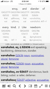
On a recent Sunday, I was listening to a sermon on 1 Peter 2:1-3. Verse 1 tells us to “put aside all slander” (NASB). Having myself been falsely accused of slander (by a sociopath as part of her request for a restraining order against me – but that’s another story), I’m very familiar with the nuances of the term. I was intrigued by the fact that other translations of the same verse used “evil speaking” instead of the very specific term “slander”. I noticed this because my digital Bible, unlike my printed Bible, allows me to simultaneously view multiple English translations, multiple Greek New Testaments, and multiple Greek dictionaries.

The word used in 1 Peter 2:1 is καταλαλιας, which literally means “to speak against”. This includes more types of speech than simply slander (making statements about a person that are provably false), including gossip (which is often true statements being told out of context). The proscription of καταλαλιας includes more than slander, a fact I may not have realized if I did not have access to Bibles other than the one most people in my church carry on Sunday.

Wax concludes with an admonition against relying solely on digital Bibles and an encouragement to depend primarily on a printed Bible so as not to lose the benefits of reading the Bible the way God intended it. I believe I’ve shown that the perceived detriments of reading a digital Bible are not negatives as much as they are simply differences between reading words from a screen vs. reading words from a page, and that in some cases, the same positive (or negative) characteristics apply to both screens and pages.


Since we’re making arguable arguments, I’ll make this one. Do a study sometime on occurrences of the phrase “the word of God” or “the word of the Lord” and similar phrases throughout the Bible. (Needless to say, this is easier with a digital Bible.) You will find that the word of God is “received”, “heard”, “given”, and “spoken” but not “written” or “read”. This is not to say that written words are not the Word of God, but rather than there is more to the “word” than its form on a page. The Word of God is the message itself, as communicated to humans by God. It is not constrained to shapes made with ink on pages made of dead trees. It is God’s Word that is “sharper than any two-edged sword”, not your leather-bound Christian Standard Bible. The pages of your printed Bible do not convict of sin or judge the thoughts or intents of your heart, but the Word of God does.

The point is that God’s Word transcends medium, language, and typographical style. The Law was no less authoritative because it was printed on stone instead of paper. Paul’s letters convict believers of sin whether they were the original autographs written on papyrus or parchment, or a modern translation printed on paper or illuminated on a screen. The Spirit of God conveys the Word of God to people through their hearts and minds. Always has. Always will.

Photo byAaron Burden

Shhh! The Blog is Sleeping

We don’t really make use of this blog anymore. There are a few articles here for historical reference but that’s about it. Comments are disabled and/or ignored.

King James Version: Red Letters and Paragraphs

Title_PageBack in October, 2014 we updated our King James Version text. We had taken some criticism for publishing a low-quality edition of the text which couldn’t seem to be traced back to any known edition of the KJV.

Red Letters

When we published that version, we intentionally left out the “words of Christ in red” feature, because the whole goal was to get to a pedigreed version of the text and red letters were not a part of the KJV text until relatively recently.

This didn’t go over well with folks who rely on red ink to know when Jesus is speaking. So we did more research to see if we could come up with an “authoritative” red-letter edition of the KJV on which to base our editorial decisions. To our surprise, we found one.

In 1899, Louis Klopsch (1852-1910), editor of The Christian Herald, was writing an editorial for his magazine when he read Luke 22:20: “This cup is the new testament in my blood, which is shed for you.” It struck him that a New Testament with Christ’s words written in “blood” would be both useful and highly symbolic. He approached his mentor, Rev. T DeWitt Talmage with the idea, and the men agreed, “It could do no harm and it most certainly could do much good.”

Klopsch Red Letter BibleRight away they discovered that the KJV contains no quotation marks to delineate those words spoken by Jesus and separate them from those of the narrator or other characters in the story. It also occurred to them that there are instances in the Old Testament where it is believed that Jesus appeared to the Old Testament saints and spoke to them. Should those words be in red? What about the words of Jesus when spoken by others in the book of Acts or the epistles?

Klopsch had to make a few choices (such as in John 3:16ff) about where Jesus’ words end and the narrator’s begin. He opted to omit Old Testament christophanies, but to include New Testament quotes in red. The first red-letter New Testament was published in 1899, and an entire Bible, containing the red-letter New Testament, was published in 1901.

Laridian was able to obtain a 1903 New Testament and a 1913 whole Bible, each with Klopsch’s original red-letter text. The New Testament claims an 1899 copyright and the whole Bible, 1901. From these well-used pages we manually marked up our electronic text to indicate the words of Christ.

Paragraphs

Soon after publishing our updated KJV last year we realized that the text we had worked from did not contain paragraph indicators of any kind. With a little effort we were able to find a source of that information that is consistent with the age and quality of the text itself, and have integrated that information into our text.

The King James Version has historically been printed with each verse starting on a new line, and a pilcrow (¶) marking the start of a new paragraph. We have followed that tradition, which means that in versions of PocketBible that allow you to display the text in paragraph form or one verse per line, you will always see the KJV text presented with each verse starting on a new line.

While some might argue that this format is jarring to the modern reader, we would point out that that KJV itself is “jarring” to the modern reader. We think there is great value in upholding the publishing traditions that add to the unique character of the King James Version of the Bible, and are very happy with the results of this effort to update our version of the text.

Most PocketBible users will see a note on the “Add/Remove Books”, “Cloud Library”, or “Download Books” screen in PocketBible to the effect that the KJV and KJV with Strong’s Numbers texts have been updated. Select the updated product to download it to PocketBible. Windows Desktop users will have to download the setup program for the KJV or KJVEC from the Downloads area of our website.

Does It Matter Where Your Bible App Comes From?

DumpsterTrevor McKendrick is an atheist who wrote one of the top-selling Bible apps for iOS. A former Mormon, McKendrick saw an unserved niche market on the App Store and created a Spanish audio Bible to fill it. Now he’s banking over $100,000 per year selling the app. He compares the Bible to Harry Potter and describes Christians as people who learn the spells in the book and try to use them to heal their children. He compares them to people who teach The Lord of the Rings as real history.

Does it make any difference whether or not the people who create the products you use for Bible study agree with the materials they publish?

When I started writing Bible software in 1988 there were very few other products on the market. I purchased the King James Bible from Public Brand Software, a distributor of freeware and shareware programs for MS-DOS. While browsing their catalog (paper catalog — this was before the Web) I saw a Bible program called WordWorker and picked up a copy of that, too.

WordWorker was pretty impressive compared to other programs available at the time. My problem with it was that the programmer who wrote it was associated with The Way International, which denies key teachings of historic Christianity and adds a few of their own. They encourage severing ties with family and friends and living with other “believers” instead, which many argue qualifies them as a “cult”.

Coincidentally I had been unsuccessfully recruited by a member of The Way while in college. Noticing a strange-looking guy observing me playing pinball at the student union, I struck up a conversation and bought him a couple games (he had never played pinball). He invited me to join his “twig fellowship”. As a brand new Christian with very little foundation in the Bible, I struggled with figuring out if this was God’s direction or not. Fortunately I dodged that bullet, and got involved with a local church that had a strong emphasis on the Bible and Bible study, which is what eventually led me into developing Bible software.

It was difficult to get excited about using WordWorker because I felt like I was supporting a cult. Even if it coincidentally met my needs, it was hard to recommend to others or even use enthusiastically because I knew where it came from. One benefit of using Bible software that comes from a person with whom you share a common faith is that you don’t have to feel guilty about supporting something with which you disagree. You and I may not agree on every fine point of doctrine, and we may not share a common worship style preference, but I bet we’re closer to agreeing with each other on the fundamentals of the faith than you would be with an atheist.

I originally wrote my Bible study software as a tool for myself to use. Its features were designed to meet my needs, which I obviously knew well. I didn’t have to do any research to figure out what people who read the Bible wanted; I wrote what I wanted.

I took my Bible program (QuickVerse) to Parsons Technology in 1988, where, over the next ten years, I employed a couple dozen different programmers. Not all of them were practicing Christians, but they were good programmers. Jeff Wheeler (who would later leave Parsons with me to start Laridian) and I led the development of the program. Both of us were Bible-believing Christians who were not just developers, but users of the program.

Having real Christians write your Bible study app guarantees that it is designed to meet the needs of someone who really studies the Bible.

Parsons Technology was not a “Christian company”. It was a plain-old software company that happened to have a Church Software Division that published church management and Bible study software. Parsons was eventually purchased by Intuit (1994), which sold us to Broderbund (1997), which was purchased by The Learning Company (1998), which was purchased by Mattel (1999), which sold the Church Software Division to a dormant company that was rumored to have previously been a booking agency for Las Vegas acts (2000). During those years we were faced with a number of demands from our pagan overlords that compromised the quality of QuickVerse. They saw “unserved niches” on store shelves and wanted us to create products that were just old versions of QuickVerse with a new cover. They weren’t interested in meeting needs, but in making money.

This was the final straw for me. When it got to where creating Bible software was about duping people into buying old versions of our program at a cheap price because BestBuy or Costco was looking for 25-cent CD-ROMs to fill an end-cap, I bailed out and started Laridian in 1998.

Our goal has always been to focus on our customers and our product, not on creating a company to sell to the highest bidder. The features and reference materials you see in PocketBible come from customer feedback (and from our own needs as our product’s first customers). We bristle at doing things like renaming our product “@Bible” so that it pops up first in alphabetic search results on the App Store, or calling our program “Bible App” to cause it to come up first when you do a generic search for a Bible app, or seeding the store with identical products, all with different names, so it appears more often in your search results. This is what marketeers do to trick people into buying shoddy products. We aim for letting the quality and usability of our apps speak for themselves.

So another benefit of having real Christians write your Bible study app is that they’re not just seeing you as a rube who will spend their hard-earned money on a quickly thrown-together, shallow product, but rather they are committed to creating not just one download but an ecosystem of products that will meet your Bible study needs not only today, but for years to come.

I don’t have a doctrinal test for people with whom I do business, but I expect my Bible study materials to come from people who are as firmly committed to the Bible as I am. It’s not that they’re the only ones who I can trust to create useful products, but it is at least more likely that they’re doing a better job.

Is Your Bible “Missing” Verses?

We occasionally receive reports from PocketBible users that a PocketBible Bible is missing a verse (or verses). These “errors” are usually discovered in a group Bible study situation. Following along as someone else reads, you realize that a verse appears to be missing in your Bible. But in this case, there is more to this than meets the eye.

What are these “missing” verses and why are they missing?

The numbering scheme for verses in the English Bible was first used in the Geneva Bible in the year 1560. This pattern was followed in subsequent English translations including the King James Version, published first in 1611. In the years since these Bibles were translated, many additional manuscripts have been found which predate those used by the translators of the Geneva and King James Bibles. Because of their age, these older manuscripts are believed by many scholars to more accurately represent the original documents. In many cases, however, they do not include all the verses that are in the more recent manuscripts.

Translations such as the New International Version, Revised Standard Version, and other newer translations take advantage of these more recently discovered manuscripts and therefore do not include all of the verses found in the older translations. Rather than reinventing a numbering scheme for the whole Bible, the translators decided to use the same verse numbers as the older Bibles but leave the missing verses blank (or move them into footnotes). The result of this is that several verses in these newer translations appear to be “missing”.

The affected verses are:

  • Matthew 17:21; 18:11; 23:14
  • Mark 7:16; 9:44,46; 11:26; 15:28
  • Luke 17:36; 23:17
  • John 5:4
  • Acts 8:37; 15:34; 24:7; 28:29
  • Romans 16:24

For the Revised Standard Version, in addition to the above list, there are other verses and points of interest:

  • Matthew 12:47; 21:44
  • Luke 22:43,44
  • The order of Exodus 22 in printed form is 1, 4, 2, 3, 5. PocketBible displays these verses in numeric order: 1, 2, 3, 4, 5.
  • James 1:7,8 was combined in verse 7 leaving 8 blank. 3 John 14 was split into 14 and 15.

Another point of view

Some are quick to jump on the idea that the newer translations are removing text from God’s Word and therefore are not to be trusted. It is important to note that it could just as correctly be argued that the older translations added text to God’s Word. Where one comes down on this argument depends on the nature of one’s own research, or on which scholars one decides to trust. We’ve determined it’s best to present a variety of options to you so that you can come to your own conclusions when choosing the Bible (or Bibles) that you find to be the most beneficial to your own spiritual growth.

If you enjoy learning about the history of the Bible, consider the PocketBible book: The Origin of the Bible by Philip Comfort.

Updated King James Version for PocketBible

Title_PageWe’ve just updated the text of the King James Version we use in PocketBible. Whether you’re a devoted reader of the KJV or only have it installed because it came bundled with your copy of PocketBible, you should welcome this move to a more pedigreed version of the text.

Laridian has long been criticized for the perceived lack of attention we’ve paid to our KJV text by those for whom the accuracy of this text is a major issue. The previous version of our text was from an unknown source and contained American spellings and modern replacements for many archaic words. In some cases, these aspects of the text went unnoticed but in others they were very apparent and called into question the quality of the rest of the text.

The most commonly cited problem was our use of the word thoroughly in 2 Timothy 3:17, where the original 1611 KJV uses the archaic word throughly. While it is the case that the word throughly is defined as “thoroughly; completely”, there are some who feel the original word conveys some additional meaning that is lost by the change to thoroughly. This, despite the fact that Vine’s Expository Dictionary says “For THROUGHLY see THOROUGHLY” and even Webster’s 1828 American Dictionary says “For this, thoroughly is now used”.  This is just one example, though arguably the most significant, of about 100 spelling changes between our previous edition of the KJV and our newest release.

A Little History

The Authorized or King James Version of the Bible was the result of a project to revise the text of the Bishops’ Bible, which was the Bible of the Church of England at the turn of the 17th century. In 1604, a committee of fifty-four men were appointed to undertake the revision. Work was delayed until 1607, by which time only forty-seven of the original appointees were available to work on the project. The instructions given to the translators were to alter the text of the Bishops’ Bible as little as possible and to use the text of Tyndale, Coverdale, Matthew, Whitchurch, or Geneva when those translations agree more closely with the original Hebrew and Greek texts. The editors worked in several teams, each tackling a portion of the books of the Bible. When the work was complete, representatives of each group oversaw a final editorial pass through the text and two men worked closely with the printer to supervise the first printing in 1611.

A number of factors made it impossible for any two early print runs of the KJV to be identical. First, the printing technology at the time required that a single page be created by laying out individual pieces of type (each representing one letter, punctuation mark, or space) to create a form. Once the entire print run for that page was completed, the type was reclaimed to create the next page. By necessity, then, the second and subsequent printings of the Bible had to be re-set from scratch using the original documents or the previous printing as a guide. While errors in the previous printings could be corrected at this time, the resetting of every page made it possibile for new errors to be introduced. In 1725, printers at Cambridge University came up with the idea of making a plaster mould of an entire form, then using this to cast a metal stereotype or cliché from which identical subsequent prints could be made. This helped reduce the errors from constant resetting of the text.

A second source of variation in the text was the lack of a standard English orthography (spelling). Most people in the 16th and 17th centuries experienced reading vicariously — the actors in Shakespeare’s plays repeated his words on stage, and the clergy read the Bible aloud to the congregation. As long as the words could be pronounced in a way the hearer could understand, the spelling of the word on the page was irrelevant. It would be another 150 years before the idea of “standard” spelling and even the concept of a dictionary of the English language would come about. In the meantime, there might be two or more different spellings of the same word within one printing of the Bible (or any book for that matter).

To complicate this further, and because correct spelling simply wasn’t an issue, typesetters would add or remove letters from words to make them fit better on a line of type. This introduced another opportunity for variation.

Even after stereotyping made it possible for one publisher to maintain consistency between printings of the same book, each publisher created their own forms and thereby introduced their own changes into the text. Publishers also felt free to add or remove footnotes, change punctuation, and revise the spelling or word usage for their particular audience.

The result of all of this is that we have literally hundreds of different versions of the King James Version text on bookshelves around the world, created over a period of more than 400 years by dozens of publishers using a variety of printing techniques. Each of these is labelled “King James Version” and none come with a list of how they differ from the printing before them, let alone the original 1611 text.

The Age of Electronic Publishing

In the late 20th century it became possible for anyone with a high-speed scanner and optical character recognition software to create an electronic copy of the King James Version text — and they did. Our previous King James Version text was the product of one such person’s efforts. We don’t know which of hundreds of available versions of the KJV text they used, but we know it had Americanized spellings (honorable for honourable, razor for rasor, counseller for counsellor, etc) and modern proper names (Jeremiah instead of Jeremy or Jeremias, Noah instead of Noe, Isaiah instead of Esaias, etc.). It also used a number of modern words in place of their archaic counterparts (the previously cited thoroughly in place of throughly, privately in place of privily, food in place of meat, two in place of twain, etc.).

Laridian’s Historic Position

Because the KJV has been around for 400 years; because it lived through every significant improvement in publishing since moveable type; and because we could find no two KJV Bibles (especially from different publishers) which agreed with each other, we took the position that there was no “best” KJV text. In every case cited by a customer, we could find an example of a KJV Bible from a major publisher that agreed with our version and another that agreed with them.

Lacking an obvious answer to the question “Which KJV is the KJV?” short of the 1611 text (which nobody reads since it uses “u” for “v”, “j” for “i”, and something like “f” for “long s”, rendering it virtually unreadable), we turned to two authoritative sources. First was Cambridge University, which is the steward of the Crown’s copyright on the King James Version in the United Kingdom. During a conversation over a meal, I asked if they had electronic files for the “official” King James Version — assuming there was such a thing, perhaps in a vault buried deep under London. Had I not been paying for their dinner, I would’ve been laughed out of the room. They repeated much of what I’ve stated above, and added the fact that every publisher over the years has made their own “corrections” and changes to the text, including Cambridge itself. They could offer me no advice other than to use one of their more recent printings (for which they had no electronic files). Since that would carry no more weight of being “the” KJV than the one we already had, that seemed like a waste of time.

I next turned to Dr. Peter Ruckman, perhaps the most well-known authority on the “KJV Only” position. Dr. Ruckman argues not only that the KJV is the only accurate English Bible in existence, but that it supersedes the original Hebrew and Greek texts in any question over interpretation of the Word of God. According to Dr. Ruckman, translations of the Bible should be made from it, not from Hebrew and Greek. I wrote Dr. Ruckman a letter asking for his recommendations for an “official” text of the King James Version that would satisfy the requirements of his most vocal followers for an accurate text. Dr. Ruckman scrawled “IDIOT” over my letter and sent it back to me, with the comment “any Gideon Bible”. I pulled my Gideon Bible off the shelf and found it to be a modern English version, not the KJV at all. Of course, I don’t believe Ruckman was making the case that the Gideons were the Keepers of the Authoritative King James Version Bible Text, but rather that I could literally grab any KJV Bible off the shelf, even the free Gideon Bible I found in a hotel, and use it in our software.

When the appeal to authority failed, we simply settled into distributing the KJV that we had and left it at that.

The Pure/Standard Cambridge Edition

Once or twice a year we are contacted by PocketBible users who have a serious problem with our KJV (usually citing the use of thoroughly in 2 Tim 3:17) and encouraging us to publish “the” KJV (and threatening us if we don’t). None of these users have ever been able to point to a definitive, authoritative source for this text, but recently we were directed to two sources: The Pure Cambridge Edition (PCE) at www.bibleprotector.com and Brandon Staggs’ Common Cambridge Edition at av1611.com. Both of these sites claim to have done extensive research to produce an electronic edition of the text that matches that in use by Cambridge University Press around 1900-1910, down to the last punctuation mark, capital letter, and use of italics.

We downloaded these texts and compared them to each other. They differ in about a dozen places, none of which are anywhere near as significant as the use of thoroughly for throughly in 2 Tim 3:17. After looking at some other similar sources, we settled on a version of the text that draws mostly from the Pure Cambridge Edition except in a couple places where we felt the Common Cambridge Edition was better. (In particular, we hyphenate Elelohe-Israel and Meribah-Kadesh instead of creating the “camel-case” spellings EleloheIsrael and MeribahKadesh used in the PCE, and we chose to leave out the footers THE END OF THE PROPHETS after Malachi 4:6 and THE END after Revelation 22:21.)

It was fairly trivial to convert this text to PocketBible format. The hard part was merging Strong’s numbers into it, but we’ve done that to create an updated version of our King James Version With Strong’s Numbers product as well. This has the additional benefit of bringing these two texts into agreement with each other, as even our own KJV and KJV/Strong’s texts had disagreed in a number of places.

Lessons Learned

We’ve gained a new appreciation not just for the King James Version in this process, but also for the history of the English language and printing technology. The myriad variations on the KJV text had led us to “give up” and settle for what was easy. However, this project created the desire to produce something of historical validity and significance, even if it can’t be said to be “the” KJV.

While we don’t agree with those who argue that the KJV is the only English Bible we should be reading, we do agree that it has historical significance and that we should provide a version of it that meets with the approval of those who put it on a taller pedestal than we do. We believe this edition of the KJV for PocketBible meets that standard.

We’re considering publishing some earlier editions of the KJV just for their historical value. While we don’t find reading the 1611 text to be particularly edifying, we do find it interesting. For example:

“And as Moses lifted vp the serpent in the wildernesse : euen so must the Sonne of man be lifted vp : That whosoeuer beleeueth in him, should not perish, but haue eternall life. For God so loued yͤ world, that he gaue his only begotten Sonne : that whosoeuer beleeueth in him, should not perish, but haue euerlasting life.”

I’m particularly intrigued by the shorthand rendition of the word “the” in “God so loued yͤ world”. This comes from the Early Middle English spelling of “the”, which was Ăľe (the archaic letter thorn followed by e). When printed in the common black letter or gothic font, thorn looked very similar to y, and printers (especially in France where thorn did not exist in their alphabet) would substitute the letter y. When needed to make the words better fit on a line, the e would be placed above the y as you see here. (Another example is the word thou which was often shortened to yͧ.) It’s easy to imagine how yͤ became “ye” in “Ye Olde Book Shoppe”, and why “Ye” in this context should be pronounced with a “th” sound like “the”.

Anyway, I digress….

You can simply download the KJV from within PocketBible if you’re running PocketBible on a platform that supports that feature, or, if you have PocketBible for Windows Desktop, go to your download account at our site to download a new installation program for the KJV or KJVEC (KJV with Strong’s Numbers).

The Trail of Blood: Following the Christians Down Through the Centuries

Back when I was at Parsons Technology in the late 80’s and 90’s I was attending a Baptist church. Somewhere along the way I picked up a copy of this little booklet — probably at a Jack Hyles or Curtis Hudson revival meeting. The Trail of Blood is a history of the church starting with the church in Jerusalem through the present day (well, through the early 1930’s, which is when it was written). What’s interesting about it is that it lays out ten or twelve distinctive doctrines that the author identifies as characteristic of Bible-believing Christianity and follows those doctrines — not the dominant churches of the day.

Whether you attend a Baptist church, consider yourself basically “baptistic” in doctrine, or are just interested in church history, this is an interesting book. I happened to think of it the other day, contacted the copyright owner, and discovered that it has recently passed into the public domain. So I quickly tagged it for PocketBible.

The Trail of Blood suggests that it was the Catholic church that split from the “true church” and points out that Protestant churches didn’t so much rise out of traditional Christian doctrine but rather Catholic doctrine, and that Catholics and Protestants together persecuted those who held to the doctrines that the author believes Paul and the early church would be most comfortable with.

Admittedly, this is a controversial title. (That’s why we didn’t make it free — so it wouldn’t show up automatically in everyone’s download account.) Obviously by suggesting that Catholics and Protestants are branches of the same, doctrinally flawed stock, he will offend most of Christendom. And contemporary scholars with access to more recent archaeological discoveries and historical documents would challenge his characterizations of some early groups of Christians. But the concept is an interesting one to consider and certainly worth dropping a dollar on to learn more. The historical chart it includes, showing the “trail of blood” through the centuries, is worth at least that much.

If it bothers you, skip it. But I think many of you would find it fascinating. In my case, while I no longer fellowship with a Baptist church, it was very formative of my understanding of the transmission of truth through the centuries.

Serendipitous Programming

Today I’ve been working on a new feature for PocketBible for iOS and one thing led to another, and, well, I ended up implementing a feature I didn’t know I was working on, and didn’t realize how much of it was already sitting there, waiting to be exposed to the user.

So the new feature I thought I was working on is the ability to “rename” your highlight colors. That is, you’ll be able to assign a topic to each color. Then when you highlight a verse, instead of seeing a list containing “Khaki”, “Cornflower Blue” and “Hot Pink”, you’ll see “Salvation”, “God’s Love” and “Prophecy”. We’ve been wanting to implement this for a long time. While we were upgrading our cloud synchronization protocol over the last few months, I added the ability to sync highlight color names with the server and we took advantage of that in PocketBible for Windows Phone and Windows Store. The plan has always been to roll that into other platforms as we have the opportunity.

While looking through the code that shows you your list of highlight colors (which I’ll have to modify to show you your user-defined names for those colors) I stumbled into a bit of code that Jeff wrote years ago but then “commented out”. (If we have code that we’d like to retain for reference purposes but don’t want to actually have the computer execute, we turn the code into a “comment” so it will be ignored by the compiler but still be there if we want to see it.)

Those of you who have been with us for a while know that Jeff was my programming partner for 27 years before his death from cancer in May 2012. It’s been a bittersweet year as I’ve had to deal with his passing while surrounded and immersed every day in code that he wrote. I keep running into little things that remind me of him, make me want to give him a call to talk about a problem, or give me a chuckle. So it’s always interesting when I run into a piece of code like this.

What this particular piece of code did was add three additional highlighting styles to the list of colors you can highlight with. These are “underline”, “strikeout”, and “underline+strikeout”. Those look like this, this, and this, respectively.

Now, why would you ever want to strike out a verse? That’s a good question and takes me back fifteen years to the days of the Palm operating system when cameras were cameras, phones were phones, and “portable digital assistants” were all the rage. In those days, color displays were luxuries that cost money, size, weight, and battery life. So most of those devices had monochromatic screens.

On color screens, we could highlight a verse with a background color. But what could we do on these black and white screens? Since our text was coded in HTML, and since HTML offered simple styles like bold, italics, underline, and strikeout, we decided to use those. We ended up not using bold and italics because they could cause the text to re-wrap when they were applied, and in those days of wimpy processors, it just took too long and was disturbing to see. That left us with underline and strikeout, so that’s what we used.

As time has gone on, we’ve gotten to where we don’t even include these underline and strikeout highlighting styles in our programs. They’re not in PocketBible for iOS, and we weren’t planning on implementing them in PocketBible for Android. Unfortunately, some of you who were around back then and have sync’ed your highlights from your Palm PDA to PocketBible for Windows to our server and to PocketBible for iPhone expect to see those underlines. So we have to at least be able to display them if they exist, but we don’t let you create them (because we don’t want to proliferate a bad idea).

What I discovered today was Jeff’s original code for being able to create underline, strikeout, and underline+strikeout highlights in PocketBible for iOS. His comment said he had taken them out because the display engine (my code) didn’t support them. Sometime between then and now I implemented those highlight styles but we just never went back into Jeff’s code and turned those choices on.

On a whim, I enabled those lines of code and what do you know — they worked! That put me in the awkward position of trying to decide whether or not to leave them in. I never liked the idea of striking verses from the Bible, and even once you get over that, it makes the text hard to read.

About then it was time for dinner and I set the laptop aside to meet my wife and get something to eat. On the way there it occurred to me that we now have some better styling options that we had back in 1998. New versions of HTML with CSS support dotted and dashed underlines.

When I got home I spent about 30 minutes and implemented the styles you see here. These new styles replace the old styles rather than adding to them. So where you had strikeouts, you’ll have dotted underlines. And where you had strikeout+underline, you’ll have dashed underlines. I think this is a nice way of making your legacy data from your Palm days more usable and it gives you three more highlighting styles to use in PocketBible for iOS. (If you’re having trouble making out the dots and dashes, click on the screen shot to see the original size image.)

One of the cool things about this is that the underlying data storage and cloud synchronization already supports it. We’re not changing the data we save, but rather the interpretation of the data. So nothing changes in any of the other platforms nor on the server.

What I think is special about this — even though it’s not a life-changing feature — is that Jeff left it behind and it only took a little extra work to make it useful. And I like that all the infrastructure both for storing the new highlight styles and displaying them was already there.

Tomorrow I’ll get back to work on naming your highlight colors. But this was a nice little one or two hour detour to give us an unexpected new feature in PocketBible.