I’ve heard from a couple of you asking for an update. That usually means I haven’t taken the time to look up from my work and look at a calendar for a while.
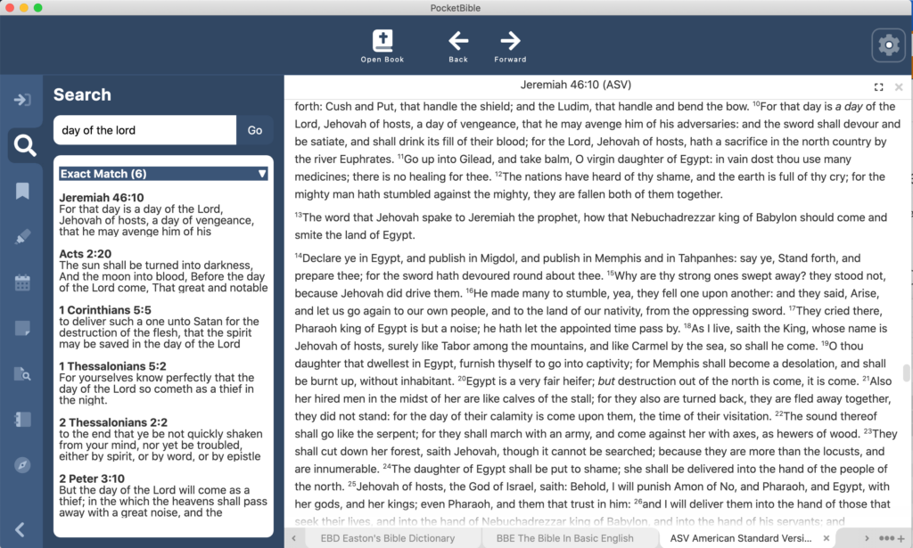
Since the last update, PocketBible can perform searches and show results. If you use any of the non-Windows versions of PocketBible, you know that it performs about a dozen different searches in parallel to accomplish one search. So you’ll see results that match exactly; results that have all the words you’re looking for, but in a different order; words that sound the same; words that have the same root word; etc. I mentioned before that it is a challenge to launch these searches in parallel in the new Windows version, but we’ve figured out a way to do that and we think it’s going to work reasonably well. Right now, we’re testing these one at a time to make it easier.
The video below demonstrates searching as compared to the current Mac version (on the left). The videos are synchronized so that the searches start at the same time on each platform so you can compare the times. As you can see, the time it takes to return exact matches is pretty close to the same in both apps. This is pretty impressive given that the Mac version is a native, compiled app and the Windows version is something less than native and something more than interpreted. If that makes no sense to you, suffice to say that we’re seeing good results when it comes to search speed.
Note that in one of the searches, the Mac version returns some results right away because they’re easy to calculate, but takes about the same amount of time to display “exact matches” as the Windows version does.
Last time I mentioned that while we were displaying lists of bookmarks and highlights, those lists were not yet fully optimized. Trying to display a list of 30,000 verses would bring the program to its knees (not to mention what it would do to a user or to Allen in Tech Support). We spent quite a bit of time since the last progress update downloading the source code for the third-party component we’re using and modifying it to do what we need it to do in order to display lists of things (search results, notes, highlights, and bookmarks, primarily). In the demo above you’ll see that we’re able to quickly display a list of over 20,000 search results. That was the goal.
We subsequently have had to do similar customizations with context menus (the little pop-up menu you get when you right-click). Our development tools have a very basic one built-in, but it doesn’t allow for sub-menus. The third-party one we found has sub-menus but they don’t have the same functionality as the main context menu. And it doesn’t handle the correct placement of sub-menus on the screen — they will happily display themselves off the right edge of your screen. So again, we’ve had to download the source code for this component, learn completely how it works, then modify it for our usage.
One of the interesting things to me as a programmer is having the opportunity to go through this body of code that I’ve lived with for 23 years now and translate it line-by-line into another programming language. In the course of doing that, you learn a lot of things. For example, there are at least 4 different reasons you need to extract Bible text from the compressed LBK file: displaying it on the screen (of course), copying a passage to the clipboard, extracting text during an Autostudy, and displaying a little excerpt in search results.
While working on search results I discovered these 4 scenarios make use of 3 entirely separate paths through the code to do a very similar thing: (1) One path is used for displaying text on the screen. (2) The second is used for either copying a passage or doing an Autostudy. (3) The third is used to display excerpts in search results. It turns out that the last two methods (2 and 3) were completely duplicating the code that gets text to be displayed on the screen (1), then filtering out what wasn’t needed before using it.
As a result, part of what I’ve been working on is eliminating this duplication of code. Now there’s just one way to get text out of the LBK file. Anyone who wants to use it for something other than displaying it on the screen will filter out the tags and features they don’t need. It sounds complicated but it’s much simpler and significantly reduced the amount of code that needed to be translated and tested.
We’re still aiming for being done by the end of the year. One thing working in our favor is it looks like PocketBible for iOS is going to require very little, if any, updating for iOS 15. That normally consumes all my time in August and September.
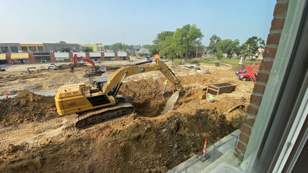
Last time I told you about our new office space. After moving in, we realized we hadn’t thought about the fact that the city was about to start a major street construction project that has our main street and several side-streets completely torn up. The construction area is 3 blocks long and our office sits right in the center.
At the same time, the strip mall across the street is being demolished to make way for a combined retail/residential building complex. The view out our office windows has been fascinating as dozens of excavators, dump trucks. bobcats, drills, cement mixers, and more work right below us.
We still have access to the building from the back, but the activity right outside the window is a little distracting. And this will be going on for the next 2 years. So that should be fun. 🙂


Craig… I just posted a reply on the May update wondering when we would see a new update… then poof! Your update today appears. You are getting so good you reading your users minds 😉
Things are really looking good. It’s amazing work building from the ground up on a new foundation. I’m excited to see the early tests. There are so many cool, helpful things that happen in Android, for instance, that I’m eager to see implemented in Windows. This looks like a good foundation for building Windows versions in the future! I’m praying for much wisdom and success as you continue building the PocketBible for Windows!
Anyone notice that Craig did a little something that normally doesn’t happen?
Hi Craig. Thanks for the update.
Has the advent of Windows 11 hindered or helped development?
Do you have a rough guess when it will be out for Beta testing?
If it’s out by the end of the year it will make a great Christmas present 🙂
BTW just started with the Holmans Commentary beginning with Romans. Really enjoying it.
Can’t wait. But will.
Hi Craig,
Thanks for all you’re doing on the new version of PB for Windows. Looks great.
Would it be possible to have an option in settings to have the Back/Forward buttons be located at the bottom of the screen?
These buttons are one of the most used buttons for me as I move in and out of study resources. And to have to place my hand over the screen I’m reading from, to reach these buttons, wouldn’t be as comfortable an experience. And for a Windows touch screen, which can be large, it’s a drag reaching to the top of the screen for really commonly used functions. The bottom of the screen is where I easily and readily reach to, in current windows apps. Some do force you to use the top a lot, but it’s never as nice IMHO.
Here’s a couple of other questions of interest to me…
1. Will there be a ready progression bar along the bottom of the screen? And can that be set to work off the number of unread days in that devotion?
2. Can we please have a way to custom arrange the book resources in the dropdown tab for various resource types? So I can arrange all the bible versions (or commentaries) I use most often at the top etc. This one would be brilliant. I’ve asked before, but not sure if it made the short-list for the new PB for Windows?
Thanks again for Pocket Bible. I’ve never used anything else since I started with PDA’s. Palm OS with MyBible. Love it. You’re a legend.
Thanks for the update – How about putting the Synchronize button visible on a button bar or where common buttons will appear. I hate having to navigate through layers to execute a sync.
73rds
I’ll admit I’m curious about how navigation will work. I use PB most on my Surface and have the windows store beta there working relatively well. One issue I have is trying to flip around to different books and seeing where each one is in the grid of book names and how it all flows depending on the window size at the time. (Not a big issue, but the switch to “where is it” slows me down in classes a little.)
I’m really looking forward to the updated release with better support and a better codebase. Hopefully that translates well across the board so everything can work more easily together.
Craig, the demo is looking really good! I know it is hard to switch focus, so thank you for the update.
I wonder if providing additional settings for what searches to perform would enable the search to work faster, or do less work. I often search for a phrase, and I don’t want verses with the same words in a different order or words with the same root. Those features are helpful in some searches but, for me at least, not most searches. Perhaps adding options for which kinds of searches are desired will save the program from performing unneeded searches, resulting in faster response time while using fewer resources.
I appreciate the care and attention you and the team are devoting to this project. Quality can’t be rushed.
Hi Laridian friends…. thank you for faithfully working away on many things…. any chance we could get an update on the new Windows version? Do you think this will be something deliverable in 2022? Thanks!