This isn’t an update on the new Windows project but rather we’re just moving the project FAQ here instead of having it be invisible as a dedicated page on our website. As we make updates to this FAQ we’ll bump its publication date so it ranks higher in the list of articles on our blog.
I haven’t seen an update for a while… Are you still working on this project?
Yes.
Don’t hesitate to post a question to tech support or in the comments below if you’re concerned about our progress or whether or not your favorite feature is going to be included. We’ve been trying to be very transparent about this project (even though you may not see updates here every day or every week) because you all contributed to it and thus made it possible.
Can I help with testing?
We’ll announce a call for testers once we get to the point where we can use them. Those who supported the project during the fund-raising period will be the first to know.
Will I need to have Internet access while using PocketBible to be able to use my Bibles and reference books?
No. And we apologize on behalf of our friends at other popular Bible software companies who have designed their apps to require full-time Internet access. “Forgive them, for they know not what they do.”
Obviously, you need access to the Internet to initially download the PocketBible app and an of your Bibles and reference books you want on your device. Once you have done that, you don’t need Internet access to use the program. The exception is when you’ve chosen to sync your notes, highlights, and bookmarks to our server for synchronization to other devices you own. Obviously you need Internet access for that. But even then, if the program discovers you’re disconnected it will just wait and sync once you reconnect.
Is PocketBible for Windows going to be a subscription service?
No. As it is on all platforms (Android, iOS, macOS, and Windows), the new PocketBible for Windows will be free.
We will offer an Advanced Feature Set (AFS) containing additional features such as Autostudy. The Advanced Feature Set is a subscription service. It gives us a way to generate revenue from our apps. Despite the fact that developing our apps is our single greatest expense, realities of the marketplace make it impossible to charge anything for software these days. The AFS gives us a way to do that without resorting to more intrusive monetization schemes, like putting ads in the program.
The current version of PocketBible for Windows Store shifts a couple very important and very basic features into its AFS: The ability to install more than 20 books, and the ability to sync notes/highlights/bookmarks with our server. These will be part of the free features in the new version, and the features of the AFS will match those of PocketBible running on other platforms.
Will my current Windows Store Advanced Feature Set subscription apply to the new version?
Your current PocketBible for Windows Store Advanced Feature Set Subscription will apply to the new version. However, if you own the Permanent Subscription to the Legacy Advanced Feature Set, which you purchased before the AFS became a subscription, you will only be entitled to the features of the new version that are in your current Advanced Feature Set. Some of those features will be moved into the standard features in the new version. Here’s a break-down:
Current Legacy Advanced Feature Set features that will become standard features:
Install more than 20 books at a time on your device
Split the screen up to five times to view multiple books at once
Quick access to recent verses
Add your own notes to any verse
Highlight verses in a variety of colors
Synchronize bookmarks, notes and highlights to the Laridian Server and between your other devices
Undecided:
Quickly download all the books you own
These will remain AFS features:
Save and re-use multiple layouts, enabling you to save the layout (panes and books) exactly as it was and come back to it
Listen to Bibles and books
If you own what we call the Permanent Subscription to the Legacy Advanced Feature Set, your existing AFS will only give you access to those features listed under “These will remain AFS features”. Most of the other features that are currently in the subscription will become standard features. Within the new program, we will refer to this as the Advanced Feature Set for PocketBible 2.x for Windows. The new version will be referred to as version 3.
Again, if you have an active Advanced Feature Set Subscription, it will be honored on the new version.
When you say you’ll “start with the Windows desktop version” does that mean you’re going to make it difficult to use on tablets?
We’re not starting with the user interface elements of the Windows desktop version, but rather we’re starting with the internals of that version of the program — the stuff you don’t see that makes PocketBible do things like search, store notes, sync with our server, read our LBK files, etc. The user interface for the new version will borrow from concepts in the macOS and iOS versions to be more usable on both the desktop and mobile devices.
There is no code from the current Windows Store version in this new version, nor is any code in the new version based on code in the current Windows Store version. We think of this as an upgrade to the older Windows Desktop version that takes the latest version of the code for that program and adds to it a new user interface inspired by our more recent editions of PocketBible.
Let’s just dive into what’s been done since I last posted an update….
Modal Dialog Component
With this new-to-us technology stack, we continuously discover that a lot of what we expect to be already done for us has to be created ex nihilo. For example, while there is a “context menu” component available to us in Electron, it isn’t very sophisticated and can only handle the simplest tasks. So we had to create context menu functionality for ourselves.
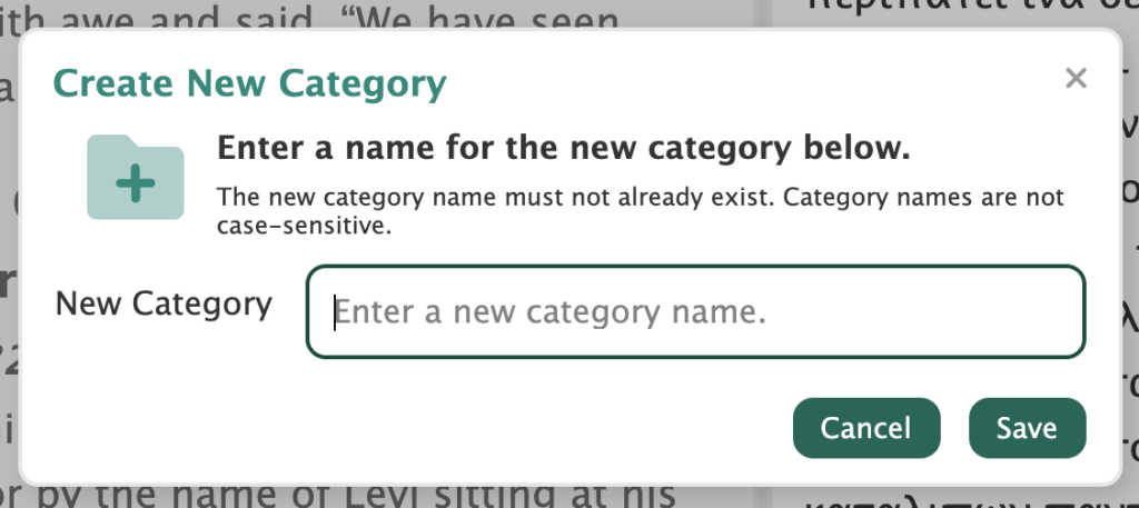
Similarly, there’s a generic “message box” dialog to use for error messages and to ask simple yes/no questions, but we found ourselves frequently needing to get input from the user, such as entering the name of a new bookmark category or choosing whether or not to clear daily reading progress when changing the start date of a devotional book. The built-in message box can’t do that.
We ended up creating a generic modal dialog that could be used to display error messages, ask simple questions, or gather (and validate) input. This is a little harder than you might think, but taking the time to do it allows us to standardize the way input is gathered in the app and gives us control over the appearance of the dialog so it can match the rest of the app. It also makes it very quick and easy to create a fairly complicated data collection dialog when we need it.
This generic dialog can be used for simple messages with OK/Cancel or complex data entry forms.
Once we had that component, we went back and made use of it in several dozen places. Some were easy and some required a little more work. But we’re happy with the results. This is the kind of task that takes a long time in the moment but makes future enhancements to the code significantly easier and faster. And it gives the user a much-better experience.
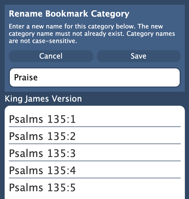
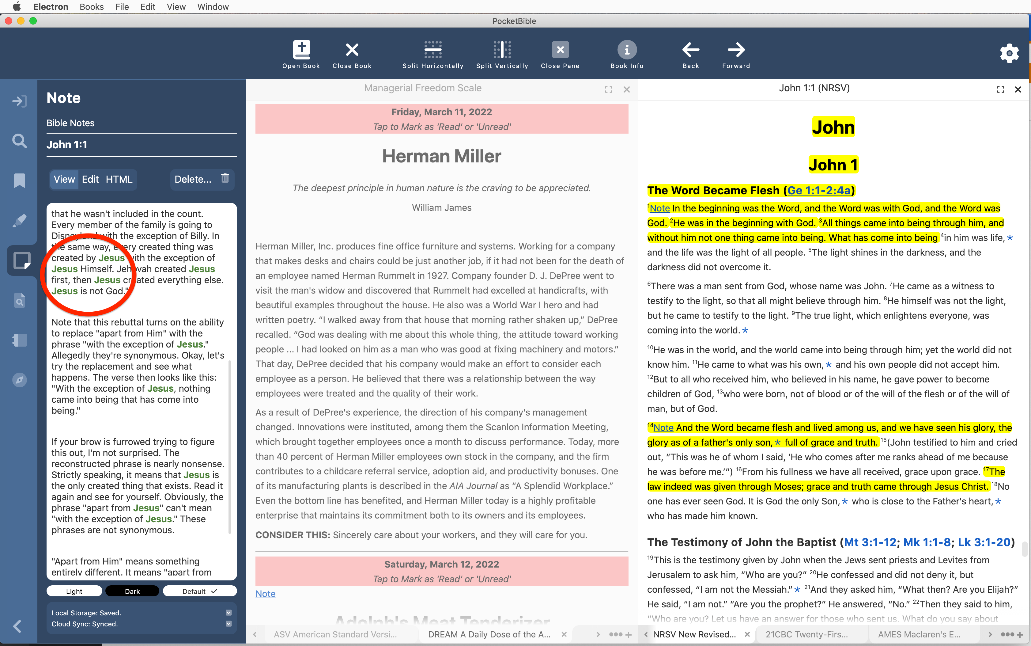
Bookmarks, Highlights, and other Study Panel Features
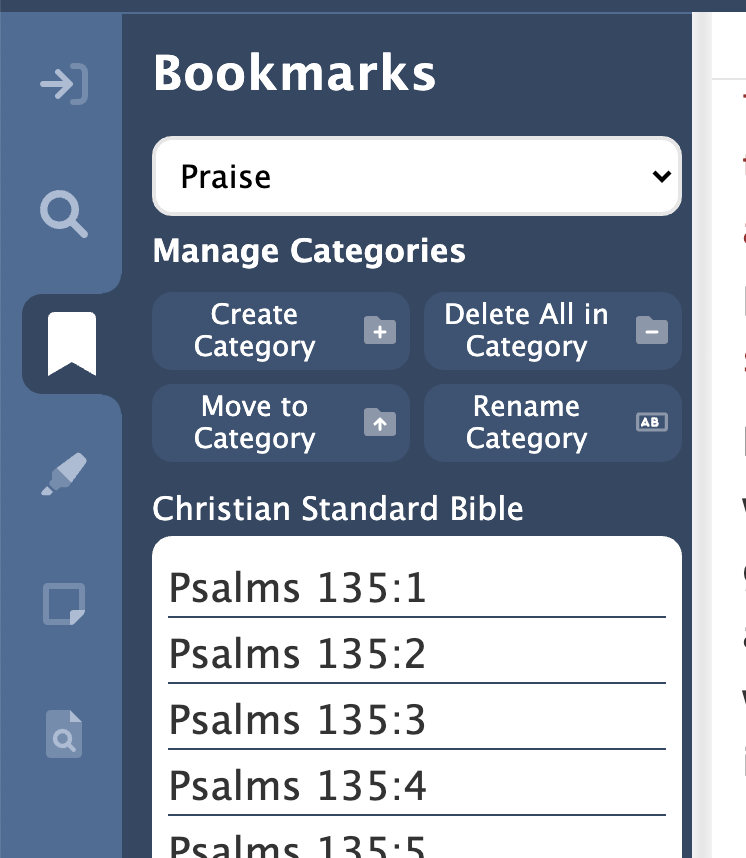
Since the last update we rounded out the features of bookmarks in the app by giving you the ability to create new categories and move the bookmarks from one category into another. We added a (somewhat dangerous) feature that allows you to delete all your bookmarks in one operation. We used our new modal dialog component (described above) to ask you 2 or 3 times if you’re sure you want to permanently delete all your carefully created bookmarks.
Reorganized the bookmarks pane and re-implemented the category management functions using the new modal dialog component.
We added the ability to change all the highlights in one color to another color. We changed some existing features to use our new modal dialog, and, like we did in the Bookmarks pane, made sure we were using the user’s global font size preference in the Highlights pane.
With our new modal dialog in-hand, we changed the implementation of some existing features to use it. And we made sure the Study Panel panes were using the global font size we’ve talked about in previous updates.
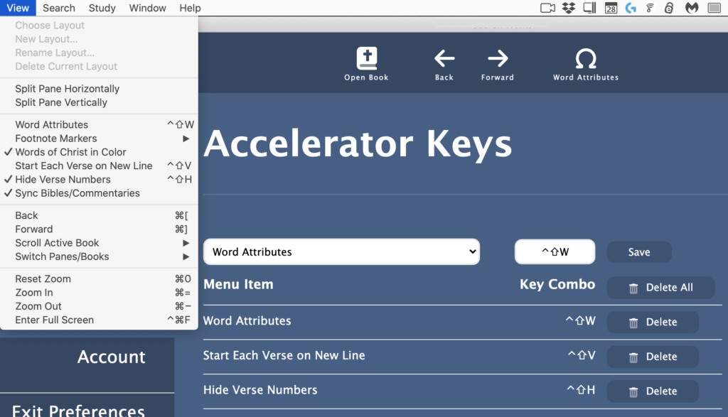
Accelerator Keys
“Accelerator keys” are the keystrokes displayed next to the application menu items that can be used as shortcuts to that menu item. Many of these you do without thinking about it, like Ctrl+C (Cmd+C on a Mac) to copy and Ctrl+V (Cmd+V) to paste. Others you discover when you realize you’ve been selecting an item from a menu over and over and wish there was an easier way.
Since the last update, we’ve implemented the ability to assign virtually any combination of modifier keys (such as Control and Alt) and a letter or number key to any operation in the program. So if you find it easier to remember Ctrl+S for “search” instead of Ctrl+F for “find”, just reassign Ctrl+S to the “Find” operation in the menu. If you find yourself repeatedly turning verse numbers on and off and get tired of selecting “Hide Verse Numbers” from the “View” menu, just assign Ctrl+Shift+H to that item. Now one key will toggle your verse numbers on and off.
New Accelerator Keys preference page lets you select different keyboard shortcuts for menu items, or assign shortcut keys for menu items that don’t have them.
Part of implementing this feature was making sure that everything you might want to do in PocketBible is present in the menus somewhere so that it can be assigned to a key. We discovered, for example, that we hadn’t yet implemented “Next/Previous Pane” and “Next/Previous Book in Pane”, so we added those to the “View” menu and implemented them in the code.
Not every key can be reassigned. Some are just too well-integrated into the way some of the built-in functionality of the code works to be changed. We manage that for you and warn you if you’re trying to do something that isn’t going to work.
Layouts
We’ve been enduring problems with splitting and resizing panes since the beginning of the project. During this period we attacked these problems.
Let me digress briefly to talk about how programming has changed since I started doing this 40 years ago. Back then we wrote our own code. When we had to, we would purchase a “library” that implemented something hard, like managing a database. These libraries were written by knowledgeable, professional programmers, thoroughly tested, and only updated when necessary to add major new features.
Today, the Internet makes it possible both to distribute and to discover little components that supposedly make programming easier. Yes, there are major components like database managers, but there are also tedious little components that do nothing more than remove leading or trailing spaces from strings. It can be easier to import someone else’s code than write it yourself.
You don’t know the pedigree of the people who write these components. Often they write some complex thing (like the virtual list and context menu components we use in PocketBible) then just vanish into obscurity, leaving you to maintain their code and fix the bugs they left in it (like the virtual list and context menu components we use in PocketBible).
The component we chose very early in the project to manage the splitting and resizing of book panes has been both a blessing and a curse. It definitely saved us some time. At least up until earlier this month.
Example: One of the things it does is notify the app that the user has dragged a splitter between two panes and changed their relative sizes. The sizes are expressed in percentages. So the original size might have been 50/50 and now the new sizes are 30/70. That’s great. PocketBible records the new sizes so that it can restore them the next time you run the app. So far so good.
The problem is that it uses the same notification message to tell you that it has internally changed the size of a pane part-way through an operation. So if you have two panes split 50/50 next to each other, and the left pane is split 30/70 vertically (one above the other), and you close the top left pane, it will notify you that you now have a left pane of size 70 and a right pane of size 50. It doesn’t tell you that the left pane is 70% high and that the right pane is 50% wide. Nor does it tell you that in just a few milliseconds it’s going to reorient and resize the panes, and further, that it’s going to do that incorrectly, leaving your left pane occupying 58.33333% and right pane 41.66667% of the screen where they used to be 50/50 before. (Exercise for the reader: Why those weird sizes?)
One of my tasks recently has been to attack this issue and try to resolve it. I believe it’s mostly conforming to my wishes but it took some doing.
Splitters between panes can be dragged to resize the pane and now have a subtle “handle” to suggest they can be moved.
While messing with the screen layout, I made the splitters between the panes a little thicker to make them easier to find with your mouse (or your finger tip if you’re using a touch screen). I gave them little visual “handles” to make it more obvious that they can be dragged to adjust their size.
Book Panes
Speaking of the screen layout, other changes were made to the book panes.
We discovered that closed panes were still “alive” in some respects and were frantically trying to do things in the background as if they were open. This had no visible impact on the app but made it run terribly slow after a while.
We completely re-implemented the book tabs at the bottom of each book pane. They were trying too hard to look all fancy and clever and as a result they didn’t always work correctly. While we were in there we made sure the tabs adjust their size to your chosen font size so you don’t end up with nice, readable Bible text and tiny, unreadable tabs.
When the text is small (top), the tabs are proportionally smaller. When text is large (bottom), tabs are larger.
The pop-out tooltip that tells you where you are as you drag the scroll bar scroller was getting stuck in the “on” condition. That’s been fixed.
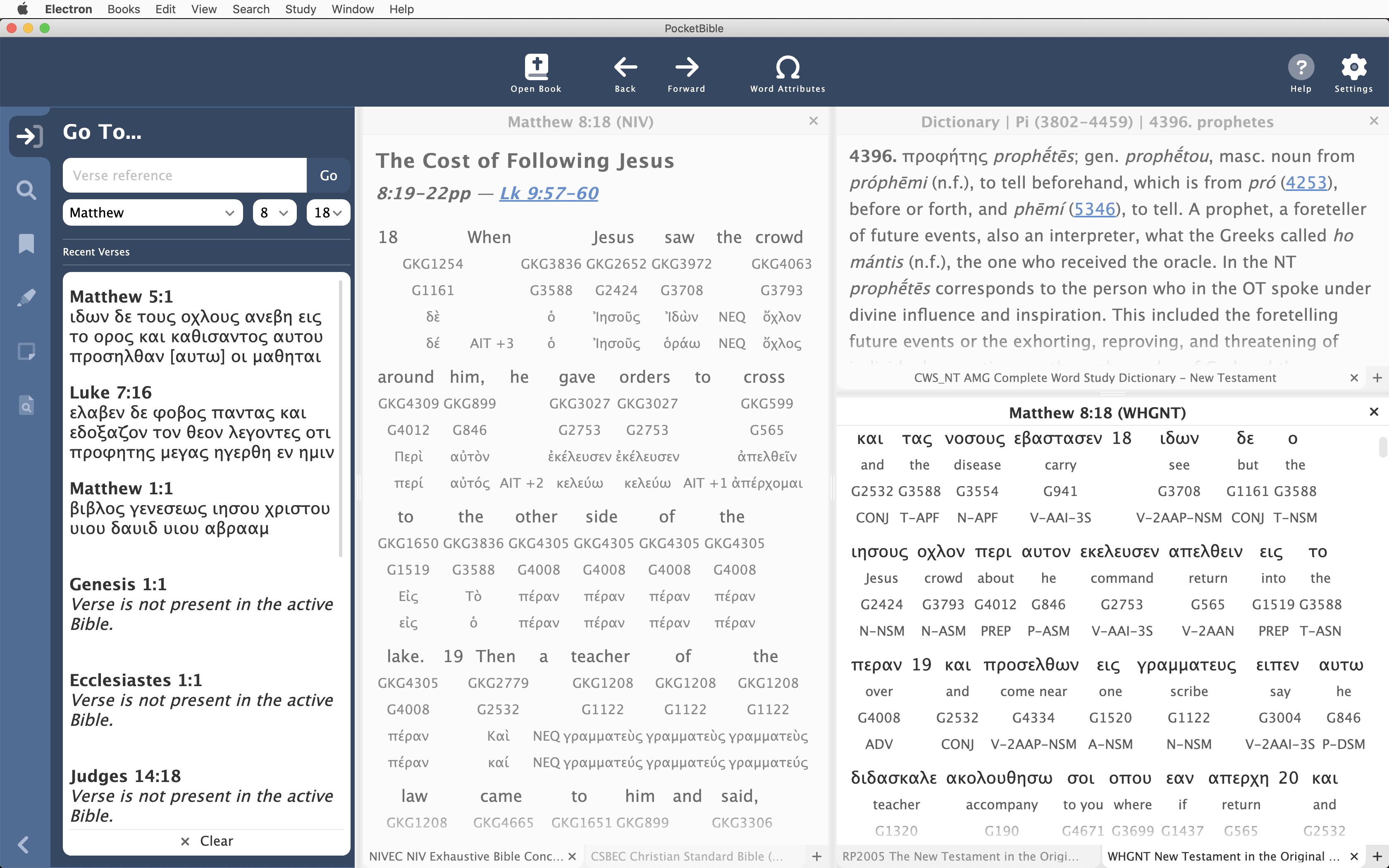
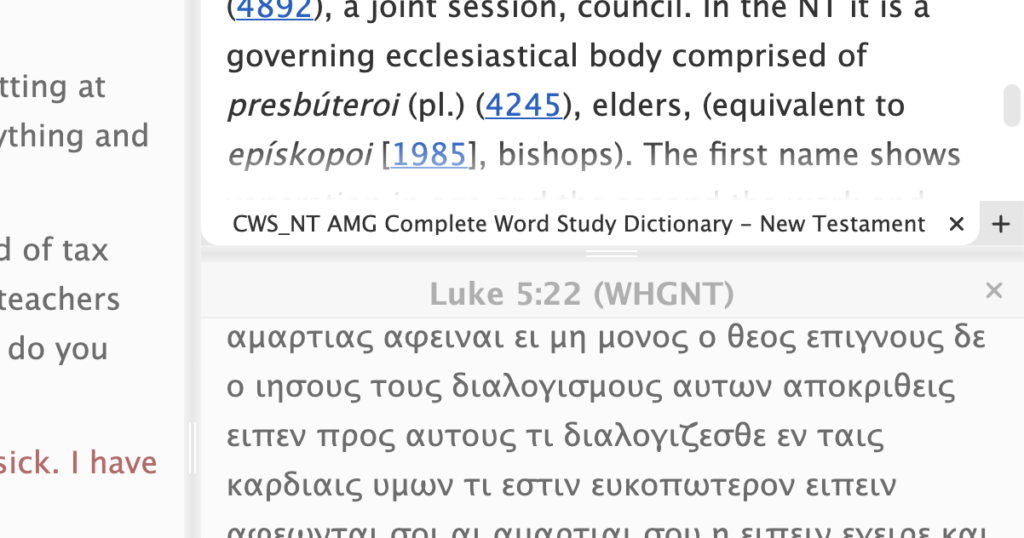
We’ve been ignoring problems with interlinear books like our Greek NT’s and the NIV with Goodrick-Kohlenberger Numbers. Some of the interlinear attributes weren’t being displayed. Now they are.
Interlinear books weren’t working until recently. This is the NIV with Goodrick-Kohlenberger numbers, Strong’s numbers, inflected forms, and lemmas displayed between the lines.
Text Selection
First, the “easy” part: We now automatically calculate a good color to use for text selection (when you drag your mouse to select text). If you think about it, this isn’t straightforward. It needs to be visible against both the background and the text color. Both of those are user-configurable and can be anything. So you can’t just choose a pleasant shade of blue and call it good. The program now finds a color using an appropriate hue from your chosen color scheme that will work for text selection.
The selection color starts with the dominant hue in the color scheme. In this case, this dark color scheme uses a shade of purple for toolbars and buttons, so text selection is indicated by a lighter tint of the same hue that contrasts both with the text color and with the background. This is one of those things that is way more complicated than the average user might think.
The real challenge was handling “select all” in a book pane. It’s simply not realistic to support the ability to hit Ctrl+A (Command+A on a Mac) then Ctrl+C (Command+C) and expect to copy an entire 400 MB commentary to the clipboard (in both plain-text and rich-text HTML). The copyright owners from whom we license texts wouldn’t like it, and it would present some real programming challenges.
On top of this, there’s the fact that PocketBible does not keep the entire book displayed all the time. We just make it look like it is. In fact, it works more like Facebook, where we render additional paragraphs of text as you scroll farther and farther into the book. So when you say “select all”, we actually only select the portion of the text that has already been rendered, which consists of 1 or 2 screen heights above and below what you can see.
A similar problem happens when you start selecting in the middle of the book and drag off to the right of the pane. Selection will extend toward the bottom of the book. (If you drag off to the left, it extends toward the top of the book.) Again, the rest of the book isn’t really there.
The best answer we could come up with was to just make sure we highlight and copy what is rendered. This has the benefit of limiting the amount of text you put on the clipboard, satisfying both our copyright owners and making it so you don’t have to wait while we render an entire Bible into your clipboard.
Miscellaneous New and Updated Features
Changed the Journal icon (AFS feature).
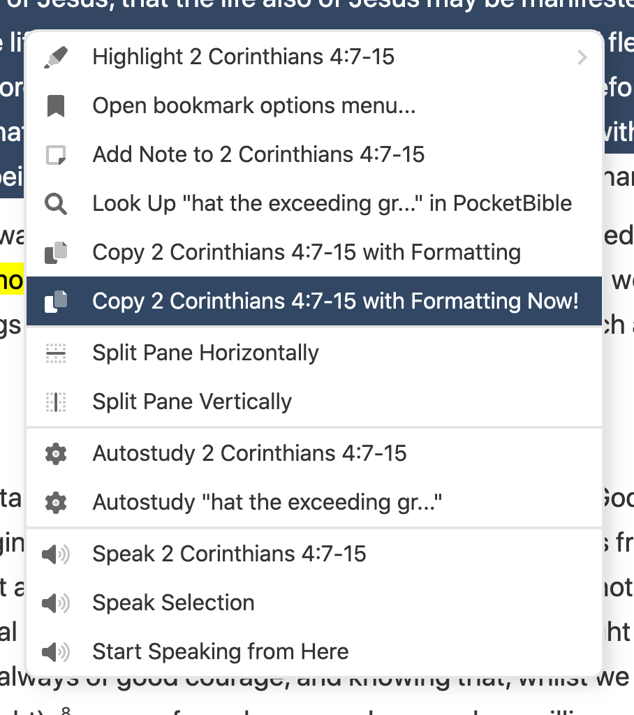
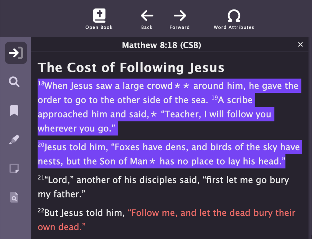
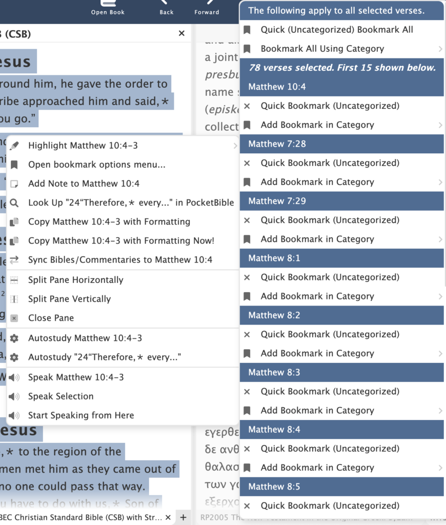
Adjustments to the way bookmarks are handled in the context menu. It can’t realistically handle the situation where dozens of verses are selected, because it lists options for each selected verse. So if you select 100 verses, you can bookmark them all, but you won’t see each one of the individual verses listed on the context menu.
Cloud Library wasn’t showing all owned books. Made changes mostly on the server to deal with this.
Fixed user interface misbehavior of icons on buttons when the buttons got smaller.
Fixed a database initialization bug that was causing tables to constantly be recreated, which would fail after the first call. This resulted in the database operation also failing.
Bookmarks in the context menu when a large number of verses are selected. In this case 78 verses are selected. Individual controls are provided for the first 15 selected verses.
Schedule
I haven’t talked about this for a while, and a few of you have asked. There’s a very common belief that writing software is like baking a cake. If you break down the tasks and and add the amount of time each takes, you’ll get the total time and can accurately predict when it will be ready to eat.
But it turns out it’s more like writing a college textbook for a subject you know well, but doing it in a language you’ve never learned using publishing tools you may have to create yourself. You can quickly learn bits of the language and maybe write an initial draft that looks pretty good. But as you write, you learn more about the language and have to go back and make corrections to previously written chapters. Then you have to decide on where illustrations are needed, figure out how to create them and how to arrange them in the text. Then there’s choosing paper, fonts, ink colors, cover design, binding style, dust jacket design.
Some parts of our probably ill-considered textbook analogy will be easy; other parts will be hard; and some of the hard parts will have to be re-done 2-3 times until you get them right. You might be able to predict completion dates for portions of it, but it’s pointless to try to predict a completion date for the entire project because you don’t really know what needs to be done until you do it.
People don’t believe me when I say we literally don’t have a planned release date for this product. You’d think after 40 years of writing software for business and pleasure, I’d know how long something is going to take. Instead, what I’ve learned in 40 years is that the “ship date” question is one that has no answer. If you try to answer it along the way, you’ll only disappoint people.
That being said, I felt going into this project that it was going to take 12-18 months. However, the further we got into it, the more we didn’t know.
The good news is that I feel like the to-do list is getting shorter. The bug list grows about as fast as we shrink it by fixing things, but those tend to be small tasks. In the interest of total transparency, I’ve included my list of remaining tasks below.
Interestingly, in the process of capturing screenshots for this article, I had to add items to the to-do list.
As you can see, a lot of these tasks are fairly minor; there’s just a lot of them. Some are harder or more unknown than they look.
Remaining Tasks
Bugs
When multiple verses are selected, the reference isn’t formatted correctly in the context menu.
When multiple verses are selected, the last verse appears before the first one in the context menu bookmark list.
Dragging a book into a new pane results in an infinite render loop.
Moving study pane to the right side (or moving it back to left side) causes the resizing controls to be lost.
When moving study pane to the right, the book panes are not getting refreshed.
Thoroughly test back/forward. May be capturing view state for history too often, like after normal scrolling.
Verify that we’re loading the latest book ordering database when we see newer Bibles.
Verify scroll by line and scroll by page is working. Not sure of the latter
Manage input focus throughout.
Implement date-sync for devotionals; save last date sync so we can use it when opening devotionals to the last synced date.
Consider an option to make pane splitters narrow for mouse ops or wide for touch ops.
If book panes get too small, it’s easy to scroll well past the end and confuse the loader
Go To Pane
Consider moving book names to top of Go To pane for all book types.
Note editor/viewer
Make it look better when empty.
Consider “add note” that adds at current location in active book. There have been serious problems with that on other platforms.
Deleting Journal notes doesn’t refresh the list correctly. (AFS)
Can sometimes get duplicate Journal notes somehow. (AFS)
See if we can honor newlines in plaintext and retain those in the rich editor. Right now they are retained in the viewer but not the editor.
Note search
Low priority: Switch to enable/disable enhanced search (even for book searches where it defaults “on”)
Preferences: Color Theme
Settle on color themes for free version and for AFS.
Search
Consider moving search back into main process.
Verify we’re using global ui styles in the study tab.
User Data
Verify we’re tracking the last-synced customer and don’t sync when it changes.
Verify we’re always requesting data from the server when we need to and saving when we should.
Preferences
Use standard font sizes in preferences.
Accelerator Keys
Code review
Organize the list of functions
Advanced Feature Set
Consider whether or not to release the base version before finishing AFS features
Journal
Navigator
Autostudy
Listen
Library Search
Saved Desktops
Today button
Hover Tooltip over Links
Prepare for Release
Resolve issues related to doing a release build
Search task
Locations of pre-installed books and images
Locations of image caches; rendering caches
Onboarding
Website
Add platform landing page and catalog page for the app.
Add catalog page for AFS subscription.
Remove other Windows platforms (consider leaving the desktop version for Win7 die-hards).
Surprisingly, we weren’t sure what our Windows app would look like in Windows.
Running the Windows App on a Windows PC
We spent some time this month bringing the program up on a Windows machine to see how it’s working. This may seem odd, since it is a Windows app, after all. But the fact is that we’ve been doing all our development and testing on our Macs. We can do this because even though the app is being developed for a single platform (Windows) it’s being done with tools that support Windows, macOS, and Linux. That works great for us since we’re 100% Mac-based here.
One of the things we wanted to verify was that the application menu was functioning correctly on Windows. As you may know, app menus on macOS are “disconnected” from the application’s window. And every application has a special menu identified by the name of the app. So PocketBible for macOS has a “PocketBible” menu that is where you’ll find “About PocketBible”, “PocketBible Preferences”, “Check for Updates” and other application-level commands. Windows is different. There is no standard place for some of these items. So we spent some time organizing the way the menu appears on Windows.
Windows also handles “keyboard shortcuts” differently. These are the key combinations that are assigned to certain operations of the app, like Ctrl+C to copy and F10 to activate the menu. On the Mac, you define these by associating them with menu items. The operating system allows you to redefine which shortcut keys go with which operations in any of your apps. Not so in Windows. So we spent some time verifying that we could handle keyboard shortcuts correctly and coming up with simple ways to route these commands through the app.
Back-End Server Updates
When we release PocketBible for a new operating system (what we generally refer to as a new “platform”), we have to populate a database on our server with all the books and Bibles that will be available for it. It’s a bit of a milestone to have created those new database records, which has happened since we last met. Prior to this, the new Windows app had been pretending to be the macOS app every time it talked to the server to either shop in the in-app store or view a list of all the books owned by the currently logged-in user. With this database update, the new app can drop the charade and just be itself.
Added the new Windows platform to the back-end database.
Highlights
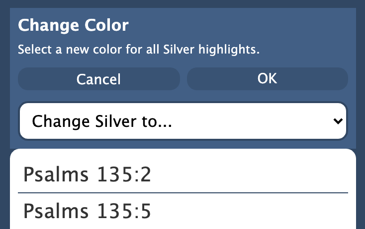
Basic highlight functionality was already working. We took some time to take a close look at the highlights study panel pane to make sure everything was there that we needed. We added functionality to remove all the highlights of a selected color, and to change highlights in one color to another color. While removing highlights of a selected color, we also added a way to remove all your highlights from the entire Bible. I don’t think we’ve implemented these features on other platforms.
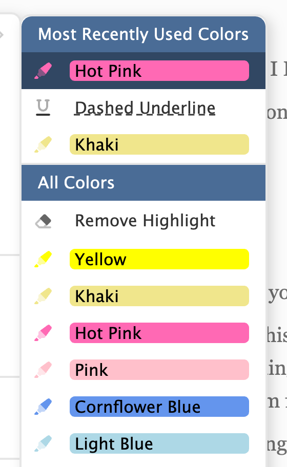
In the right-click or context menu, we added a “most-recently used colors” list to the top of the menu to make it easy to get to the colors you use most often. This is something we implemented first in PocketBible for iOS. Again in keeping with the iOS version of PocketBible, we moved the highlight eraser to the top of the list of colors to make it easier to find and get to.
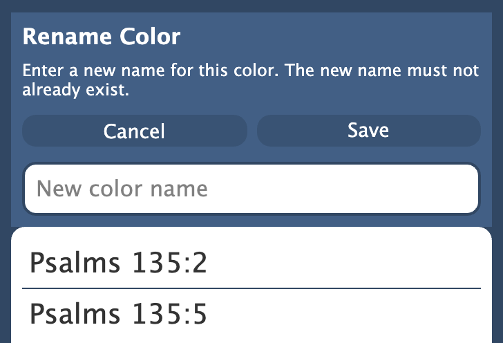
If you own the Advanced Feature Set, you’ll be able to rename your colors. Even though we’re delaying AFS features to the end of the project, we went ahead and implemented that one while we were working on highlights.
Bookmarks
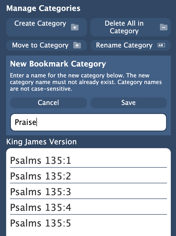
We also reviewed the status of bookmarks. We implemented “create a bookmark category” from the bookmarks pane in the study panel and will have it implemented from the context menu by the time you read this.
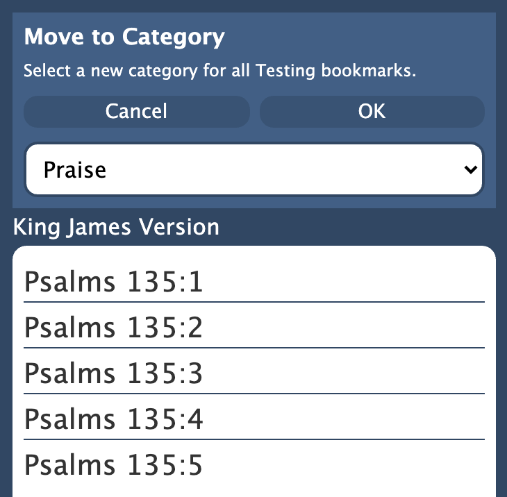
We added a feature to move bookmarks from one category to another. I don’t believe this feature exists in any other version of PocketBible. We also added a feature to remove all your bookmarks. This is something we have had to do for people on the server before; it will be much easier if you can do it yourself.
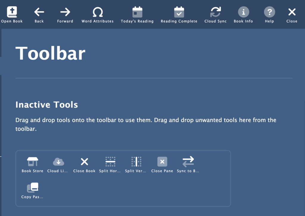
Menus and Toolbar
While we were looking at menus, we also looked at the toolbar, since toolbar buttons and menu items are handled similarly in the app. We compared the new Windows app to the current macOS app to make sure we had thought of everything and added some menu items and toolbar buttons we hadn’t yet implemented.
Among these were the following. Unless otherwise noted, we added a keyboard shortcut, a toolbar button, and implemented the functionality:
About This Book – Shows information about the active book.
Toggle Word Attributes (Strong’s Numbers) – Implemented and also added a “toast” — a brief message that is shown to indicate the state of this option (on or off).
Sync Bibles/Commentaries to Active Bible – When the global setting is turned off, this menu item/toolbar button will allow you to tell your Bibles and commentaries to sync up to the current verse in the active Bible.
Sync Now – Sync your data with the server manually whether automatic sync is on or off at the time. Also added a progress bar on the Account Preferences screen and an indicator on the toolbar to show this activity is happening.
About PocketBible — Version, build date, copyright and other info about the app.
Help — Show the User’s Guide (either open it or make it active if it’s already open).
Help on the Web — Related to opening the User’s Guide, this option takes you to the FAQ on our website.
Start Each Verse on New Line
Hide Verse Numbers
Toggle Sync Bibles/Commentaries
Footnote Style — control whether you want to display just asterisks in the place of footnotes, show the entire note, or hide footnotes entirely.
Toggle Words of Christ in Color
Copy Passage — Added a toolbar button. This was already implemented and connected to the menu and context (right-click) menu.
Mark Current Reading as Complete
Go To Today’s Reading — This was already implemented as a button on the Go To… pane. In addition to adding the toolbar button and menu item, we implemented the feature that allows you to go to today’s reading in all your open devotionals when you go to today’s reading in the active devotional.
On the subject of the toolbar, we made some adjustments so that right-click on the toolbar allows you to customize it, and turned the Preferences (or Settings) button into a “Close Preferences” button when you are in the Preferences screens.
On the subject of menus, we created a way for menus to be adjusted when your Advanced Feature Set subscription is enabled or disabled. The AFS features themselves haven’t been implemented yet but we need to support the mechanisms you use to activate those features.
Other Miscellaneous Features
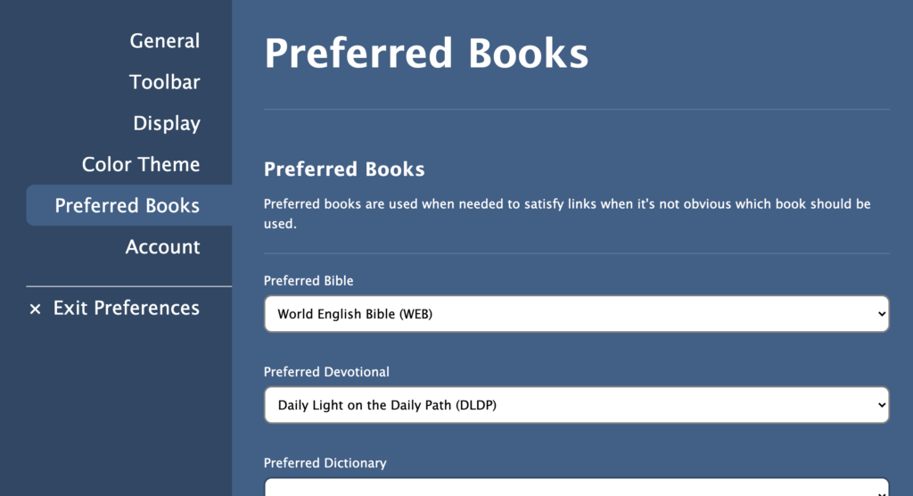
Implemented a way to choose “preferred books” so that when you select a Bible link with no Bibles visible, we know which Bible to try to use. Similar behavior happens with commentaries and dictionaries.
The “expand pane to fullscreen” feature was temporarily removed. I think it’s going to end up being an AFS feature and will be implemented similar to how we do it on the Mac. The way we were planning to do it for Windows just won’t work.
Made links to Web pages and email addresses open the appropriate external app.
When opening a book in a pane where that book is already open, we just activate the existing tab instead of creating a second one. Similarly, if you drag a tab from one pane to another, if the book is already open in the target pane we remove it and replace it with the dragged tab.
Since the last update we wrapped up work on managing bookmark categories (add, rename, delete, etc.).
One of the things we’ve been working on are various display-related settings. “Settings” is not something you implement all at one time as a separate task. We have been doing them as we need them. One of the tasks we’ve undertaken in the last month or so is to make sure we’ve remembered all of them and that we’ve saved them so they can be restored the next time you run the app. This task will continue in the next month or so to make sure we have everything on the toolbar and menus that you’ll need.
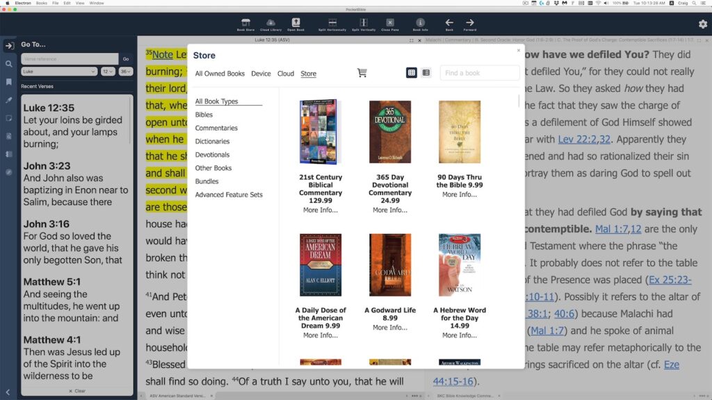
In-App Store
One of the background tasks that has been going on here for some time is a revamping of our website. I could write a whole series of blog articles on that task, but suffice to say that the new design separates the data (like all the “catalog text”, screen shots, and book previews for each product) from the way it is presented. We’ve been able to use people who know Web design to do the “front end” development that the user sees, and use database developers to write the “back end” that provides all the data to the front end. It does this through an API (application programming interface) running on the server.
The initial plan for the in-app bookstore in this new version of PocketBible was to do it the way it’s done on Android, iOS, and macOS. On those platforms, the app has an embedded website viewer that opens a mini version of our website inside the app. As we contemplated how to do that in the Windows app, we had a different idea. Instead of making a little website and figuring out how to get it to interact with the app, we could use the existing API for the new website. All the code and user interface would be inside the app. It would use the API to get the data it needs.
The problem with doing it this way comes up when considering how to handle payments. Securely handling your credit card and PayPal transactions is hard to get right. (Unlike most other e-commerce sites that use third-party shopping carts, Laridian has a custom solution that interacts directly with the credit card processor and PayPal.) Doing it from inside the app creates security issues that we didn’t want to take the time to solve. So instead, when it comes time to check out, we securely transfer you to our website through your existing browser. You finish the transaction there then come back to the app to download your purchases. It all works pretty smoothly and it drew a nice boundary around what we had to implement in the app, saving us some time.
Accessibility
As our customer base ages we have heard more and more about the necessity to think about being able to control font sizes throughout the app. That means in menus and dialog boxes — elements normally controlled by the operating system, not PocketBible — in addition to book and Bible text. Each operating system on which we run presents us with different challenges. Most handle accessibility very badly. The way it’s done in iOS, for example, makes it virtually impossible to create any kind of data input form. If we adopt iOS’s way of doing things, we don’t really know how big any text is. They just take over and make it as big as you ask them to. It creates a real mess for every app.
Because of the development environment we’re working in, we have significantly more control. But with great power comes great responsibility. We have to be thinking about accessibility — especially text size — constantly. The problem is that there is a lot of text in a lot of places in the app — window/pane titles, button labels, section labels, instructive text, dialog boxes, and more. Rather than giving you control over the size of text in every context, we’ve decided to tie what we think of as “user interface text” to the sizes of your book text. You have one control that sizes the text in your book window and we base the size of other text in the app on that choice.
To demonstrate both the in-app store and accessibility features, I put this little video together. I don’t normally record video in the office because we get a lot of background noise from the restaurant below us and the street in front of our building. And because our offices are in a 19th century building with brick walls, original wood floors and 14-foot ceilings, there are a lot of echos. But I got here before anyone else this morning and thought I’d give it a try. 🙂
PocketBible for Windows accessibility demo.
One of the fun things about the way we develop here is that it is very iterative and nothing is ever final. While making this video I discovered that the range of font sizes I was allowing both for books and for user interface text was not wide enough so I made some adjustments. I also realized that it was hard to tell which switches on the preference page where you set the font size were on and which were off. I made a couple small changes so now switches turn green when they’re on.
We reported extensively on the note editor in progress update #8. We spent a little more time on that task, in particular as it relates to when we save the changes you make to a note. First, we wanted to make sure that your edits get saved when you exit the app, so we provided a notification to the note editor that the app is about to exit so that it can save your work. (You probably think that just “happens” — and it does — but somewhere there’s a programmer who wrote the code to detect the fact that the app was closing and made sure that your work got saved.)
In addition we took more control over exactly when we sync an edited note to the server. When the note is open for editing, our other apps periodically sync to the server to make sure your changes get saved. This is potentially important on a mobile device where you might drift out of Internet coverage or the battery might die at any moment.
On the desktop, we can be a little more patient. We wait until you are done editing the note (say you switch to the viewer or the other editor), then we save all your changes to the server at that time. Of course locally we save your work every few seconds so that you don’t lose anything if the power goes out. But by waiting to sync with the server until you’re done editing, we make certain problems easier to solve when you have the note open on more than one device at a time.
Finally, when linking to a note from search results, we now highlight the searched-for word(s) in the note viewer. This may be a first for PocketBible. I don’t recall doing this in previous releases, though some of you with memories that extend back to the last century more clearly than mine do might remember it differently.
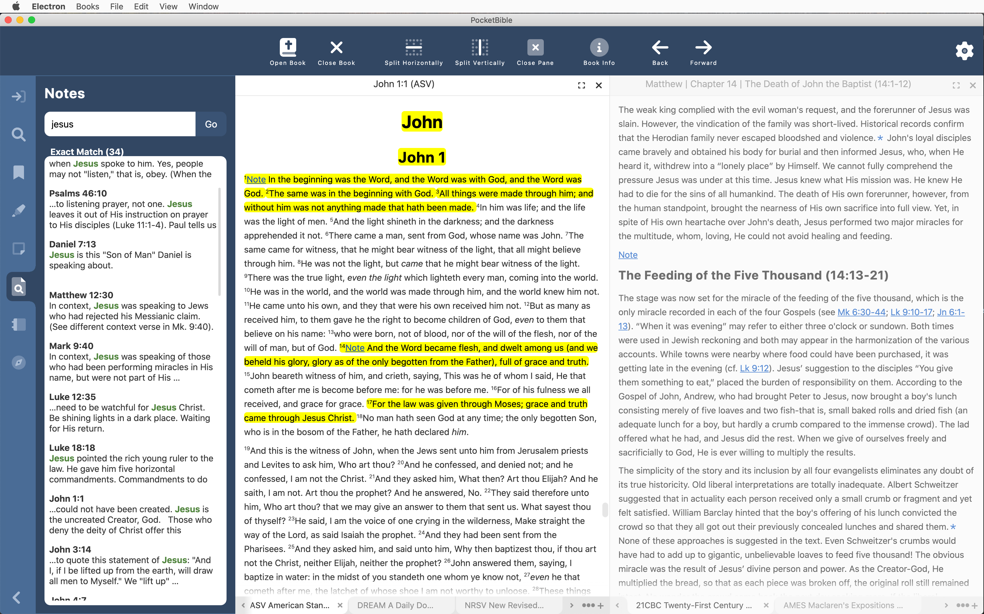
Note Search
Note searching is similar to book searching except there are no indexes and of course the text comes from a completely different place. The overall structure of the code is the same except for when you get down to actually looking for the word or words in the text. Book text comes from an LBK file which has a lot of indices to support searching, but notes come from a database with no indexing. We’re able to use exactly the same code until we get to that last step, where it branches depending on the source of the text being searched. As a result, a lot of the logic of searching was already done.
The display of note search results is similar to displaying book search results. What we didn’t realize going into this was that it is so similar that it can actually share the code. So the Note Search, Book Search, and Journal Search panels are just 3 instances of the same chunk of code (we call it an “object” rather than a “chunk-o-code”). So we spent some time throwing away some work we had done on separate panels for Note and Journal searches and adapted the existing book-searching code to account for notes.
Similarly, the Journal is just a collection of notes, so the work we do for regular note searches and note editing automatically applies to the Journal. So even though the Journal is an Advanced Feature Set feature, we’re doing the implementation now as we work through the general notes feature. (Other AFS features will likely be put of until work on the standard feature set is done.)
Note search showing note excerpts in results list and highlighted search words.
On the other platforms, when you do a search for a word in your notes, the search results will show an excerpt of your note, but it’s just the first couple of lines. You don’t see where the thing you’re searching for actually occurs in the note. In the Windows version, we’ve made it so that search words are highlighted in the note viewer and are also highlighted in the search results. And we’ve added a smart “excerpt” function so that if the word you’re searching for occurs later in your note than the first couple of lines, we’ll show you the portion of the note in which your word occurs.
Since the book search, note search, and journal search all turned out to be the same/similar code, when we added excerpts with highlighted search words for notes and Bibles, we were also able to add them for non-Bible books.
Study Panel
As a result of working on the note editor, we learned more about how to better handle layout of other panels. This is particularly related to the re-layout that happens when you resize the Study Panel or the entire PocketBible window. Previously we had been doing a lot of manual calculations to position buttons and text appropriately. It turns out there were some easy ways to allow that to happen more automatically.
Bookmarks
We’re just wrapping up work on managing (add, rename, and deleting) categories. This gets tricky when you’re syncing all that data to other devices, so we’ve had to do a lot of testing of the entire synchronization path from Windows to the server and from the server to other devices.
Book Display
We happened to notice while doing our own devotional reading that the book pane was not getting refreshed when you change the start date of a devotional. So now it gets refreshed to update the dates you see in the text.
Quite a bit of progress since the last report. Some of it (note editor) was re-implementing something we thought was already done, but that has to happen every once in a while.
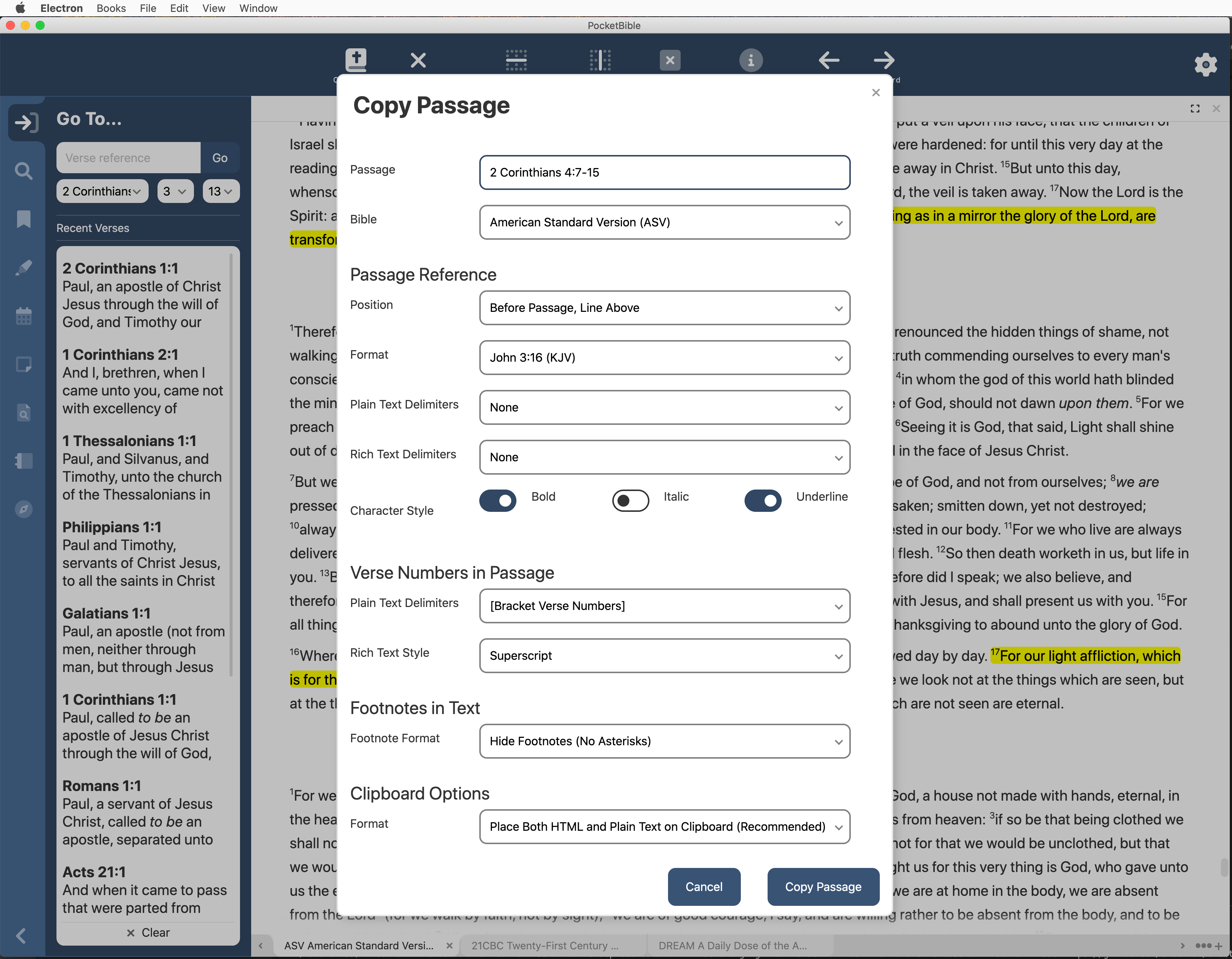
Copy Passage
One of the major accomplishments of the last month has been what we call the “Copy Passage” feature. It allows you to enter a verse or passage reference and select a number of options for how you would like the text to appear, then press a button to copy it all to the clipboard with all your options.
With this feature in place, you can use Ctrl+C to just copy the selected text, Shift+Ctrl+C to go to the Copy Passage dialog to choose options, or, once you have the options configured the way you like them, Shift+Alt+Ctrl+C to immediately copy the selected verses with all the formatting options you’ve chosen.
Both the current Windows versions have some limited implementation of this feature. The implementation in the new Windows version is based on the macOS and iOS implementations, which have more features.
Note Editor
Writing a rich text editor for notes is not easy. Back when we were at Parsons Technology doing something similar for QuickVerse 5, we paid someone $200,000 just to implement this one feature.
A few years ago, the people who define how the Web works created technology that is present now in every browser that does a lot of this work for us. It’s far from perfect, but it’s pretty good. Since we use HTML (the “language” of the Web) throughout PocketBible and render it with built-in HTML functionality that is part of the underlying operating system, it wasn’t hard to integrate this functionality into PocketBible for Android, iOS, and macOS.
When we originally started looking into re-writing PocketBible for Windows, this was one of our concerns — would we be able to use this built-in feature for editing notes? We discovered that Microsoft’s development environment was sadly deficient in this area and it became one of our main reasons for going with the Electron system I talked about in update #3. Electron includes Chromium, the guts of the Chrome browser, to provide HTML rendering in every Electron app.
The HTML editing that is built into Chromium can be difficult to use. So initially, we implemented the note editor using a free component we found called TipTap. TipTap is endlessly reconfigurable and seemed like it would meet all of our needs. We even reported that note editing was complete back in update #4. But after we got digging into this, I realized that there were little things that weren’t working at all. For example, if you copied Bible text with superscripted verse numbers into a note, TipTap would remove the superscript. If you had a note that included a table, the row and column information about the table would be removed and you’d only see the text, all run together in a blob.
Turns out TipTap was “easily reconfigurable” but required custom programming to support every single HTML feature. So there was a custom plug in required to make text bold, another one for italics, one for superscript, and another one for tables. But on closer inspection it turned out that they were sorely lacking. For example, you could create a table, but you couldn’t put borders around the table cells. And TipTap would intercept all our Bible verse links, launch a browser, and try to direct you to a site like “http://John 3:16”, which of course didn’t work. Further, if you were reading a note that you created on another platform, like PocketBible for Android or iOS, anything that TipTap didn’t recognize would be stripped from your note.
At first it looked like we just needed to update TipTap from version 1 to version 2, but that didn’t fix anything. So we bit the bullet, removed TipTap entirely, and wrote our own HTML editor based on what we’d done for other platforms. This ended up working fairly well. It’s done except for wringing out the bugs at this point.
Note viewer, note editor, and HTML editor all using the default color scheme. Note that the colored text essentially disappears when shown using a dark color scheme. In that case, the “Light” button at the bottom can be used to change the viewer/editor background.
One of the little things we noticed that turns out is a problem no matter what platform you’re on is that if you use the note editor to change the color of your notes then choose a color scheme that causes the note editor to have a dark background instead of the traditional white background with black text, you may not be able to see your notes. So the new version has an easy way to switch to a light or dark background color in case you need it to accurately view your notes.
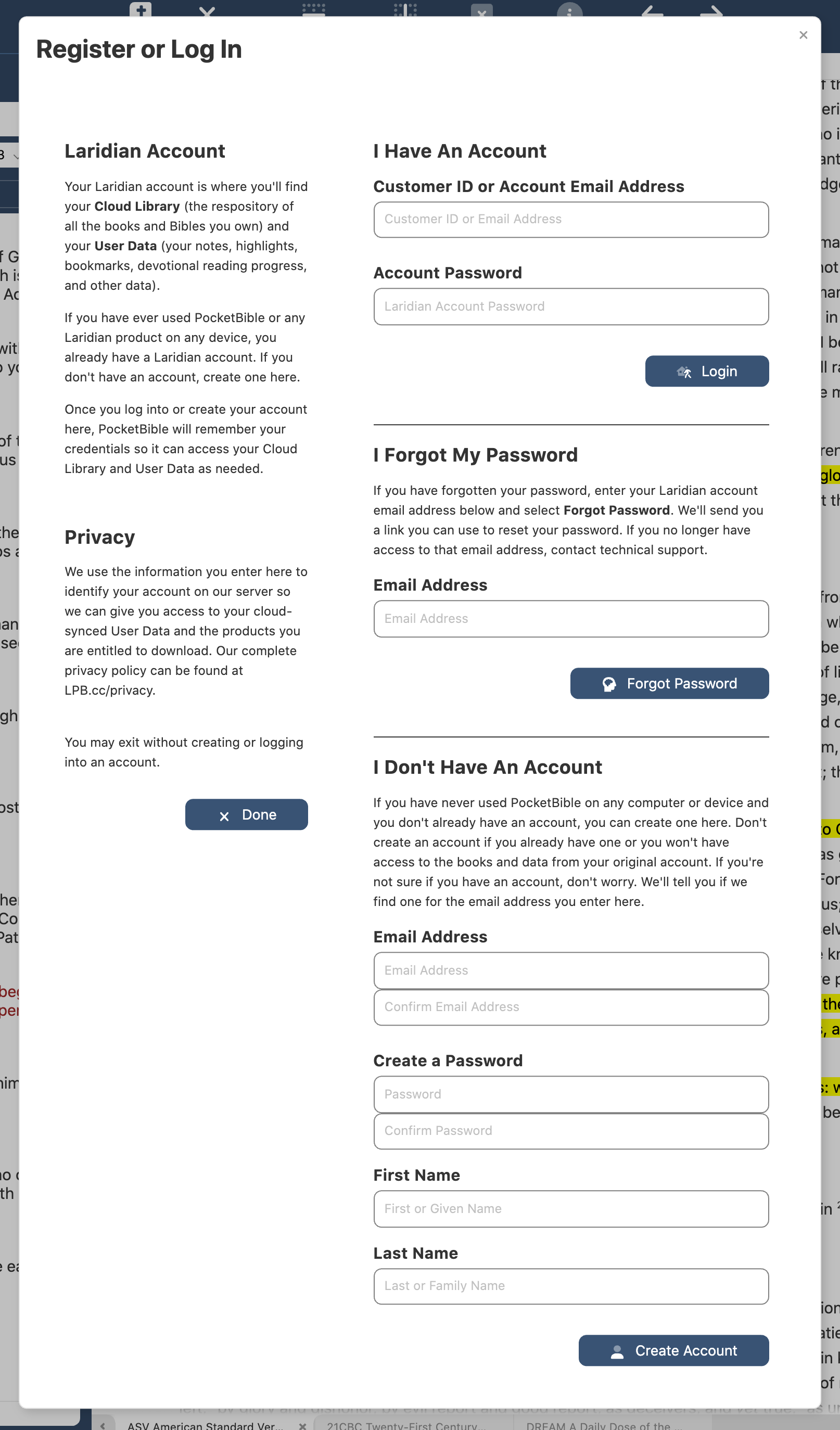
Registration
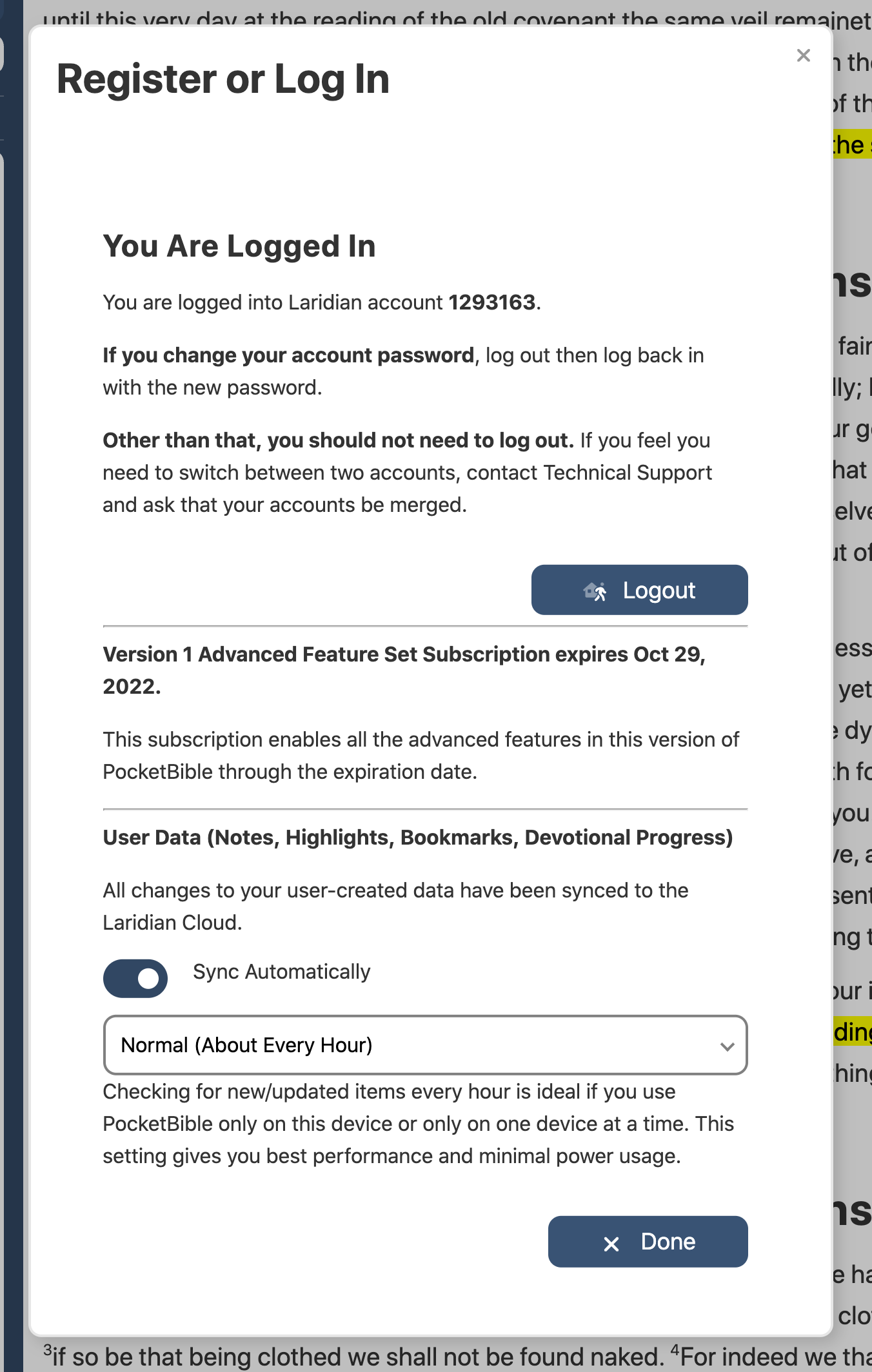
In update #6 I said we had implemented the ability to log into your account, which is true. But we didn’t prompt you to register when you first launched the app. So that’s been implemented. You can now log into an existing account or create a new one. And the account screen in PocketBible settings/preferences will show you your Advanced Feature Set subscription status and give you options for synchronizing your notes, highlights, and bookmarks.
When you first launch the app, you’ll be prompted to register — either by logging into your existing account or creating a new one. Once registered you’ll see the current state of your account, which you can also view on the Preferences screen anytime.
Current Tasks
We’re currently working on some polishing of the bookmark feature. We previously had implemented the ability to set and clear bookmarks, but not create new categories, remove categories, or rename categories. We’re well into that now. We need to do similar work with respect to highlights.
We’re also testing and tweaking the features mentioned above. While doing one thing we often discover better ways to do things that affect other parts of the program. For example, over the last couple of days I’ve revisited the “go to” pane and significantly streamlined the way it works based on work we did while implementing the note editor. This has made it more reliable by removing a couple hundred lines of code that just gave it more places it could go wrong.
We’ll soon move from the note editor to implement note searches. We have the basic user interface in place; we just need to implement the actual searching.
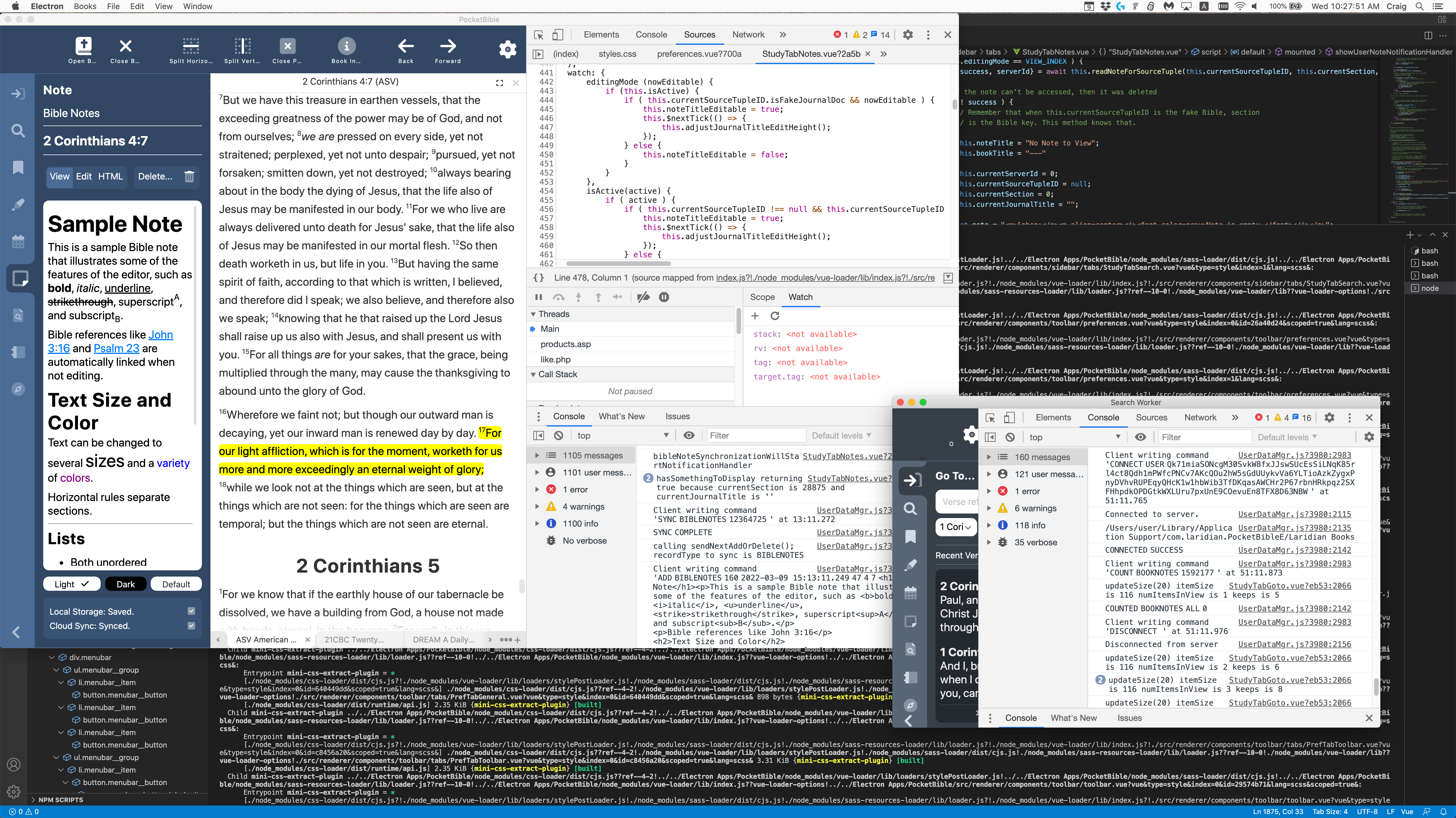
One behind-the-scenes task that is happening is getting us positioned to be able to create what we call a “release build”. When we build the app in its current state, it’s really suitable only for development use. It has additional panes and windows that show our developers the internal workings of the code for debugging purposes. The version you get (the “release build”) won’t have those features, of course. I want to be able to create a release build sooner rather than later so that we have time to work the bugs out of that process and get set up for beta testing.
What PocketBible really looks like during development. The large window in the upper left is the main UI thread with developer tools open in the right half. The smaller window in the lower right is a search worker thread that won’t have any user interface in the release build. Behind all this (and usually on its own monitor) is source code and output from the build process. When I screenshot this for public consumption, I maximize the upper left window and close the developer tools so it looks more like what you will see.
Construction Project
I see it’s been over 3 months since I updated you on the view out our front windows. As you recall the city completely shut down and rebuilt the main street through town, which passes in front of our building. At the same time, the strip mall across the street was torn down and a new combination retail/residential building is going up in its place. Our entertainment for the last 9 months has been watching (and listening to) the construction.
The street re-opened around Thanksgiving. Work on the building continues. The exterior appears to be completely framed. Windows are being installed and bricking has begun. Something is happening on the roof but we can’t see it well enough to tell what it is — perhaps an insulation layer that goes down under what I assume will be a rubber membrane style roof. On the inside we can see electrical work being done and also fiberglass tub/shower inserts in each apartment.
A similar build is being behind this one, which will have parking underneath and 2-3 floors of apartments. We won’t be able to see that one being built
Christmas break and some changes in the availability of team members have taken a toll on productivity, but work continues on the app.
Navigating: The Go To Tab
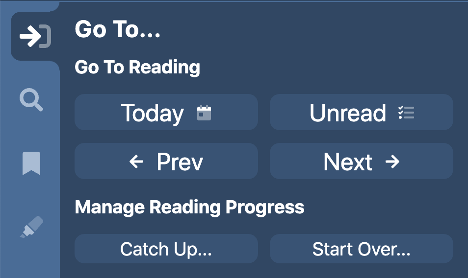
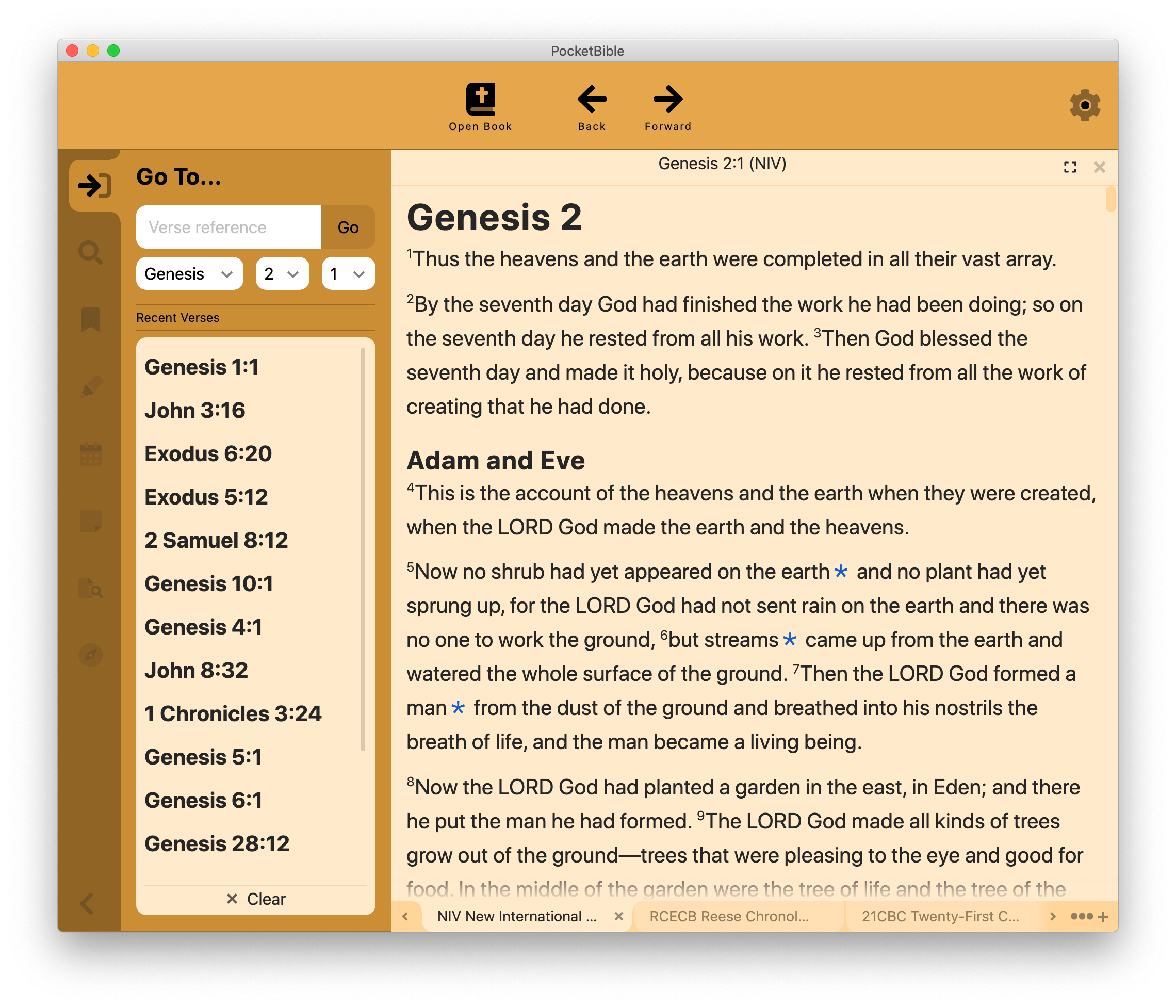
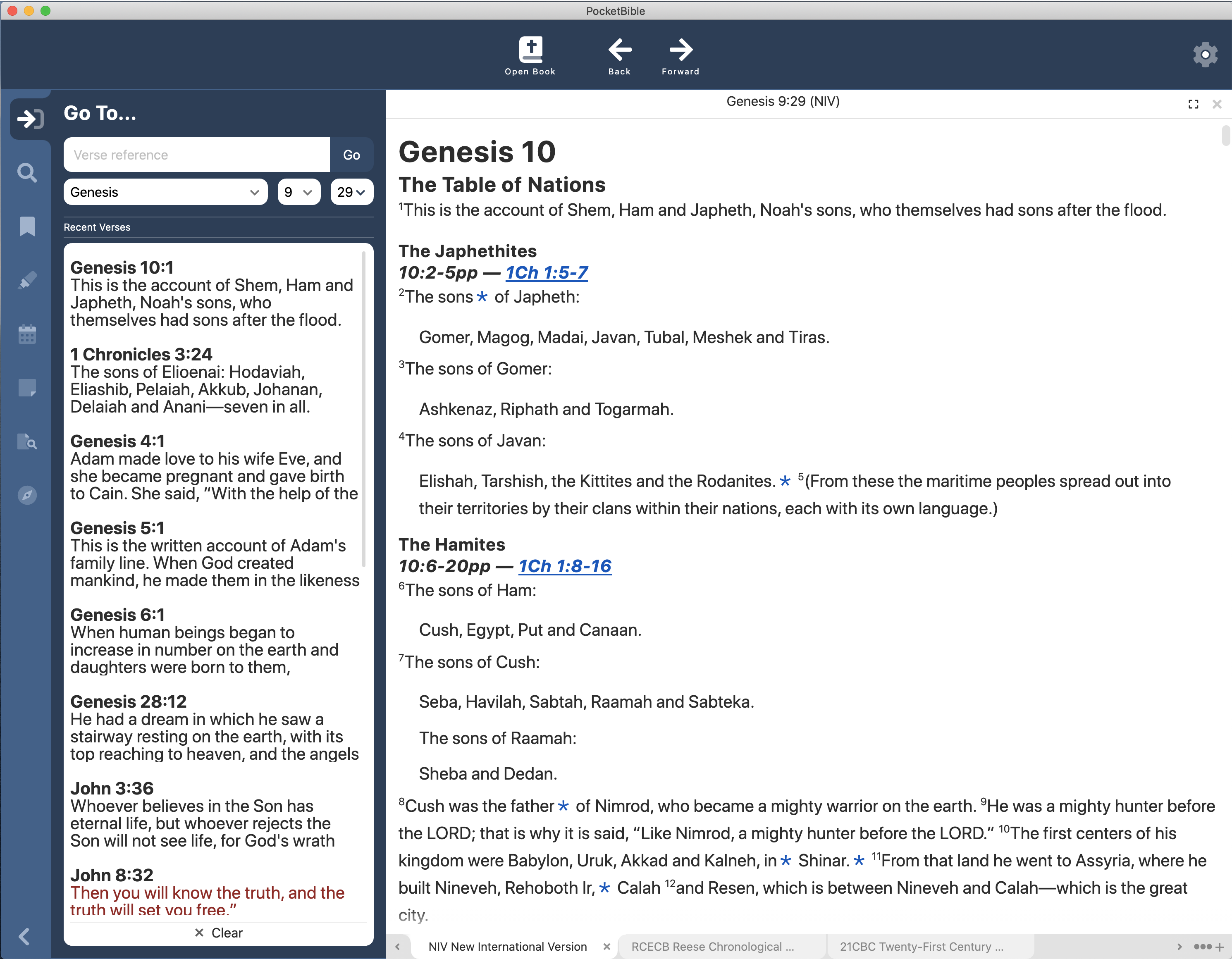
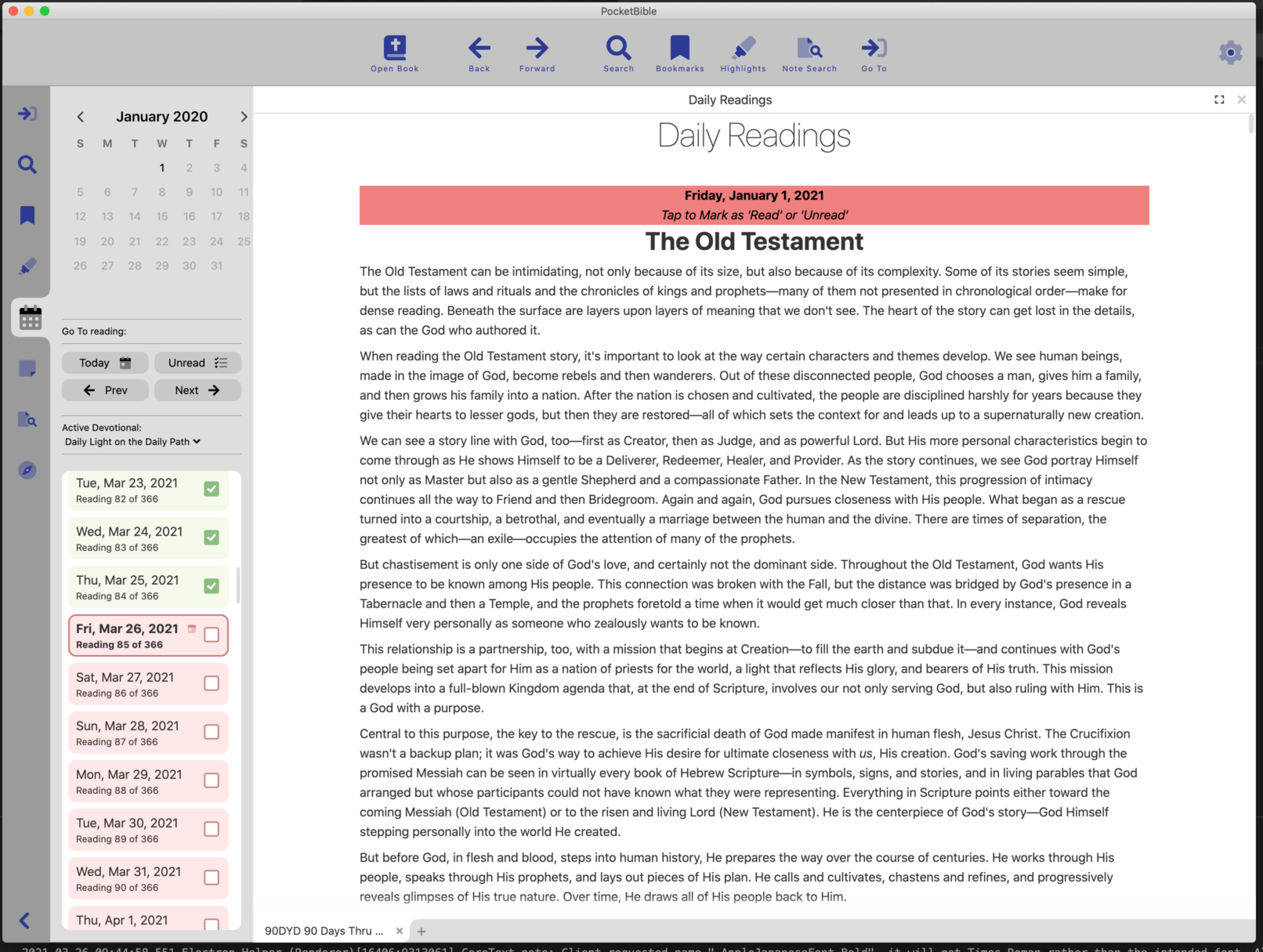
A lot of time has been spent implementing what we call the Go To Tab in the Study Panel. It’s where you go to navigate through a Bible or reference book. There are 3 different configurations of this pane. For Bibles, you have the ability to enter a Bible reference or choose book, chapter, and verse from drop-down lists. In addition, a list of your most recently visited verses is displayed.
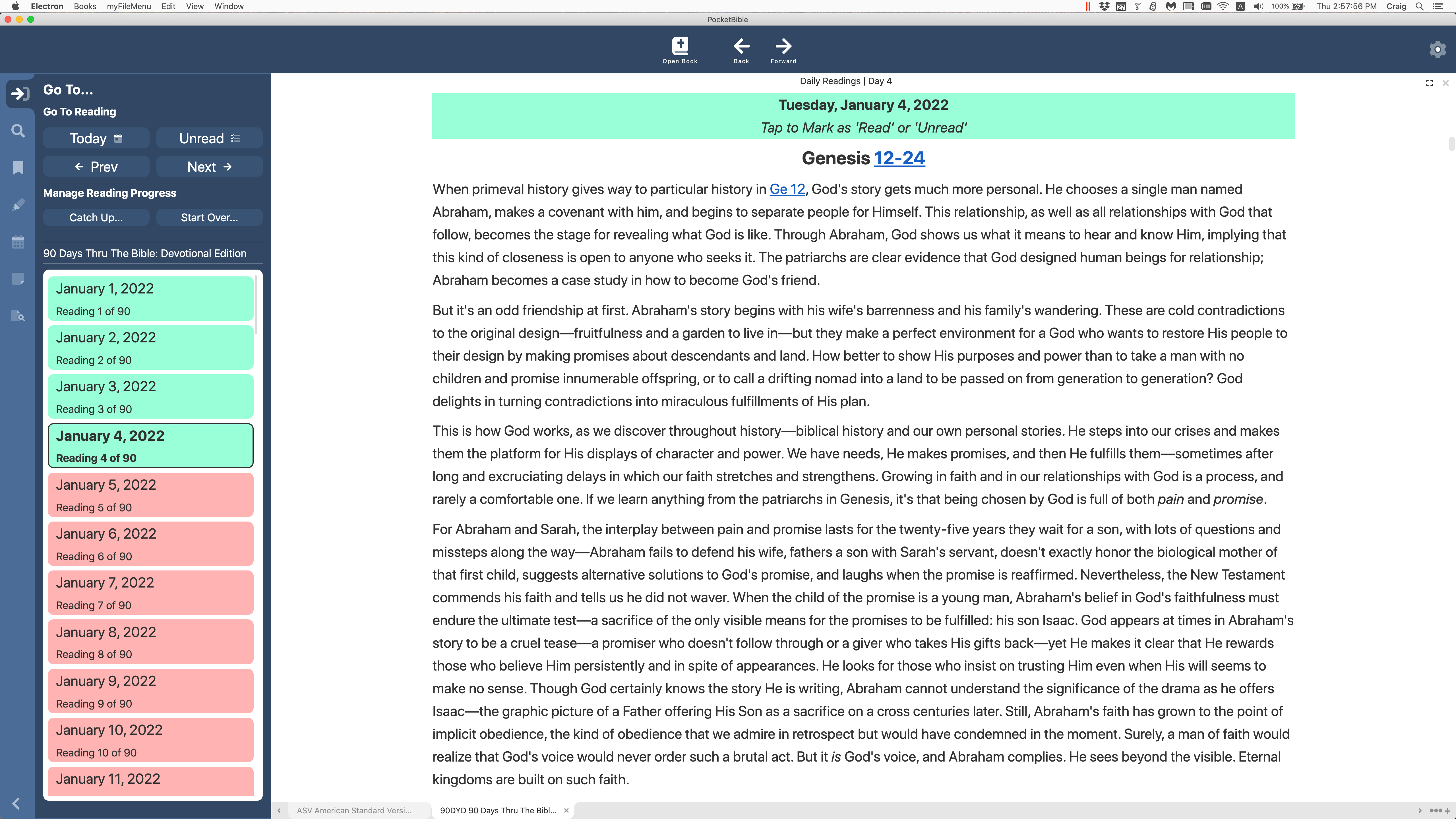
For devotional books, the main interface is the ability to navigate to the first unread reading, previous and next readings, and to the reading for a specific date. A list of readings that are highlighted to indicate whether or not you have read them is displayed. Functionality is provided to “start over” on a devotional by setting the start date and clearing your existing reading progress data. Related to the implementation of the Go To Tab for devotionals is the ability to click on a heading over the reading for a given date to mark that readings as “read” or “not read”.
Go To Tab for BiblesGo To Tab for DevotionalsGo To Tab for All Other BooksThe Go To Tab
For all other books, a hierarchical table of contents is displayed, and your current position in the book is highlighted.
Study Panel and Toolbar Position and Size
While we were working on the Study Panel, we made it so you could have it positioned on either the left or right side of the screen. (You’ve seen it on the left side in every screenshot to date.) We also save the width of the Study Panel and allow you to double-click on its border to rotate between its minimum width, the width you’ve set it to, and its maximum width. This is in addition to being able to either show or hide the panel.
Related to the position of the Study Panel, we also made it so you can display the toolbar either at the top or at the bottom of the screen. We think this might be handy when using PocketBible on a Windows tablet. While doing that, we made both the toolbar position and contents persistent (saved in your user preferences).
Showing the Study Panel on the right and the toolbar on the bottom
Navigation History
We spent some time on a rough implementation of what we call “navigation history”. This is the data that lies behind the “back” and “forward” buttons on the toolbar. This is significantly more difficult in PocketBible than in something like a browser. In a browser, your back/forward buttons take you through the history of the current browser pane or window. PocketBible can have multiple panes and multiple books open in each pane. The history database needs to keep track of all of that.
We call this a “rough” implementation because there are a lot of places in the code where we need to “capture” history because the position is about to change. Further, there are a lot of places where we don’t need to actually capture history but we need to somehow mark the book or pane as “dirty” and in need of being saved. We believe we have identified most if not all of these places. Further testing is required.
A Few Smaller Things…
The ability to highlight a word and right-click to look up its definition is implemented.
The search field now displays a list of recent searches.
You can specify a range of verses to search when searching a Bible.
The range of font sizes you can select has been expanded.
We spent a lot of time (and continue to spend a lot of time) working on internal, non-user-facing elements of the code. Some of these are to accommodate updates to third-party libraries used by the app. Others are to flesh out implementations that were started with the idea we’d finish when we knew more about what they needed to do. Some are tweaks to the user interface that we’re getting around to as we pay attention to different aspects of the program.
Schedule
I have a hard time coming up with different ways of saying “we’ll be done when we’re done”. We go through periods where we make a lot of progress and others where we have a problem we just can’t figure out and get past. As I’ve said before, we don’t work with a specific release date in mind. We just keep working our way through the list.
A few of you have offered suggestions. We appreciate but can’t always implement those. That being said, the reason the toolbar can be moved to the bottom of the screen is because a PocketBible user asked us if we could do it. We had one false start that led us to believe we couldn’t, but then we backed up and took another run at it and the result is what you see above. So if you have suggestions, feel free to pass them along either here in the comments or to tech support. We are locked into some decisions but will always think and talk about good ideas, regardless of the implications.
I was hoping to post a video update this time but if you’ve been following these updates over the last few months you know they’re doing construction right outside our windows. Today it’s especially noisy. So this is going to be a text-based update.
In the last couple of months we’ve made significant progress in several areas. I’ll go over each of these.
Searching
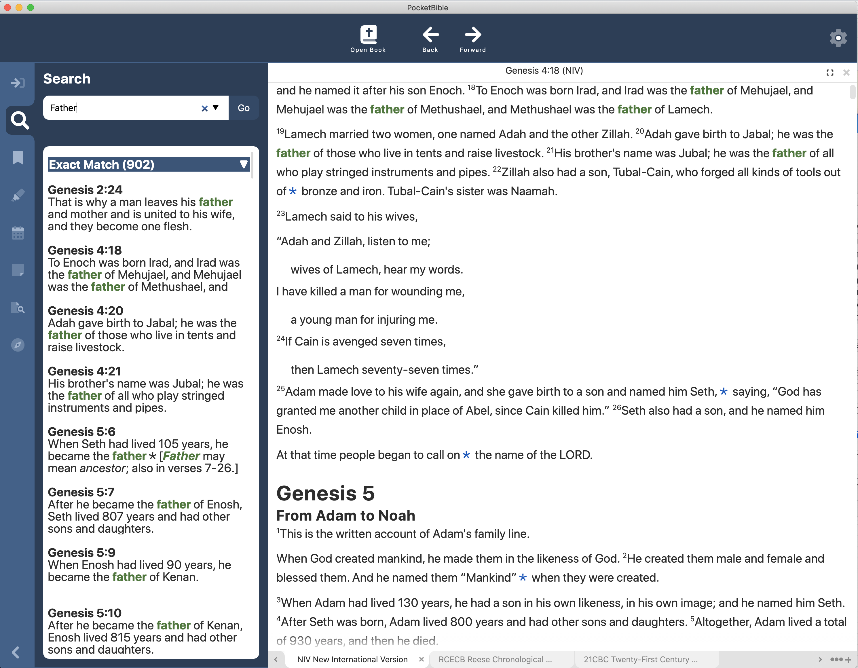
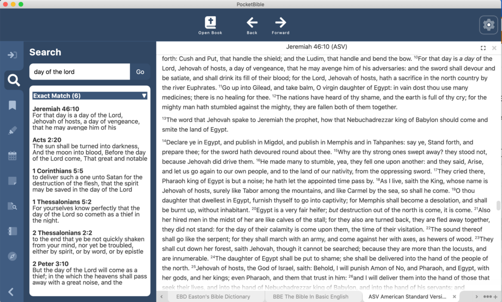
I demonstrated searching last time. Since then we have made it so search words/phrases are highlighted in the text and in the search results themselves.
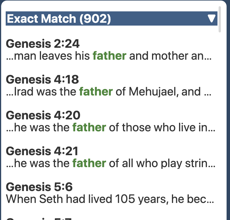
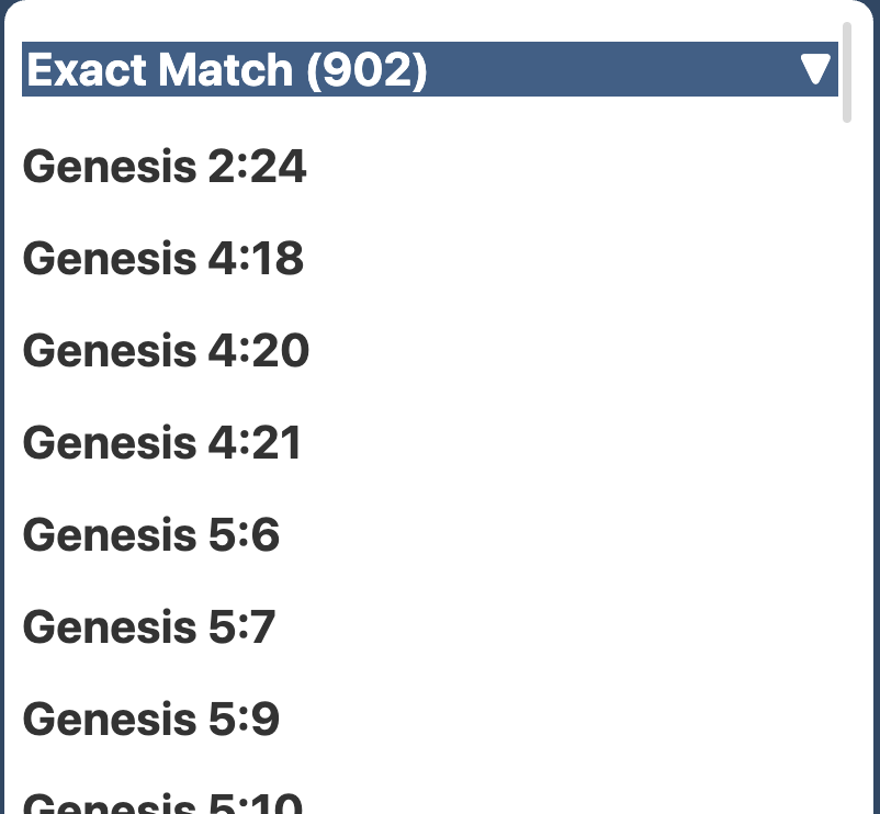
Search results are highlighted in the text and categorized in the search results pane on the left.
If you’ve used PocketBible for Android, iOS, or macOS, you’ve seen how we organize search results into categories like “exact match”, “sounds like”, “same root word”, etc. We’ve implemented all those searches now in the Windows version. You can tap on the heading of each section of results to collapse or expand it to make it easier to navigate through the results.
Search results are displayed as they become available and a progress bar shows you how far along you are in the search.
The “did you mean ‘go to’?” result category is implemented, so you can “search” for John 3:16 in a Bible and the app will realize that you just want to go to that verse and will take you there.
In addition, there are three different “sizes” of the search results excerpts. You can display just the Bible reference, just a one-line excerpt, or three lines of the full verse.
“Large Excerpt”
“Small Excerpt”
“Reference Only”
Search results styles
Text Display
The program allowed you to change the font and font size before; those settings are now saved between sessions. Changing the font size affects the size of text in search results, lists of highlights/bookmarks, notes, etc.
Highlights are shown in the text. The “words of Christ” color (red here) is adjusted to maintain contrast against each highlight background color.
Note links and highlights are now shown in the text. Before you could highlight a verse and it would show up in your list of highlights, but was not shown in the text. The app automatically adjusts colored text (links, search hit, and words of Christ) so that the text has adequate contrast against each of the highlight colors. If we didn’t do this, you wouldn’t be able to see “words of Christ in red” against a red highlight background.
Note links in the text are active. Clicking on a note link shows you the note in the Notes pane.
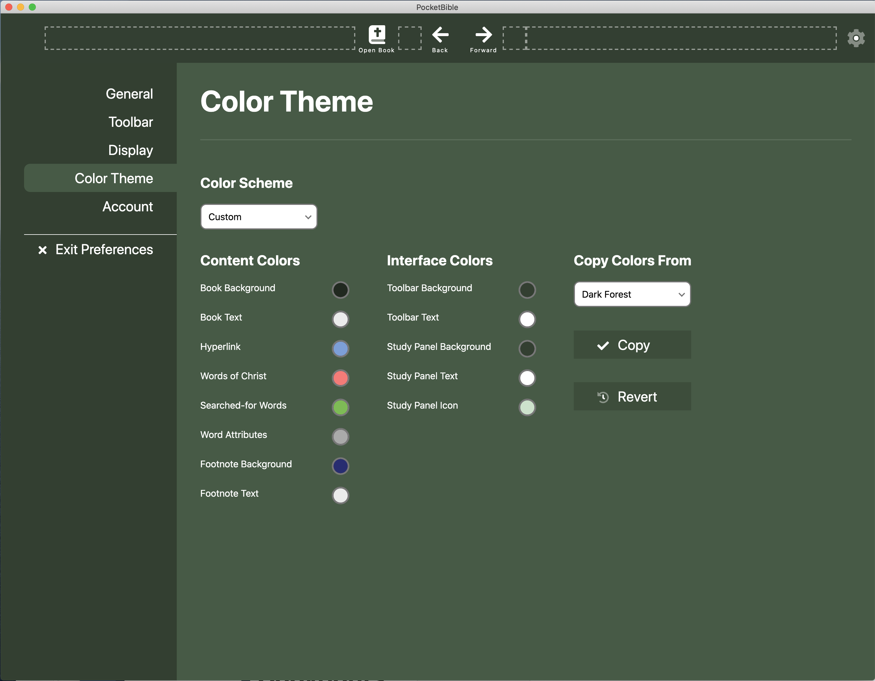
Color Schemes
While working on highlight colors, and especially while adjusting the various text colors to make sure they’re visible against all the highlight colors, we did some work on color schemes, especially to make sure that text colors were visible against all the different backgrounds.
Color schemes are now persistent between sessions.
Create a custom color scheme. Start by copying an existing scheme.
We’ve added a custom color scheme so that you can choose your own background and text colors for various parts of the user interface. You can copy an existing color scheme then modify it. If you don’t like your changes, you can revert to your previous custom scheme.
In the process of tweaking the color schemes, we’ve defined some additional built-in schemes. We may or may not keep these.
“Dark Steel”
“Sky”
“Ochre”
Some sample color schemes. If you don’t like ours, you can create your own.
Go To…
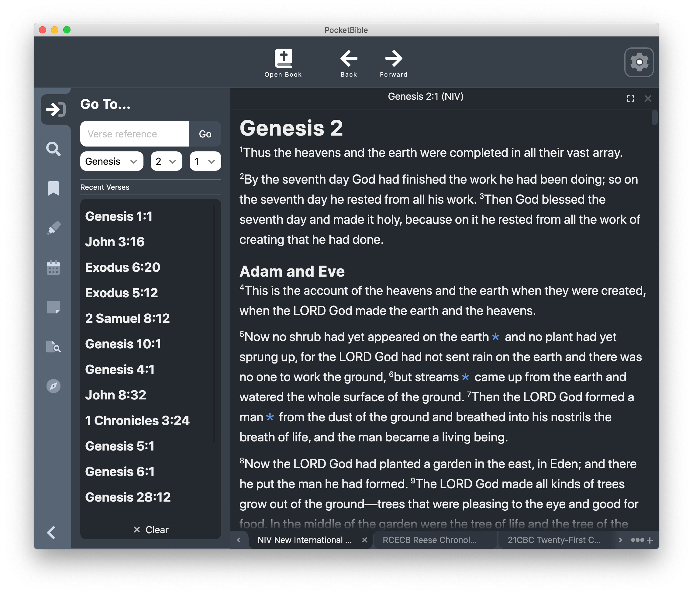
The Go To Verse pane works for Bibles. You can type a reference like “John 3:16” to go directly there. As you type, a list of all matching Bible book names and abbreviations is displayed to help you get the spelling right.
Go To Verse pane with list of recently visited verses.
Instead of typing a reference, you can choose a book from a list of all the books of the Bible, then choose a chapter from a list of all the chapters in that book, then choose a verse from all the verses in that chapter. PocketBible will correctly display weird chapter schemes, like the “Prologue” in the apocryphal/deuterocanonical book of Sirach and the lettered chapters that appear in Esther in some Bibles.
Any time you go to a verse or click on a link to a verse, the verse is added to a list of recently visited verses that appears in the Go To Verse pane. This allows you to quickly navigate to a passage you were previously reading. A button at the bottom of this list allows you to clear it, though it’s not necessary to every do that.
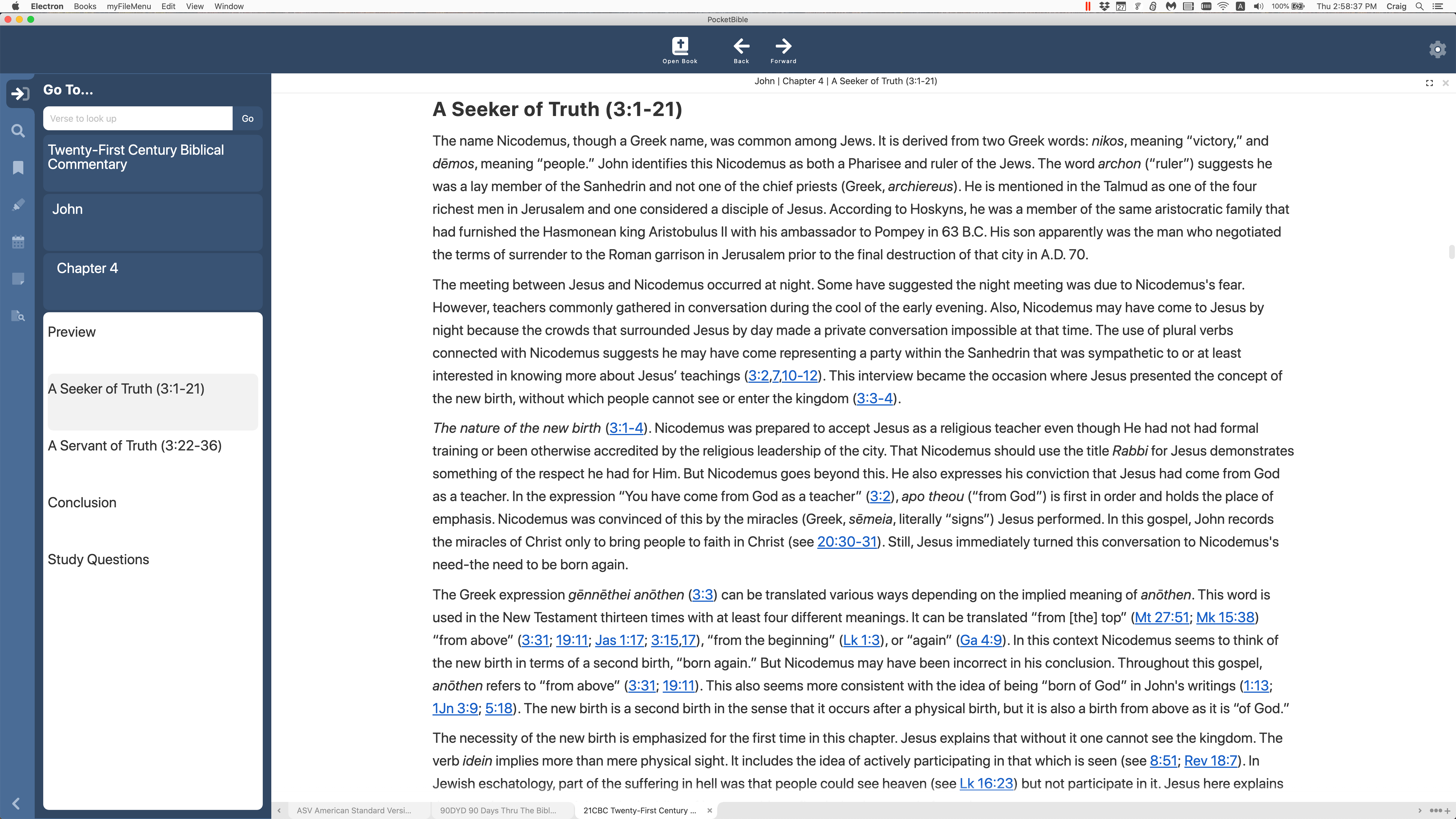
For dictionaries, commentaries, and “other” books, you will navigate via the table of contents. As of today, the table of contents navigation hasn’t been implemented, but you can type a word into a field at the top of the Go To pane to go to the dictionary entry for that word, or type a verse reference to go to the commentary article for that reference. In both cases, a drop-down list of all possible words (dictionaries) or Bible references (commentaries) helps you navigate these books.
Account
We’ve implemented the ability to log into your account. We use that to determine if you own the Advanced Feature Set and will enable/disable features as a result. Previously we had been using a hard-wired test account.
Schedule
We were really aiming for the end of the year but it’s looking like it’s going to be a little longer than that. A few unexpected and some arguably predictable factors have affected the schedule. One of our key programmers was in a car accident and suffered a concussion that manifests as an inability to focus and think clearly. This has impacted our productivity substantially. In addition, one of our outside contract programmers has had very limited availability. We’re expecting that to improve over the next couple of months.
The biggest issue is that we severely underestimated the amount of time it would take to re-write the entire program in a new language and deal with issues that would arise as a result. There are still major pieces of code (especially Advanced Feature Set features) that have not even been touched.
We’re not going to predict a new date at this point. Suffice to say it won’t be in 2021. Sorry about that. Stick with us, though — the program is really going to be good when we get it done. And as soon as we feel like we can be 80% sure of a ship date (or a beta date) we’ll let you know.
Construction
As I mentioned above, our office sits right above a major construction site. The street in front of our office has been closed for complete replacement for a block and a half in each direction. At the same time, a one-block wide, three-story tall retail/apartment building is going up across the street. This has been going on since June or July. They hope to open the street by the end of the month, then close it back down next spring.
180° panorama of the street below.
The construction project has been a source of endless surprises, such as showing up one morning a couple weeks ago to discover that there was literally no access to our building. The sidewalks were closed from both directions. Yellow caution tape was taped across our door. We discovered the secret was to walk boldly through the construction site as if you belong there, and remove the caution tape as if the danger is past. The downside, however, is that then they pour a new sidewalk right outside your door and you can’t leave until it’s dry enough to walk on.
On another day, the electricians were digging a hole for a street light foundation and augured right through the new water main in front of the neighboring building. We didn’t anticipate a problem, since one of the features of the new system is that they can shut off water to one building without affecting the others. Despite that grand promise, we were still without water for most of the day for some reason.
On a positive note, we were able to get a bike rack installed, so no more locking our bikes to whatever stationary object is convenient. Just in time for winter. 🙂
If screen shots and videos of this Windows app appear to have been captured on a Mac, that’s because they were. We are able to do development and testing on macOS even though we’ll eventually deploy on PC.
I’ve heard from a couple of you asking for an update. That usually means I haven’t taken the time to look up from my work and look at a calendar for a while.
Since the last update, PocketBible can perform searches and show results. If you use any of the non-Windows versions of PocketBible, you know that it performs about a dozen different searches in parallel to accomplish one search. So you’ll see results that match exactly; results that have all the words you’re looking for, but in a different order; words that sound the same; words that have the same root word; etc. I mentioned before that it is a challenge to launch these searches in parallel in the new Windows version, but we’ve figured out a way to do that and we think it’s going to work reasonably well. Right now, we’re testing these one at a time to make it easier.
The video below demonstrates searching as compared to the current Mac version (on the left). The videos are synchronized so that the searches start at the same time on each platform so you can compare the times. As you can see, the time it takes to return exact matches is pretty close to the same in both apps. This is pretty impressive given that the Mac version is a native, compiled app and the Windows version is something less than native and something more than interpreted. If that makes no sense to you, suffice to say that we’re seeing good results when it comes to search speed.
Note that in one of the searches, the Mac version returns some results right away because they’re easy to calculate, but takes about the same amount of time to display “exact matches” as the Windows version does.
Early look at searches in PocketBible for Windows
Last time I mentioned that while we were displaying lists of bookmarks and highlights, those lists were not yet fully optimized. Trying to display a list of 30,000 verses would bring the program to its knees (not to mention what it would do to a user or to Allen in Tech Support). We spent quite a bit of time since the last progress update downloading the source code for the third-party component we’re using and modifying it to do what we need it to do in order to display lists of things (search results, notes, highlights, and bookmarks, primarily). In the demo above you’ll see that we’re able to quickly display a list of over 20,000 search results. That was the goal.
We subsequently have had to do similar customizations with context menus (the little pop-up menu you get when you right-click). Our development tools have a very basic one built-in, but it doesn’t allow for sub-menus. The third-party one we found has sub-menus but they don’t have the same functionality as the main context menu. And it doesn’t handle the correct placement of sub-menus on the screen — they will happily display themselves off the right edge of your screen. So again, we’ve had to download the source code for this component, learn completely how it works, then modify it for our usage.
One of the interesting things to me as a programmer is having the opportunity to go through this body of code that I’ve lived with for 23 years now and translate it line-by-line into another programming language. In the course of doing that, you learn a lot of things. For example, there are at least 4 different reasons you need to extract Bible text from the compressed LBK file: displaying it on the screen (of course), copying a passage to the clipboard, extracting text during an Autostudy, and displaying a little excerpt in search results.
While working on search results I discovered these 4 scenarios make use of 3 entirely separate paths through the code to do a very similar thing: (1) One path is used for displaying text on the screen. (2) The second is used for either copying a passage or doing an Autostudy. (3) The third is used to display excerpts in search results. It turns out that the last two methods (2 and 3) were completely duplicating the code that gets text to be displayed on the screen (1), then filtering out what wasn’t needed before using it.
As a result, part of what I’ve been working on is eliminating this duplication of code. Now there’s just one way to get text out of the LBK file. Anyone who wants to use it for something other than displaying it on the screen will filter out the tags and features they don’t need. It sounds complicated but it’s much simpler and significantly reduced the amount of code that needed to be translated and tested.
We’re still aiming for being done by the end of the year. One thing working in our favor is it looks like PocketBible for iOS is going to require very little, if any, updating for iOS 15. That normally consumes all my time in August and September.
Last time I told you about our new office space. After moving in, we realized we hadn’t thought about the fact that the city was about to start a major street construction project that has our main street and several side-streets completely torn up. The construction area is 3 blocks long and our office sits right in the center.
At the same time, the strip mall across the street is being demolished to make way for a combined retail/residential building complex. The view out our office windows has been fascinating as dozens of excavators, dump trucks. bobcats, drills, cement mixers, and more work right below us.
We still have access to the building from the back, but the activity right outside the window is a little distracting. And this will be going on for the next 2 years. So that should be fun. 🙂
Replacing the decades-old sanitary sewer on the main street through town, right in front of our office.In the foreground, storm sewer work begins on our main street. In the background, footings are being poured for a 3-story commercial/residential building.An old steam line wrapped with asbestos was unexpectedly found under the street in front of our office and had to be dealt with. Specially trained workers in hazmat suits and respirators filled dozens of large bags with asbestos insulation while surrounding dirt and clay tile was carefully removed.
I apologize for the delay getting an update out. We get busy and we are always thinking that after we implement the next big thing would be a good time for an update. Next thing you know several big things have been implemented and no update.
Since the last time you heard from us:
Notes can be edited, saved, and sync’ed to the server. The note links in the text open the note in the editor.
Bookmarks can be created and lists of bookmarks in a given category displayed. You can select a bookmark to go to it in the text.
Highlights can be created but they’re not yet visible in the text. You can see a list of them and select from the list to go to the verse.
The option to sync Bibles and commentaries has been implemented, so commentaries and other Bibles will follow along as you scroll through the Bible text. There’s a separate option to sync dictionaries so that any request for one dictionary to go to an article for a word will result in all dictionaries responding, and another option for all devotionals to go to today’s reading when any one devotional goes to today’s reading. Here’s a little demonstration:
The scrollbar is implemented. As you drag the scroller up and down, there’s a tooltip that tells you where you’re at in the book. When you release the mouse button, the text goes to that location. There’s an option to scroll by pages or scroll by chapters in the Bible. Other types of books have similar options.
The program saves its display state, window size, and position between sessions. If you have more than one monitor, it remembers which monitor it was on. If you unplug a monitor or switch to one with different resolution, it adjusts its size and position accordingly.
There are other little things that get done along the way, of which I may not have made a note.
We’re currently working on implementing searches. There are interesting technical challenges porting that code from Mac/iOS/Android to our environment in Windows. On the other platforms we launch a dozen parallel activities to perform a single search. The Electron environment is single-threaded. There is a way to create multiple processes but the communication between them is rudimentary. We’ve settled for trying to make it so the user interface (mainly mouse movement and interaction) doesn’t stutter during a search, but searching may be more of a serial, rather than a parallel, operation. I’m guessing nobody will notice. Searches will still be fast.
An interesting complication that arose during implementation of searching was being able to support finding words with the same root word as the one you are looking for. The algorithm that reduces words to their root words is written in an esoteric programming language that was created specifically for this one purpose. In order to translate that language into what we need (Java for Android, C for iOS and macOS), we have to use a custom transpiler that converts from the weird root-word language into Java or C. The new version of PocketBible is being written in JavaScript, which would require that we write a custom back-end for the transpiler. This was disappointing as we figured it would take several days, if not more, to implement. Fortunately, the next day we found that someone had already converted the code by hand to JavaScript. We added our modifications to support Early Modern English (KJV language) and we were back on schedule.
One of the things that happens during development is that you sometimes get to do things twice. We were using a very basic method of displaying lists like your list of bookmarks, notes, and highlights. This method worked fine (and is working now) but in those rare cases where you have 20,000 search results, it will get bogged down. So we’re replacing the already-working list mechanism with a new one. It’s one of those things that, once it’s done, you won’t notice the difference. But it requires careful surgery to remove one method and replace it with another. This is being done to support search results but other areas of the program will benefit. Most people don’t have 20,000 bookmarks, but for those who do, this will be a noticeable improvement (at least it would be noticeable if they had seen it before and after, which they won’t.)
As some of you know, last August our city was hit by a rare wind storm known as a derecho. Sometimes called a “land hurricane”, a derecho has straight-line winds that exceed 100 MPH. Our city experienced winds as strong as 140 MPH. And while a tornado has stronger winds, it generally only affects a narrow path, maybe a couple hundred yards wide. This derecho caused wind damage over an area 100 miles wide and 700 miles long.
The office build we were in took significant damage. The roof had to be replaced along with all the flooring, all the ceiling, and a good portion of the walls. We were able to continue working there while roof repairs were made and most of the interior was removed, but in mid-February we had to move out. We spent 3+ months working from home with some negative impact on productivity. Then in mid-May, a new office suite became available just 2 blocks from our old location. By the end of the month we’ll be in a beautifully restored 19th century building with exposed brick walls, original wood floors, and 12′ ceilings.
That’s where things stand as of today. Thank you again for your interest and support of this project.


 In the right-click or context menu, we added a “most-recently used colors” list to the top of the menu to make it easy to get to the colors you use most often. This is something we implemented first in PocketBible for iOS. Again in keeping with the iOS version of PocketBible, we moved the highlight eraser to the top of the list of colors to make it easier to find and get to.